Download
1 / 45
450 likes | 468 Views
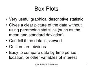
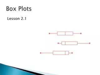
Displaying Numerical Data Using Box Plots. Lesson Overview (1 of 6). Lesson Overview (2 of 6). Lesson Overview (3 of 6). Lesson Overview (4 of 6). Lesson Overview (5 of 6). Lesson Overview (6 of 6). Warm Up. OBJECTIVE: SWBAT display numerical data using box plots.

E N D
Warm Up OBJECTIVE: SWBAT display numerical data using box plots. Language Objective: SWBAT use content specific vocabulary to describe all parts of a box plot to a partner. A group of taste testers reviewed a brand of natural peanut butter. They gave the peanut butter a rating of 0-100 points depending on its quality. The ratings are below: 34 40 52 57 57 60 60 63 67 69 69 71 71 89 Find the minimum, maximum, median, range, and interquartile range (IQR) for this set of data. Challenge: What would the 15th score have to be in order for the peanut butter to have a mean rating of 63 points? Min = 34 points Max = 89 points Median = 61.5 points Range = 55 points Interquartile range (IQR) = 12 points 86 points Hint Agenda
Agenda: OBJECTIVE: SWBAT display numerical data using box plots. Language Objective: SWBAT use content specific vocabulary to describe all parts of a box plot to a partner. • Warm Up – Review of median, range, and IQR (Individual) • Launch – Intro to Box Plots (Whole Class) • Explore – Box Plots & Electronics Usage (Small Group) • Summary – Why Use Box Plots? (Whole Class) • Practice – Four Corners ( Whole Class) • Assessment –Paper Plates Discussion (Partner)
Launch Think-Pair-Share List some of the ways this information could be displayed visually. 34 40 52 57 57 60 60 63 67 69 69 71 71 89 Bar Graph? Line Plot? Circle Graph? Table? Agenda
Launch Whole Class A box plot is one of the ways this data can be displayed. 34 40 52 57 57 60 60 63 67 69 69 71 71 89 Agenda
Launch Whole Class Example of a box plot: Agenda
Launch Vocabulary Box Plot: A graph that uses a rectangle (box) to represent the middle 50% of a set of data and “whiskers” at both ends to represent the remainder of the data. Agenda
Launch Turn-and-talk A box plot is constructed from the five-number summary of a set of data. Using the graph and what you know about range and interquartile range, what do you think the five-number summary consists of? Hint Agenda
Launch Notes Five-Number Summary Minimum Lower Quartile (Q1) Median Upper Quartile (Q3) Maximum Median = 61.5 34 40 52 57 57 60 60 63 67 69 69 71 71 89 Minimum Upper Quartile (Q3) Lower Quartile (Q1) Maximum Agenda
Launch Think-Pair-Share The box plot below shows how the five-number summary corresponds to the box and whiskers of the box plot. Based on the figures above, how do you make a box plot using the five-number summary? Agenda
Launch Notes Once you have found the five-number summary, follow these steps to make a box plot:1. Write the data in order from least to greatest2. Draw a number line that can show the data in equal intervals3. Mark the median4. Mark the median of the upper half (the upper quartile, or Q3)5. Mark the median of the lower half (the lower quartile, or Q1)6. Mark the maximum (the greatest number)7. Mark the minimum (the lowest number)8. Draw a box between the lower quartile and the upper quartile9. Draw a vertical line through the median inside the box10. Draw two horizontal lines ("whiskers") from the rectangle to the extremes (minimum and maximum) Agenda
Launch Check Your Work! Agenda
Explore – Class Challenge! • In your head, estimate the NUMBER OF HOURS you spend using electronics in ONE WEEK . -TV -Computer -Video Games, etc. • On the paper in front of you, in large writing, write your estimate. • Without talking, form a line from least to greatest in the front of the room. Hold your estimates in front of you for people to see. Agenda
Explore Number of hours per week 6th graders spend using electronics. To Do: 1) Quietly return to your seat 2) Record the information above in your notes Agenda
Explore Next Steps: • Using the data, independently find the five-number summary in your notes • Compare your five-number summary with those of your group members 3) As a group, construct one poster that has the following: a) Data ordered from least to greatest b) Five-number summary c) Box Plot You have 12 minutes! Agenda
Explore Small Group How does your box plot compare? Quietly walk around the room to view the box plots made by other groups. Questions to think about: -What is great about the mathematics you see? -What suggestions do you have for the other groups? You have 3 minutes! Agenda
Summary Whole Class Questions to discuss: -What is great about the mathematics you saw? -What suggestions do you have for the other groups? -Based on the data that we collected, how much time does the typical student spend using electronics weekly? -When are box plots useful? For example, why would someone choose to create a box plot instead of a bar graph? Agenda
Explore Whole Class Let’s compare your box plot with a box plot that was created using an applet! Online Tool Agenda
Practice Four Corners The five-number summary divides a data distribution into four parts. In this activity you will have to decide what percent of the data values fall in given intervals. 1 4 2 3 Agenda
Practice Four Corners About what percent of the data values fall in the following interval? • after the upper quartile 25% Agenda
Practice Four Corners About what percent of the data values fall in the following interval? • before the median 50% Agenda
Practice Four Corners About what percent of the data values fall in the following interval? • after the median 50% Agenda
Practice Four Corners About what percent of the data values fall in the following interval? • in the box (between the upper and lower quartiles) 50% Agenda
Practice Four Corners About what percent of the data values fall in the following interval? • before the upper quartile 75% Agenda
Practice Four Corners About what percent of the data values fall in the following interval? • before the lower quartile 25% Agenda
Practice Four Corners About what percent of the data values fall in the following interval? • after the lower quartile 75% Agenda
Practice Four Corners About what percent of the data values fall in the following interval? • between the median and the upper quartile 25% Agenda
Practice Four Corners About what percent of the data values fall in the following interval? • between the median and the lower quartile 25% Agenda
Assessment – Paper Plate Discussion! At your seats, you and your partner have four paper plates. Each plate has a letter on it: a, b, c, or d. Each of the following slides has a multiple choice question on it. The possible answers are a, b, c, or d. For each question, think about the answer in your head. Then turn to your partner and explain your answer. After your discussion, you or your partner should put the plate in your hand that represents what you believe is the correct answer. When you hear two claps, raise your plate in the air. Agenda
Assessment – Paper Plate Discussion! Ms. Simmons made the box-and-whisker plot below to show some statistics about the ages of the students in her class at a community college. Which of the following best represents the median age of the students in her class? A. 25 B. 27 C. 29 D. 31 Agenda
Assessment – Paper Plate Discussion! The box-and-whisker plot below shows the distribution of the daily high temperatures, in degrees Fahrenheit, in the town of Clifton during the year 2004. Based on the box-and-whisker plot, in which of the following intervals of temperatures is it most likely that exactly 50% of the daily high temperatures are located? A. 38°F to 54°F B. 38°F to 81°F C. 54°F to 72°F D. 54°F to 81°F Agenda
Assessment – Paper Plate Discussion! Ms. Dumont kept a record of the numbers of students enrolled in foreign language classes at Central High School during the past 20 years. She used her data to make the box-and-whisker plot shown below. Based on Ms. Dumont’s plot, what is the interquartile range of the numbers of students enrolled in foreign language classes? A. 5 C. 30 B. 15 D. 50 Agenda
Assessment – Paper Plate Discussion! A community center offers classes for students. The range of the number of students in each class is 13. The median number of students in each class is 9. Which of the following box-and-whisker plots could represent the numbers of students in the classes? Agenda
Assessment – Paper Plate Discussion! At your seats, you have two paper plates in front of you. Each plate has a word on it: True or False. Each of the following slides has a statement that is either true or false. For each statement, determine if it is true or false. Then turn to a neighbor and explain your answer. After your discussion, put the plate in your hand that represents what you believe is the correct answer. When you hear two claps, raise your plate in the air. Agenda
Assessment – Paper Plate Discussion! True or False? The class median is less than 80. True Agenda
Assessment – Paper Plate Discussion! True or False? Half the class scored between 60 and 80. True Agenda
Assessment – Paper Plate Discussion! True or False? At least one student earned a score of 100. True Agenda
Assessment – Paper Plate Discussion! True or False? The class mean is probably less than the median. True Agenda
Assessment – Paper Plate Discussion! True or False? If there are 30 students in the class, at least 10 scored above 80. False Agenda