Download
1 / 20
200 likes | 323 Views
Part II S igma Freud & Descriptive Statistics. Chapter 4 A Picture is Really Worth a Thousand Words. Why Illustrate Data?. When describing a set of scores you will want to use two things… One score for describing the group of data Measure of Central Tendency

E N D
Part IISigma Freud & Descriptive Statistics Chapter 4 A Picture is Really Worth a Thousand Words
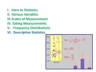
Why Illustrate Data? • When describing a set of scores you will want to use two things… • One score for describing the group of data • Measure of Central Tendency • Measure of how diverse or different the scores are from one another • Measure of Variability • However, a visual representation of these two measures is much more effective when examining distributions.
Ten Ways to a Great Figure • Minimize the “junk” • Plan before you start creating • Say what you mean…mean what you say • Label everything • Communicate ONE idea • Keep things balanced • Maintain the scale in the graph • Remember…simple is best • Limit the number of words • The chart alone should convey what you want to say
Frequency Distributions • Method of tallying, and representing the number of times a certain score occurs • Group scores into interval classes/ranges • Creating class intervals • Range of 2, 5, 10, or 20 is usually good • 10-20 class intervalsfor the entire range of data • Divide total # of data points by # of class intervals desired to determine numeric range of the class intervals
Histograms • Hand Drawn • Histogram
Histogram • Tally-Ho • Method
Frequency Polygon • A “continuous line that represents the frequencies of scores within a class interval”
Fat & Skinny of Frequency Distributions • Distributions can be different in four different ways… • Average value • Variability • Skewness • Kurtosis
Skewness • Positive & Negative Skewness
Kurtosis • Platykurtic (A) & Leptokurtic (C)
Cool Ways to Chart Data • Column Chart
Cool Ways to Chart Data • Line Chart
Cool Ways to Chart Data • Pie Chart
Using the Computer to Illustrate Data • Creating Histogram Graphs
Using the Computer to Illustrate Data • Creating Bar Graphs
Using the Computer to Illustrate Data • Creating Line Graphs
Using the Computer to Illustrate Data • Creating Pie Graphs