Download
1 / 27
270 likes | 374 Views
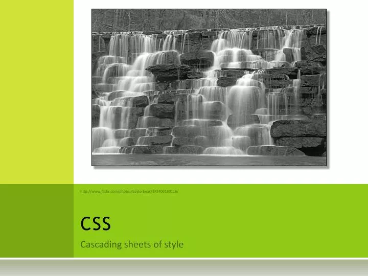
CSS. http://www.flickr.com/photos/baylorbear78/3406180116/. Cascading sheets of style. CSS properties. CSS properties fall into six categories: Color : Text and background colors, background images. Fonts : Can control font family and size.

E N D
CSS http://www.flickr.com/photos/baylorbear78/3406180116/ Cascading sheets of style
CSS properties • CSS properties fall into six categories: • Color: Text and background colors, background images. • Fonts: Can control font family and size. • Text: Text properties include word-spacing, to control the spacing between words, letter-spacing to control the spacing between letters, text-decoration to render the text underlined, overlined, with a line through it, or even blinking. • Boxes: Control borders, padding, and margins. • Positioning: The x, y, and z coordinates of an HTML element can be set absolutely, floated to one side, or set relative to their default position. • Classification: There are several categories into which HTML elements can be placed. These categories include how the element should be displayed and how whitespace is treated.
Box Model • The margin lies outside the content and separates this box from others. • Borders can be different styles, widths and colors. • Padding separates the border from its content • The content is contained in the box. • An outline can be added to the box. An outline does not change the box size.
Containing Boxes • Every box is contained within another box. The position and width of a box is usually dependent on the position and width of the containing box. • There are three types of boxes: • Block Boxes. • Elements, such as <div>, <h#>, <p>, generate block boxes to contain their content. • Block level elements generate a principal block box that only contains block boxes. • Block boxes are organized vertically, each succeeding box placed beneath the previous one. • Inline Boxes. • Generated by inline elements, such as <span>, <img />, <e>, <u>. • Content is presented as line-boxes, as opposed to a complete block on a page. • These boxes will cover only the content, rather than setting apart a complete block on a page. • Anonymous Boxes. • Content in a block box that is not enclosed in a block-level element is nevertheless regarded as if it were surrounded by its own box.
Width and Height • The width of a box is determined by the width of the children. • width of parent = margin-left + margin-right + • padding-left + padding-right + • border-left + border-right + • children-width • Width can be overridden • img.logo {width: 10%;} • p {height: 15px; } • h1 {width: 33%; height: 2.5 em; }
CSS Units • There are two types of length units in CSS, the relative and absolute. • Relative units : • em -- the current 'font-size' of the relevant font • ex -- the 'x-height' of the relevant font or the height of a small x • px -- pixels is relative to the viewing device • Absolute units : • in -- inches, 1 inch is equal to 2.54 centimeters • cm -- centimeters • mm -- millimeters • pt -- points, the points used by CSS2 are equal to 1/72th of an inch • pc -- picas, 1 pica is equal to 12 points or 1 pica to 6 inches • NOTE: rarely use absolute units. These are useful only when the physical properties of the display are known.
Width and Height • You can constrain width and height values by specifying minimum and maximum values. • min-width • max-width • min-height • max-height
Borders • Borders can be controlled with the following properties • border-color • border-style: none, hidden, dotted, dashed, solid, double groove, ridge, inset, outset • border-width: <length>, thin, medium, thick
Borders • border is a shorthand for all of the above • border width style color • The following are equivalent: • p { border: solid red } • p { • border-top: solid red; • border-right: solid red; • border-bottom: solid red; • border-left: solid red; • border-image: none; • }
Rounded Borders • Borders can be rounded. Each of the following take two values: a percentage or length. • border-top-right-radius • border-top-left-radius • border-bottom-right-radius • border-bottom-left-radius
Example The two values of ‘border-top-left-radius: 55pt 25pt’ define the curvature of the corner. Example: <div style="box-sizing:border-box;width:600px;height:400px;border-color:black;border-style:solid;border-width:2px;border-radius:100px 400px 50px 400px;"/>
Margin • Margins can be controlled using • margin-top • margin-bottom • margin-left • margin-right • Margin is a short-hand to set all four properties • margin top right bottom left • Of course, nothing is ever simple • If there is only one component value, it applies to all sides. If there are two values, the top and bottom margins are set to the first value and the right and left margins are set to the second. If there are three values, the top is set to the first value, the left and right are set to the second, and the bottom is set to the third. If there are four values, they apply to the top, right, bottom, and left, respectively.
Margin Examples • Consider the following examples • body { margin: 2em } • /* all margins set to 2em */ • body { margin: 1em 2em } • /* top & bottom = 1em, right & left = 2em */ • body { margin: 1em 2em 3em } • /* top=1em, right=2em, bottom=3em, left=2em */ • The last rule of the example above is equivalent to the example below: • body { • margin-top: 1em; • margin-right: 2em; • margin-bottom: 3em; • margin-left: 2em; /* copied from opposite side (right) */ • }
Padding • Padding is controlled by • padding-left • padding-right • padding-top • padding-bottom • padding is shorthand • padding top right bottom left • h1 { • background: white; • padding: 1em 2em; • }
Outline • From the www.w3.org CSS Spec: • Graphical user interfaces may use outlines around elements to tell the user which element on the page has the focus. These outlines are in addition to any borders, and switching outlines on and off should not cause the document to reflow. The focus is the subject of user interaction in a document (e.g., for entering text, selecting a button, etc.). User agents supporting the interactive media group must keep track of where the focus lies and must also represent the focus. This may be done by using dynamic outlines in conjunction with the :focus pseudo-class. • For example, to draw a thick black line around an element when it has the focus, and a thick red line when it is active, the following rules can be used: • :focus { outline: thick solid black } • :active { outline: thick solid red }
Layout • Layout is a term that describes how page elements are positioned and sized. Web layout is one of the most important issues to settle when designing a page. • Two primary techniques • Static layout • The page has fixed-size and fixed-position areas which are filled with content. • Usually uses tables where the cells contain page elements • Examples: www.yahoo.com, www.cnn.com • Fluid layout • Elements on the page are allowed to dynamically change size and location based on the window size • Always uses div tags with css to control positioning • Examples: www.wikipedia.org, www.amazon.com • Template: http://css-tricks.com/examples/PerfectFluidWidthLayout/ • Most business websites limit the width to standard screen sizes (although browser size is more central). • Reference: www.hobo-web.co.ui/best-screen-size/ , http://www.w3schools.com/browsers/browsers_display.asp
Floating • Fluid layouts control content through CSS. One of the most confusing properties of CSS is the FLOAT property. Float values are: left, right, none. • The rules get pretty complicated. Here is a summary: • The left side of a left-floated box may not be positioned past the left side of its containing block. • If a left-floated box is preceded by other left-floated boxes, it should be positioned either to the right or below the box immediately preceding it. • A left-floated box's right side may not overlap any right-floated boxes. • The top of a floated box may not be higher than its containing block. • The top of a floated box may not be higher than the tops of any floating boxes preceding it. • The top of a floated box may not be higher than the tops of any other boxes occurring earlier in the page's source. • A left-floated box's right side may not extend past the right side of its containing block. • A floated box must go as high on the page as possible. • Left-floating boxes are to be positioned as far to the left as possible. Right-floating boxes should be positioned as far to the right as possible. A higher position on the page is to be preferred over a position further to the left or right.
Clearing • The clear property prevents elements from being layed-out in certain areas surrounding another element. • Clear has values: left, right, both, none.
Layout • Some main layout techniques • Divisions and tables • Divisions <div> specify rectangular areas • These can be filled with any content • Including nested <div> tags • Positional control of elements • static (default) – normal flow • fixed – browser window coordinates • absolute – containing element coords • relative – relative to where it would be according to normal flow rules
CSS Colors • The following CSS properties are related to color: • color: the foreground color of an elements text • background-color: the color of an elements background • border-color • outline-color • Colors can be specified in multiple ways • rgba(r,g,b,a) • the rgb values are in [0,255] or [0,100%] • a is in [0,1] where 0 means transparent and 1 means opaque • Some colors are named • #rgb where rgb are hex values in [0,255]. • hsla(h,s,l) • h is in [0,360] • s and l are in [0,100%] • a is in [0,1]
Colors From http://www.w3.org/TR/css3-color/#color • These two rules are semantically equivalent: • em{ color: lime } /* color keyword */ • em { color: rgb(0,255,0) } /* RGB range 0-255 */ • These rules are semantically equivalent • em { color: #f00 } /* #rgb */ • em { color: #ff0000 } /* #rrggbb */ • em { color: rgb(255,0,0) } • em { color: rgb(100%, 0%, 0%) } • Clipping • em { color: rgb(255,0,0) } /* integer range 0 - 255 */ • em { color: rgb(300,0,0) } /* clipped to rgb(255,0,0) */ • em { color: rgb(255,-10,0) } /* clipped to rgb(255,0,0) */ • em { color: rgb(110%, 0%, 0%) } /* clipped to rgb(100%,0%,0%) */ • HSL • p { color: hsla(240, 100%, 50%, 0.5) } /* semi-transparent solid blue */ • p { color: hsla(30, 100%, 50%, 0.1) } /* very transparent solid orange */
Display and Visibility • display and visibility allow control over layout and hiding elements. • Visibility: • visible (default) • hidden (the elements still take space but can't be seen) • Display: • inline (generates an inline box) • block (generates a block box) • none (generates no box; the element is not rendered; changes layout) • other options relate to lists and tables
Display and Visibility • Here are some examples of the 'display' property: • p { display: block } • em { display: inline } • li { display: list-item } • img { display: none } /* Do not display images */
Fonts • Fonts can be controlled via • font-family: family-name, generic-family • { font-family: "New Century Schoolbook", serif } • font-style: normal, italic, oblique • font-variant: normal, small-caps • font-boldness: normal, bold, bolder, lighter,100|200|…|900 • font-size • line-height: the height of a line of text • There is a shorthand for specifying all of the above • font: style variant weight size/line-height family
Examples • Font-style: • h1, h2, h3 { font-style: italic } • h1 em { font-style: normal } • Font-variant: • h3 { font-variant: small-caps } • em { font-style: oblique } • Font-boldness: • p { font-weight: normal } /* 400 */ • h1 { font-weight: 700 } /* bold */ • strong { font-weight: bolder } • Font-size: • p { font-size: 16px; } • blockquote{ font-size: larger } • em { font-size: 150% } • em { font-size: 1.5em } • Font • p { font: 12px/14px sans-serif } • p { font: 80% sans-serif } • p { font: x-large/110% "New Century Schoolbook", serif } • p { font: bold italic large Palatino, serif } • p { font: normal small-caps 120%/120% fantasy }
Background settings • CSS background properties are used to define the background effects of an element. • background-color • background-image • background-repeat: • repeat-x: tiled horizontally • repeat-y: tiled vertically • repeat: tiled horizontally and vertically (default) • no-repeat • background-attachment • scroll: background scrolls with the viewport (default) • fixed: background doesn't scroll • background-position • [left | center | right ] [ top | center | bottom] • Shorthand • background: color image repeat attachment position
Examples • Background-image • body { background-image: url("marble.png") } • p { background-image: none } • Background-repeat and attach • body { • background: red url("pendant.png"); • background-repeat: repeat-y; • background-attachment: fixed; • } • Background-attach • body { background: url("banner.jpeg") right top } /* 100% 0% */ • body { background: url("banner.jpeg") top center } /* 50% 0% */ • body { background: url("banner.jpeg") center } /* 50% 50% */ • body { background: url("banner.jpeg") bottom } /* 50% 100% */ • Background • BODY { background: red } • P { background: url("chess.png") gray 50% repeat fixed }