Download
1 / 5
50 likes | 52 Views
This visualization represents wind speed and direction measurements taken at H.J. Andrews Long-Term Ecological Research Forest in Oregon. The data was collected at two stations in adjoining valleys and mapped onto a Digital Elevation Model (DEM) created using lidar data. The software allows users to visualize and analyze the data, making correlations and patterns more apparent.

E N D
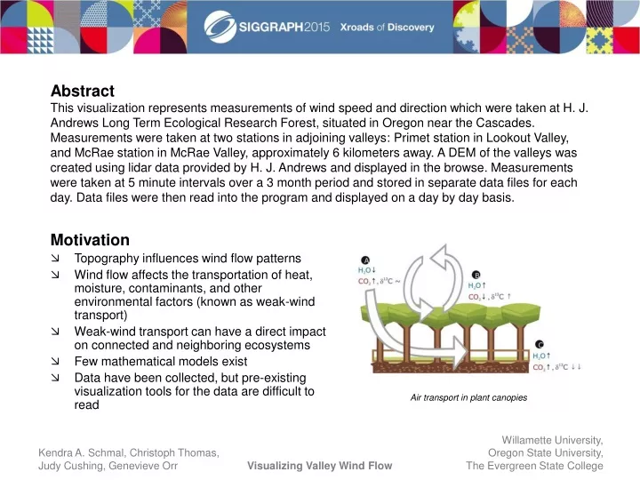
Abstract This visualization represents measurements of wind speed and direction which were taken at H. J. Andrews Long Term Ecological Research Forest, situated in Oregon near the Cascades. Measurements were taken at two stations in adjoining valleys: Primet station in Lookout Valley, and McRae station in McRae Valley, approximately 6 kilometers away. A DEM of the valleys was created using lidar data provided by H. J. Andrews and displayed in the browse. Measurements were taken at 5 minute intervals over a 3 month period and stored in separate data files for each day. Data files were then read into the program and displayed on a day by day basis. Motivation • Topography influences wind flow patterns • Wind flow affects the transportation of heat, moisture, contaminants, and other environmental factors (known as weak-wind transport) • Weak-wind transport can have a direct impact on connected and neighboring ecosystems • Few mathematical models exist • Data have been collected, but pre-existing visualization tools for the data are difficult to read Air transport in plant canopies
Experiment • Data were collected at H. J. Andrews Long-Term Ecological Research Forest over a period of 3 months • Two ground-based acoustic remote sounders (SoDAR) were stationed in the connected valleys, Primet and McRae • Measurements of wind speed, direction, height, and additional factors were taken every 8 seconds between an elevation of 15 meters and 395 meters at 10 meter intervals, and then averaged to 5 minute and hourly intervals • SoDAR produces “Sodargrams” which visualize wind speed and direction separately with respect to time • The data were analyzed manually and classified into different “wind profiles” based on the characteristics of flow at the time Top: Elevation map of H. J. Andrews, showing SoDAR locations at Primet and McRae Bottom: Station set-up
Approach • Use Lidar elevation data of H. J. Andrews to create a Digital Elevation Model (DEM) of the valley • Map the stations onto the DEM using UTM coordinates • Read in wind speed and directional data from daily files produced by SoDAR • Output the data, representing measurements at each height interval as a vector, originating from the station center • Allow user to scale vectors by height or magnitude Lidar Image of H. J. Andrews DEM created from Lidar data DEM with elevation and hillshade Sample vis
Pre-existing software • Original data had to be analyzed manually, which is very time consuming • Pre-packaged “Sodargrams” are not intuitive to read. Wind speed and direction are not visualized together, so correlations may not be readily apparent • Graphs from different stations also cannot be visualized together Our Software • Data orientated spatially over DEM, makes the influence of the topography more obvious • Speed, direction, and location are visualized together • Potential for analyzing data automatically, to save time • Able to animate data sets • User can add new stations as experiment grows Sodargram showing wind speed Sodargram showing wind direction Sample from our software showing wind speed and direction for both stations
Future Work • Use color and other visual cues to represent additional wind parameters • Incorporate data analysis into the visualization • Ability to view multiple data sets Acknowledgments Visualization research was part of the Visualizing Terrestrial and Aquatic Systems (VISTAS) Project, funded by the National Science Foundation NSF BIO/DBI 1062572. Thomas’ work was supported by the NSF, Physical and Dynamic Meteorology Career award NSF AGS0955444, and the Army Research Office, contract W911NF-10-1-036.1.