Download
1 / 17
170 likes | 377 Views
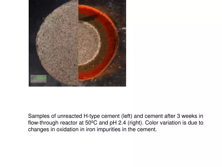
Samples of unreacted H-type cement (left) and cement after 3 weeks in flow-through reactor at 50ºC and pH 2.4 (right). Color variation is due to changes in oxidation in iron impurities in the cement. Cement samples recovered with sidewall corer from a 19 year-old oil well at RMOTC in Wyoming.

E N D
Samples of unreacted H-type cement (left) and cement after 3 weeks in flow-through reactor at 50ºC and pH 2.4 (right). Color variation is due to changes in oxidation in iron impurities in the cement.
Cement samples recovered with sidewall corer from a 19 year-old oil well at RMOTC in Wyoming.
Schematic of the system that is modeled by the semi-analytical models. Any leakage along existing wells can form secondary plumes of CO2 in permeable layers above the injection zone, as shown in the figure.
A key advantage of the semi-analytical models is their computational speed and hence suitability for Monte-Carlo simulations. Here, the distribution of total leakage after 30 years of injection are shown based on assumed statistical distributions for properties of the existing wells.
Location of Wabamun Lake study area outside Edmonton, Alberta and surrounding CO2 sources Courtesy of Stefan Bachu
Figure 1. Comparing H2 costs for alternative production options for the transition to a H2 economy The cost to consumers at refueling stations is presented for a coal H2 case involving the production of 1 tonne per day of slipstream hydrogen (99.999% purity) at a central facility (that also produces 362 MWe of power) and delivery of this H2 to a refueling station 24 miles away as a compressed gas that is transported by truck. Assuming natural gas and coal prices of $8.0 and $1.34 per GJ (HHV), respectively and a carbon price of $100/tC, the figure shows that the cost of H2 to consumers via this approach is much less than H2 provided via current steam methane reforming (SMR) technology and comparable to the cost of H2 produced via hoped-for future SMR technology.
To edit, right click and select “Document Object” and then Open or Edit
To edit, right click and select “Document Object” and then Open or Edit
To edit, right click and select “Document Object” and then Open or Edit
Figure 5: Economics of Baseload Wind Power The four central figures show the comparative economics and least-cost technology under varying conditions among three baseload electricity options (1) natural gas combined cycle (NGCC) (2) wind energy backed by dedicated natural gas simple cycle and combined cycle generation (yellow and green) and (3) wind energy with compressed air energy storage (CAES). Since all three technologies use natural gas as a fuel, the carbon prices in the top figure can also be expressed as an effective fuel price that adds the carbon price to the direct fuel price (top axis).
Fig. 11. Latitudinal distribution of annual mean (a) CO2, (b) O2/N2, and (c) APO. Circles represent shipboard data, and squares and triangles represent the data at Ochi-ishi and Hateruma, respectively. Open and solid symbols indicate averages for 2002 and 2003, respectively. (d) Comparison of observed annual mean APO with the model simulation results of Gruber et al. (2001). Individual profiles of the observed APO are shifted to visually fit the model-simulated APO profile.
Fig. 12. Latitudinal distribution of annual mean atmospheric SF6 concentration from observations and simulations with the Mozart model.
Fig 13. Diatom microfossils as seen through a microscope under near-UV light, which causes the internal organic matter to fluoresce yellow. Sigman's group analyzes this trapped organic matter for the information it holds about past conditions in the surface ocean.
Figure 14. Temperature adaptation required to avoid dangerously frequent bleaching (using the HadCM3 climate model forced by the SRES A2 emissions scenario).
Figure 15. Change in annual (A) absolute radiative forcing and (B) normalized radiative forcing (F/ENOx ), due to changes in ozone and methane resulting from a 10% reduction in surface anthropogenic NOx emissions from each of the nine regions and a combined 10% reduction in anthropogenic NOx, CO, and VOC emissions (three bars on the right).