Download

1 / 32
330 likes | 339 Views
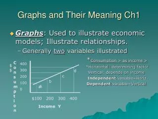
Friday, 20 December 2019. Graphs and their interpretation. Learning Objectives. About different types of graphs, How to interpret the different shapes How to draw them when you are doing your practical work,. Types of graphs. Let’s look at some examples of graphs.

E N D
Friday, 20 December 2019 Graphs and their interpretation
Learning Objectives • About different types of graphs, • How to interpret the different shapes • How to draw them when you are doing your practical work,
Types of graphs Let’s look at some examples of graphs • Line- Use for continuous data • Bar- Use for discontinuous data • Pie- Use for discontinuous data
Often the best way to represent numerical data is in a graph. This makes it easy to read, digest, compare and spot trends. Different types of graph are used to present different types of statistical information.
Graphs 1: line graphs Different types of graph are used to represent statistical data. Most graphs have two axes: the X axis is horizontal (across the bottom) while theY axis is vertical (up the left side). The two axes each represent a different set of data. Line graphs are drawn by plotting points by their X and Y coordinates, then joining them together or drawing a line through the middle. X= Independent Variable Y= Dependent variable
Types of line graph Comparison Sometimes different sets of data will be represented on the same line graph, so comparisons can be made. This is sometimes called a comparison line graph. Compound If information can be subdivided into two (or more) types of data - eg total population growth, female population growth and male population growth - then all three can be drawn on a compound line graph. Scatter Where the points on a graph do not map into a neat line, a line is drawn through the middle of the points to show the trend or correlation. This is called a scatter graph.
Types of graphs 1 A straight line graph: length length weight weight An example would be the length of a spring against the weight on it.
Types of graphs 2 A special case is when the straight line goes through the origin : In this case the two quantities are directly proportional. If one doubles, then the other one also doubles. See page 390. origin
Types of graphs 2 If you think your graph should go through the origin, then draw it exactly through the origin.
Types of graphs 3 A curved graph, rising : The dependent variable rises quickly at first and then more slowly examples:
Types of graphs 4 A curved graph, falling : The dependent variable falls quickly at first and then more slowly examples:
Predictions for world wide energy consumption What will happen to total global demand? What will happen to fossil fuels? What will replace fossil fuels? Why will the global demand increase?
Biology Experiment Booster 2b: Understanding Line Graphs Questions 1 What are the trends in drug taking between 1996 and 2010? 2 Which drugs are the most used and least used? 3 Which drugs have increased or decreased in use? 4 What evidence is there from this graph that using cannabis can lead to people taking‘harder’ drugs? 5 Suggest possible reasons for the trend in general drug use.
Graphs 2: bar charts Bar charts or bar graphs represent data as vertical blocks or columns. The X axis shows what type of data each column represents, and the Y axis shows a value for that type of data. For example, in An eye colour graph, each column on the X axis represents a colour of the eyes, with the height of each column on the Y axis showing the amount of people with that colour.
Differences in eye colour for pupils at Alsop in 2 form groups How many pupils had blue eyes? Which colour is the most common? How many pupils were in the sample? What is wrong with this graph?
Biology Experiment Booster 2a: Understanding Bar Charts Questions 1 What is the relationship between age and the number of people with diabetes? 2 Which age group has the largest number of people with diabetes? 3 What is the percentage of males with diabetes between the ages of zero and 44? 4 Compare the number of males and females with diabetes as they increase in age. 5 Suggest reasons for the relationship between age and the number of people withdiabetes.
Graphs 3: pie charts • Pie chartsare used for showing how something breaks down into its constituent parts. • Pie charts are usually drawn so the biggest piece of pie comes first (starting at 12 o'clock). • The 'others' section usually goes last (coming up to 12 o'clock). • If each piece of pie has its percentage written in, it's easier for the reader to work out the exact proportions
The pie charts below show differences in eye colour for pupils at Alsop in year 10 What is the most common colour? What is the least common colour?
Biology Experiment Booster 2c: Understanding Pie Charts Questions 1 Compare chart A and chart B. 2 Identify which graph represents the person on a hot day. Explain your answer. 3 Other than the temperature of the day, what else could cause the proportions of water loss shown in chart B?
Learning Outcomes You should now: • Know how to draw a line-graph correctly, • Be able to give examples of graphs with different shapes, • Be able to interpret graphs with different shapes.
Drawing a graph When should I draw a bar-chart…? …and when should I draw a line-graph?
Drawing a graph Look at the table of your results: If this column has • only certain fixed values, • use a bar-chart: • a continuous range of values, • use a line-graph:
Drawing a graph What is the best way to draw a line-graph?
5 steps in drawing a graph 1. Choose simple scales. For example: 1 large square = 1 newton (1 N) or 1 large square = 2 N, or 5 N, or 10 N But never choose an awkward scale, like 1 square = 3 N or 7 N Choose a scale that will make your graph use most of the sheet of paper.
5 steps in drawing a graph 1. Choose simple scales. Put the dependent variable on the ‘y-axis’ and the independent variable on the ‘x-axis’
5 steps in drawing a graph 2. Plot the points neatly. To mark the points we usually use an X x x x x Usually you need 5 or more points for the graph. x x Re-check each one before your next step.
5 steps in drawing a graph • If the points form a straight line… …draw the best straight line through them x x ‘line of best fit’ x x x x Check that it looks the best straight line.
5 steps in drawing a graph 4. If the points form a curve… …draw a free-hand curve of best fit Do not join the points like a ‘dot-to-dot’.
5 steps in drawing a graph 5. If a point is not on the line… …use your apparatus to check this measurement again x x x x This is called an anomalous point. x x You can decide to ignore anomalous points.
5 steps in drawing a graph • In summary: • Choose good scales,with the dependent variable on the y-axis • Plot the points carefully • Draw a line of best fitusing a ruler for a straight line graph, • or draw free-hand for a curved graph • Check anomalous points.