Download
1 / 11
110 likes | 118 Views
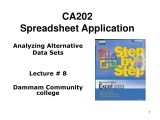
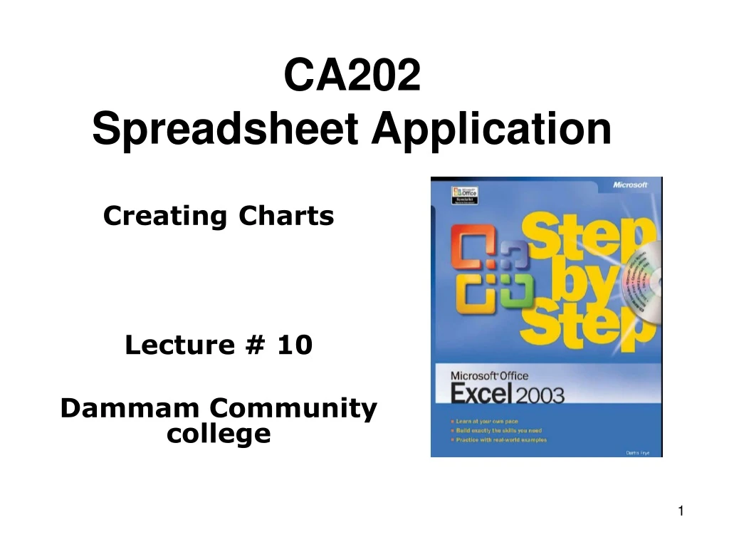
CA202 Spreadsheet Application. Creating Charts Lecture # 10 Dammam Community college. Objectives. ✔ Create and customize a chart. ✔ Perform trend line analysis. ✔ Create a dynamic chart using Pivot Charts. ✔ Create diagrams to illustrate relationships and processes. Why Charts?.

E N D
CA202Spreadsheet Application CreatingCharts Lecture # 10 Dammam Community college
Objectives ✔ Create and customize a chart. ✔ Perform trend line analysis. ✔ Create a dynamic chart using Pivot Charts. ✔ Create diagrams to illustrate relationships and processes.
Why Charts? • List of values in cells can’t communicate easily the overall trends in the data. • The best way to communicate trends in a large collection of data is through charts and graphs, which summarize data visually. • you can have future sales and add a trend line to the graph representing that prediction. • you can create a PivotChart that reflects the contents and organization of the associated PivotTable • You can also create diagrams, such as organizational charts, that are useful in many organizations.
Chapter Objective • In this chapter, you’ll learn how to create a chart and customize its elements, find trends in your overall data, create dynamic charts, and create and format diagrams.
Creating a Chart • To present your Excel data graphically, you select the cells you want to represent graphically and then click the Chart Wizard on the Standard toolbar to launch the Chart Wizard. • You have Chart sub-type section • You also have Press and Hold to View Sample button. CreateChart
Customizing Chart Labels and Numbers • After you create a chart, you can customize its elements to conform to a particular color scheme, fill effect, or border pattern. You can also change the appearance of the labels and numbers in your chart. • Double-click the label to open a formatting dialog box. Add Title, change decimal no.
Finding Trends in Your Data • You can use the data in Excel workbooks to discover how your business has performed in the past, but you can also have Excel make its best guess as to future sales if the current trend continues. • Right Click on September Bar and Click Add Trend Line
Creating a Dynamic Chart Using PivotCharts • You can also create dynamic charts, or PivotCharts, to reflect the contents and organization of a PivotTable. • You can create a PivotChart in two ways: • By clicking a cell in an existing PivotTable and then clicking the Chart Wizard button on the Standard toolbar, or • By selecting the appropriate option button on the last page of the PivotTable and PivotChart Wizard. Dynamic
Creating Diagrams • Excel has just the tool to create those recycle, network, or organizational structure diagrams: • Insert Diagram …
Chapter 10 Key Points • You can use charts to summarize large sets of data in an easy-to-follow visual format. • You’re not stuck with the chart you create; if you want to change it, you can. • Adding chart labels and a legend makes your chart much easier to follow. • If your chart data represents a series of events over time (monthly or yearly sales), you can use trendline analysis to extrapolate future events based on the past data. • A PivotChart lets you rearrange your chart on the fly, emphasizing different aspects of the same data without having to create a new chart for each view. • Excel lets you create and modify common business and organizational diagrams, such as organization charts and process diagrams, quickly.