Download
1 / 31
310 likes | 491 Views
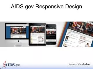
Responsive Web Design (RWD) Building a single web site for the desktop, tablet and smartphone An Infopeople Webinar November 13 , 20 13 Jason Clark Head of Digital Access & Web Services Montana State University Librar y. pinboard.in tag. pinboard.in/u:jasonclark/t:rwd/.

E N D
Responsive Web Design (RWD) Building a single web site for the desktop, tablet and smartphone An Infopeople Webinar November 13, 2013 Jason Clark Head of Digital Access & Web Services Montana State University Library
pinboard.in tag pinboard.in/u:jasonclark/t:rwd/
twitter as channel (#hashtag) @jaclark #rwd
Terms: HTML + CSS Does everybody know what these elements are? CSS - style rules for HTML documents HTML - markup tags that structure docs - browsers read them and display according to rules
Overview • What is Responsive Web Design? • RWD Principles • Live RWD Redesign • Getting Started • Questions
http://www.w3.org/History/19921103-hypertext/hypertext/WWW/Link.htmlhttp://www.w3.org/History/19921103-hypertext/hypertext/WWW/Link.html
Responsive design = 3 techniques • Media Queries • A Fluid Grid • Flexible Images or Media Objects
RWD Working Examples HTML5 Mobile Feed Widget www.lib.montana.edu/~jason/files/html5-mobile-feed/ Mobilize Your Site with CSS (Responsive Design) www.lib.montana.edu/~jason/files/responsive-design/ www.lib.montana.edu/~jason/files/responsive-design.zip Learn more by viewing source OR Download from jasonclark.info&github.com/jasonclark
Media Queries • switch stylesheets based on width and height of viewport • same content, new view depending on device @media screen and (max-device-width:480px) {… mobile styles here… } * note “em” measurements based on base sizing of main body font are becoming standard (not pixels)
Media Queries in Action <link rel="stylesheet" type="text/css” media="screen and (max-device-width:480px) and (resolution: 163dpi)” href="shetland.css" /> Responsive Web Design, Ethan Marcotte http://www.alistapart.com/articles/responsive-web-design
Define the Breakpoints • 3 major breaks 480 / 768 / 1024
Define the Breakpoints • 3 major media query rules < 480 < 768 > 768
A Fluid Grid • Create Flexible Layouts with Relative Sizing | 200 px | 300 px | 800 px | | 15.38% | 23.07% | 61.5384% |
Box Sizing Set how the browser calculates the width of an element to include (or not include) padding, borders, and margins div.doc { width: 200px; padding: 0 30px; -webkit-box-sizing: border-box; -moz-box-sizing: border-box; box-sizing: border-box; }
Flexible Images & Media • Adaptive Sizing img {width:100%;} img {max-width:100%;}
Flexible Images & Media ... • Adaptive Sizing <div class="video-container"> <iframe src="http://player.vimeo.com/video/6284199?title=0&byline=0&portrait=0" width="800" height="450" frameborder="0"></iframe> </div> .video-container {position:relative;padding-bottom:56.25%;padding-top: 30px;height:0;overflow:hidden;} .video-container iframe {position:absolute;top:0;left:0;width:100%;height: 100%;}
Ensure Device Screen Size • meta viewport tag in <head> <meta name="viewport" content="width=device-width, initial-scale=1">
Linearize Layout for Mobile • Turn all block level elements into full width to create single column layout width -> 100%
Hide Non-Essential Content • As screen sizes shrink, remove elements from view • Apply a .hide class @media screen and (max-width:480) { .hide {display:none;} }
RWD Gotchas • Hidden page weights • Be lean with your markup • Minify if performance bottleneck
Minification + Optimization Removing unnecessary characters and spacing from code to reduce size, and optimizing the code to improve load times Minify www.cleancss.com Optimize csstidyonline.com stidyonline.com/
What Type of Support? • see "When can I use…" • http://a.deveria.com/caniuse/ • Mobile browsers leading the way • Modernizr • http://www.modernizr.com/ • HTML5 enabling script • http://remysharp.com/2009/01/07/html5-enabling-script/
RWD Tools • Twitter Bootstrap • twitter.github.io/bootstrap/ • Responsify • responsify.it/ • 960 Grid System • http://960.gs/
Resources • HTML5 & CSS3 Cheat Sheets • webresourcesdepot.com/html-5-and-css3-cheat-sheets-collection/ • HTML5 Boilerplate • http://html5boilerplate.com/ • HTML5rocks • html5rocks.com • HTML5 Please • html5please.com/#use
Next version of RWD = Flexbox • A flexible box model? body>div#main { display: -webkit-flexbox; display: -moz-flexbox; display: -ms-flexbox; display: -o-flexbox; height: 500px; padding: 1em; background-color: gray; }
Live RWD redesign Taking off the training wheels....
RWD in Libraries • Matthew Reidsma • matthew.reidsrow.com • @mreidsma • Brad Czerniak • brad.hawidu.com • @ao5357
Questions? twitter.com/jaclark www.lib.montana.edu/~jason/talks.php
Infopeople webinars are supported in part by the U.S. Institute of Museum and Library Services under the provisions of the Library Services and Technology Act, administered in California by the State Librarian. This material is licensed under a Creative Commons 3.0 Share & Share-Alike license. Use of this material should credit the author and funding source.