Download
1 / 1

E N D
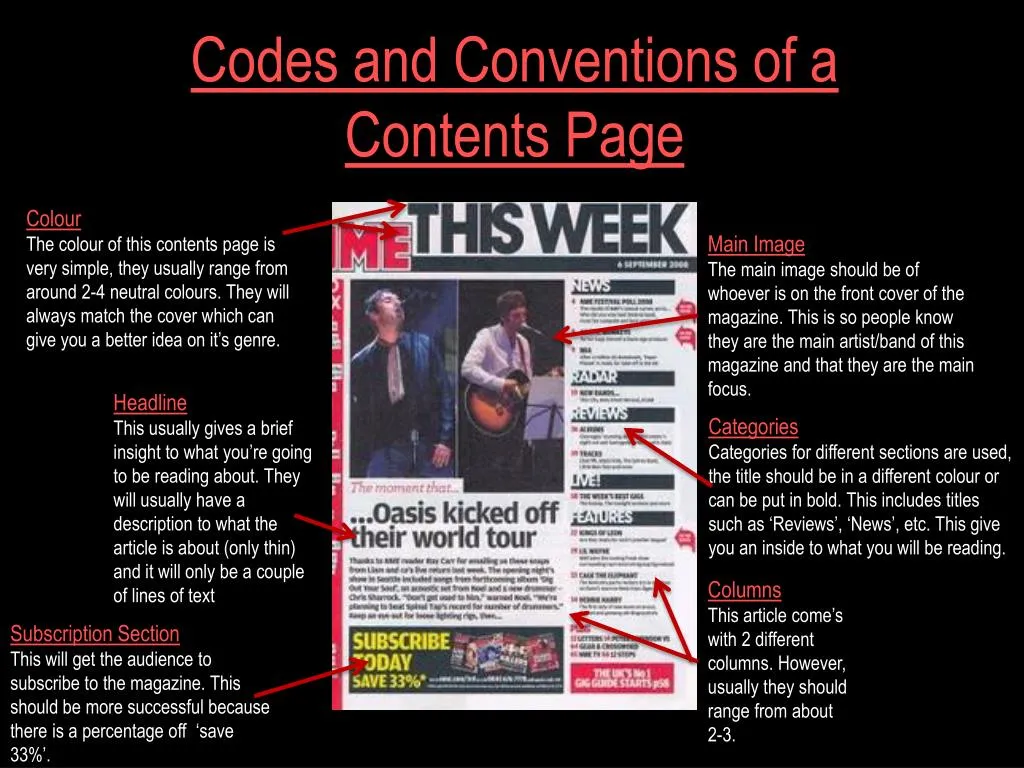
Colour The colour of this contents page is very simple, they usually range from around 2-4 neutral colours. They will always match the cover which can give you a better idea on it’s genre. Main Image The main image should be of whoever is on the front cover of the magazine. This is so people know they are the main artist/band of this magazine and that they are the main focus. Codes and Conventions of a Contents Page Headline This usually gives a brief insight to what you’re going to be reading about. They will usually have a description to what the article is about (only thin) and it will only be a couple of lines of text Categories Categories for different sections are used, the title should be in a different colour or can be put in bold. This includes titles such as ‘Reviews’, ‘News’, etc. This give you an inside to what you will be reading. Columns This article come’s with 2 different columns. However, usually they should range from about 2-3. Subscription Section This will get the audience to subscribe to the magazine. This should be more successful because there is a percentage off ‘save 33%’.