Download
1 / 1
10 likes | 88 Views
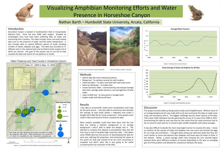
Nathan Barth – Humboldt State University, Arcata, California. Introduction

E N D
Nathan Barth – Humboldt State University, Arcata, California Introduction Horseshoe Canyon is located in Southwestern Utah in Canyonlands National Park. Since the year 2000, park rangers (headed by archeologist Gary Cox) have been collecting data on toads and monitoring their numbers. This data includes some non-toad related data such as the presence of water and the water temperature. It also includes data on several different species of toads including number of adults, tadpoles and eggs. This data was recorded at 17 different sites in the national park and on federal lands nearby (14 of which are shown). The goal of this project was to use GIS to help visualize this data and search for any patterns or trends. Visualizing Amphibian Monitoring Efforts and Water Presence in Horseshoe Canyon Figure 2: Average water presence by year From the rim of Horseshoe Canyon (facing SW) Near site “Mouth of Water” facing NE • Methods • Add XY data (for each individual location) • Merge tool - To combine records for each location • Field Calculator – To add a new field with total toad count • Select by Attributes – To Isolate Year • Create Summary Table – Summarized by site and got average start time, average water presence, and average/sum of total toads. • Layer to KMZ tool - To view points in Google Earth • Graphs made with Microsoft Excel • Results • I was able to successfully create some visualizations and maps for the park service. I was also able to summarize and calculate the average of total toads (adults + tadpoles) and create a Google Earth KML file for visual comparison. Some graphs were made in Microsoft Excel to further visualize the data. • More analysis probably could have been done with the raw data but lacking a statistics background or an ecology background I wasn’t able to delve too deeply into it. The attempt to compare this dataset to precipitation data also fell short due to lack of localized high resolution data. I did obtain some PRISM data but the process of downloading the data for each year, defining the projection, and extracting the values at the points for that year proved to be too time consuming to complete and didn’t seem like it was going to be useful considering the low resolution of the data. Figure 3: Average Toad Population by year Discussion This project turned ended up being pretty simple and straightforward. Without much of an ecology background all I was really able to do was summarize the data an make some maps and animations with it. The biggest challenge was the sheer volume of the data. There were 3263 individual records spanning the course of 11 years from 2000 to 2011. Summarizing this data by year and then by site meant that the same processes had to be run once for each year (or 11 times) to get suitable shapefiles with yearly averages. It was also difficult to decide the most meaningful manner to visualize this data. I chose to combine all the species of toads and tadpoles into one count and exclude the eggs for my maps and animations. I thought about doing just observed adults but they are much harder to count and observe than tadpoles and there were far fewer of them in the dataset. Taking a yearly average rather than showing the sum seemed logical because there were different numbers of records depending on the year so averaging got rid of this problem and allowed for comparison between the years. Figure 1: A screenshot from the animation visualizing water presence and toad counts