Download
1 / 16
170 likes | 567 Views
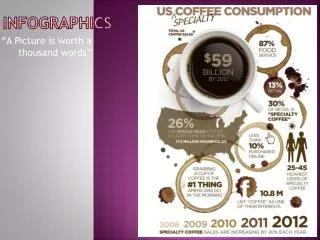
Infographics. Visualizing Data. What are they?. Infographics can be used to visualize data in beau tiful and interesting ways making it fun and easy to digest . They can be instructive and informative . They can be reports , resumes , and syllabi . . Why use them?.

E N D
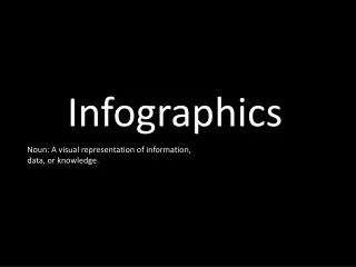
Infographics Visualizing Data
What are they? Infographics can be used to visualize data in beautiful and interesting ways making it fun and easy to digest. They can be instructive and informative. They can be reports, resumes, and syllabi.
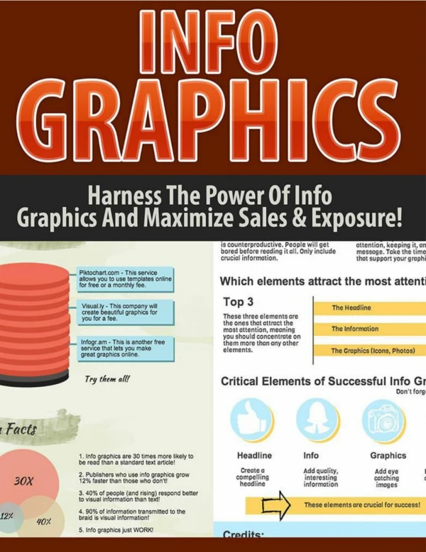
Why use them? • Provide visual information that creates a memorable learning experience • Translate a wall of text to images is more engaging1
Teaching • Choose/make an accurate graphic • Provide context • Have students interpret it themselves • Evaluate it together
Research • Create a unique poster • Visualize quantitative data • Summarize a complex project
Assessments • Hits multiple cognitive levels • Can show advanced understanding • Encourages data collection, synthesis, and organization
Tufte’s Principles of Data Visualization • Representation of numbers should be directly proportional to the numerical quantities represented. • Clear, detailed, and thorough labeling should be used to defeat graphical distortion and ambiguity.
Tufte’s Principles of Data Visualization (cont.) 3. Explanations of the data should be written on the graphic itself; label important events. 4. Show data variation, not design variation.
Tufte’s Principles of Data Visualization (cont.) 5. The number of information-carrying (variable) dimensions depicted should not exceed the number of dimensions in the data. 6. Graphics must not quote data out of context.
What do I need? • A topic • Interesting data • Images (or ideas for images) • Tools
Recommended Tools • Graphics Tools: Photoshop or Illustrator • Data Tools: Excel or Google Spreadsheet • Infographic Tools: • Piktochart • Infogr.am • Easel.ly • Mapbox (Interactive maps)
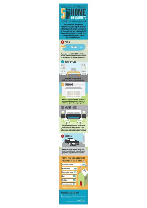
Piktochart • Free and premium themes • Simple tools • Fair publishing options • All data is public Example 1 Example 2
Resources http://www.good.is/infographics • http://selection.datavisualization.ch/ Teaching: http://blog.visual.ly/how-to-turn-infographics-into-effective-teaching-tools/ http://www.coetail.com/educationjourney/2013/04/19/using-infographics-in-class/ http://piktochart.com/infographics-in-education/ Assessment: http://www.schrockguide.net/infographics-as-an-assessment.html
References • Ebner, M. & Bruff, D. Visual Thinking. Retrieved from http://cft.vanderbilt.edu/guides-sub-pages/visual-thinking/ • Tufte, E. R., & Graves-Morris, P. R. (1983). The visual display of quantitative information (Vol. 2). Cheshire, CT: Graphics press.