Download
1 / 46
460 likes | 574 Views
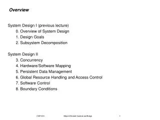
Overview. Major principles of designing digitally: consistency and hierarchy And their relationship to the design principles Layout Break Grids Expectations for next week’s assignment. Recall…. Consistency was a means to create unity Hierarchy is related to emphasis and focal point .

E N D
Overview • Major principles of designing digitally: consistency and hierarchy • And their relationship to the design principles • Layout • Break • Grids • Expectations for next week’s assignment
Recall…. • Consistency was a means to create unity • Hierarchy is related to emphasis and focal point
Consistency • …for “the mock user” • = rules for placement and treatment of interface elements • Setting and maintaining expectations • Visual language
Three types • Internal • Receives the most attention from designers • External: consistent with other similar products • Design patterns • External analogic “or metaphoric correspondence of a design to features in the world beyond the computer domain1” 1989: Grudin: “The Case Against Interface Consistency”
Internal • Type • Is the typographic alignment consistent? • Are the typeface choices consistent? • Is the typographic navigation predictable across pages? • Thesaurus • More on type next week • Graphic/imagery • Do the images convey a consistent mood? • Are the sizes of the images consistent with the overall structure and each other? • Are the website’s icons of the same family? • Color • Are colors used consistently across pages? • More about color in week four • Motion
External • Follow known conventions when possible • A design can be internally consistent, yet conflict with other similar interfaces • Other interface may itself be internally inconsistent • Other interface may be internally consistent but incorporate different choices (e.g., different names for objects) • Other interface may only cover some of the same functionality and thus differs in the distinctions that it needs to make
Caveat • You probably cannot make everything 100% the same everywhere • Be clear about what the user can do • Use the same tools the same way as much as possible • At what point do you move away from consistency? Microsoft Ribbon: • http://www.techsupportalert.com/content/dont-ms-office-ribbon-bring-back-proper-menus.htm
Consistency is about learning NOT necessarily the best user experience • Windows-8 • http://www.youtube.com/watch?v=Ohg_oBFKliI&src_vid=qIMuJTrxuhQ&feature=iv&annotation_id=annotation_40836 • http://mobileopportunity.blogspot.com/2012/05/fear-and-loathing-and-windows-8.html
Too far? http://www.youtube.com/watch?v=25DKXGKblOw&feature=player_embedded&noredirect=1
Documenting consistency • Style guides examples • http://design.canonical.com/brand/D.%20Ubuntu%20Web%20Guidelines.pdf • http://issuu.com/bondo/docs/netflix_style_guide • http://wiki.seeminglee.com/bank-of-america-ui-style-guide • For more: • http://www.creativebloq.com/branding/great-examples-design-style-guides-3132070
Visual Hierarchy • Perception/interpretation of the relative importance of objects • ==about communication
Tools • Position • How western readers approach pages • Alignment • Proximity • Repetition v. contrast • Size • Color • Density/whitespace • Style/Texture
Position • Gutenberg diagram
Hierarchy: Position: Alignment http://themeforest.net/item/stuff-template/full_screen_preview/127580?ref=WebPremium&ref=WebPremium&clickthrough_id=155808949&redirect_back=true
Hierarchy: Position: Proximity http://net.tutsplus.com/
Hierarchy: Size http://getactive.sj-stmk.org/
Hierarchy: Color (and value) • Much more in week four
Hierarchy: Density/whitespace http://www.pojeta.cz
Failed hierarchy • Hierarchy can be used for both good and evil • E.g. flashing web banners • “Good visual hierarchy isn’t about wild and crazy graphics or the newest photoshop filters, it’s about organizing information in a way that’s usable, accessible, and logical to the everyday site visitor.” Brandon Jones
To establish hierarchy • List the key information • Assign values (1-10) according to their importance to the average user • Now, look at the actual design again. • Assign values (1-10) according to the actual visual importance as you see it in the live design. • Consider: Does the expected importance match up with the actual designed importance? • From: http://webdesign.tutsplus.com/articles/design-theory/understanding-visual-hierarchy-in-web-design/
Personality • First impressions happen automatically, consciously and unconsciously • Don Norman = Emotional Design: Why we love (or hate) Everyday Things • (1) Visceral design – appearance • (2) Behavioral design – pleasure and effectiveness of use • (3) Reflective design – self image, personal satisfaction and memories
Involving users • You cannot really create personality – people interpret it through their own filters • Do the visual characteristics appeal to your audience? • Does the interface represent what is necessary for successful use? • Do the attributes that convey personality work across platforms and devices?
Overview • Major principles of designing digitally: consistency and hierarchy • And their relationship to the design principles • Steal like an artist • Layout • Break • Grids • Expectations for next week’s assignment
Where do we get ideas? • Learn how to steal like and artist
Nothing is original • Most the time…people just do not know the source • Good artists know that creative work builds on what came before • Andre Gide (French writer): “Everything that needs to be said has already been sad. But, since no one was listening, everything must be said again.”
It is about the remix through you • Become a hoarder of good ideas • Collect good ideas – keep them in some sort of organization “Steal from anywhere that resonates with inspiration or fuels your imagination. Devour old films, new films, music, books, paintings, photographs, poems, dreams, random conversations, architecture, bridges, street signs, trees, clouds, bodies of water, light and shadows. Select only things to steal from that speak directly to your sol. If you do this, your work (and theft) will be authentic.” ---Jim Jarmusch
Family trees • Chew on one inspirational sources – artist, designer, writer, thinker - that you love • Study everything you know • Find three people that the source loved • Rinse and repeat • “See yourself as part of a creative linage”
You have to start somewhere • Jump in and start making things • Imposter syndrome is expected • “You start out as a phony and become real” – Glenn O’Brien (American writer) • Sometimes you need to start by copying • The Beatles were once a cover band • …..but it is about the remix THROUGH YOU
….for more…get the book • For now – start your inspiration files for portfolios • Post them on the Wiki = your name + screenshot + link
Overview • Major principles of designing digitally: consistency and hierarchy • And their relationship to the design principles • Steal like an artist • Layout • Break • Grids • Expectations for next week’s assignment
Layout • Sets stage for screens to communicate: helpful, appealing • Application interface design almost always involves modules (not discrete pages) • Core principles apply regardless • Basic terminology • Alignment • Proximity • Scale • Whitespace • Grid
Space between graphics, columns, images, text, margins and other elements • Not always white • Associated with elegance/sophistication – means to control emphasis and organization
Horror Vacui • A tendency to favor filling blank spaces with objects and elements over leaving spaces blank or empty
It can be beautiful http://www.greenteadesign.com/thedesigntree/culture/whos-afraid-of-horror-vacui/