Download
1 / 8
80 likes | 86 Views
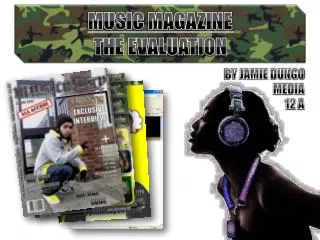
Music Magazine Evaluation. By Lewis Berrett. Forms and Conventions.

E N D
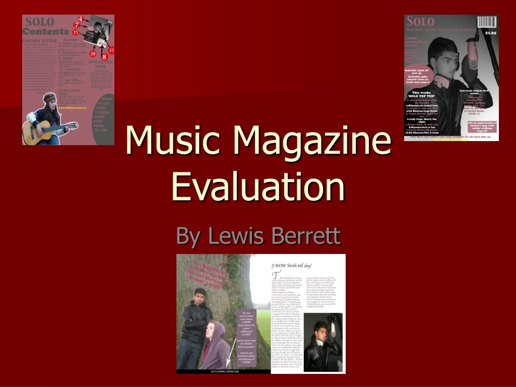
Music Magazine Evaluation By Lewis Berrett
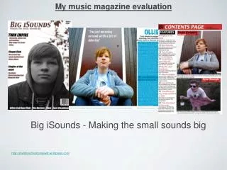
Forms and Conventions I used a musty pink colour for the title of my music magazine, I then use this same colour on other aspects of my cover, as well as my contents page and my article, to give my piece brand identification. This sort of branding is synonymous to all magazines as having something that makes a magazine easily identifiable helps to create repeat purchase on the magazine. I also used the same font for the title of my front cover, and contents page, which would be kept the same on each issue, again creating a brand image. The simple but catchy callout that I decided on for my music magazine was ‘individual sounds from individual artists, I used this because its something that sticks in your head and also to differentiate my magazine from other music magazines, as my magazine focuses souly on ‘individual’ artists. I think this would give it a competitive edge over other magazines and set it apart! On my front cover I used a caption to the left of my cover photograph, showing who the person in my picture is and why they are on my front cover, this is a convention often used in published magazines, making my magazine look more professional. I use a scroll on my front cover and my article, which is a convention often used in magazines, to give extra information, and to make the page look fuller. On my article I bleed an image on the left hand side of the page, and then put other things over the top of it, this leaves the page looking full, professional and enticing.
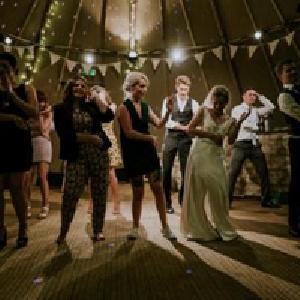
representation Jamie or ‘J-WOW’ is the central image on my front cover, and made out to be a ‘big thing’ and a musical icon. This is shown by his placing, with his head being ‘above the fold’, his importance is also shown by how much of the page he takes up, spread over most of the cover.
Distribution of my magazine I think that the most likely media institution to distribute my magazine would be something like IPC media, my reason for this is that some of their other magazines are of a similar genre and style and have a very similar target audience. For instance, NME is a magazine distributed by IPC, and although the genre of music included in my magazine is different to that of NME, the layout of the magazine would be similar, and the target audience would also be partially similar.
Audience The main audience that I feel my magazine would appeal to is both males and females aged 13 to 20, I think that the nature of the music represented in my magazine is most definitely of a multi gender focus, being primarily pop music. The artists in my magazine are all quite young and tend to be enjoyed by a young audience. I chose to focus my magazine on this audience because, this is the audience that I am a part of, and this is music that I myself enjoy, making it easier to relate to what the reader of my magazine will want. My magazine would also appeal to a slightly older audience of about 20 to 30, again multi gender, this audience is focused on again by the choice of music, but may also be enticed by things like the competitions in the magazine as this would be a wealthier audience with more expendable income.
Attract and address my audience I focused my magazine at the selected audience using many different factors. The way in which I wrote was key, I didn’t make it overly formal, to keep it lively and entertaining, but still being careful not to seem unprofessional or patronising. I believe that by doing….. My magazine would be seen as appealing to this particular audience i addressed my audience in my editors letter, telling the readers about the competitions that I have inside. I appealed to the type of person that I knew would be likely to read my magazine
Technologies Throughout this project I have used a few different programs, most frequently used was Photoshop, this is a program that I was in no way familiar with at the beginning of the project, having never used it before, but slowly and steadily I picked up different skills on Photoshop and became more adventurous. I used such things as the lasoo tool to my advantage, cutting out pictures, and using the ‘transform’ option to change the scale, colours, effects, outlines and to rotate my images when I saw fit. I used the skills that I learnt to make my pictures look more interesting, giving some of them a white outline to make them stand out against their darker back grounds. At first I found in particular the lasoo tool very difficult to use, but after trying a number of times, it became far simpler, and I consider myself to now be quite good at it. ‘In design’ was another program that I used, I started off using this for my double page spread. I did about half of the piece using this program, but found it harder to work with and therefore saved my work as a jpeg (another skill that I learnt during this process) and finished it off on Photoshop. I don’t think that my photography skills where particularly good, I had the ideas of what I wanted my photos to be like, but wasn’t actually able to take very good pictures, , I therefore had to use aspects of Photoshop to enhance my pictures. I do however think that my photography improved from my first set of photographs to my latest, as I started to focus not only upon the focal point of my picture but on the entire mise-en-scene It was also the first time for me opening a blog online, and I have learnt how to do different things on the blog, which I have quite enjoyed
Progression • In the progression of my student magazine, I learnt many different photoshopping skills that enabled me to enhance my work, this skills improved through out the course of my work. And were greatly improved upon my music magazine piece. • My photography skills in a way improved from my student magazine to my music magazine, as I realised the importance of making sure everything in the photo is appropriate, and making the photographs look more professional. • I learnt more about the forms and conventions that should be shown in a magazine, and as such improved upon things I had left out in my student magazine. For example my use of scrolls