Download
1 / 3
30 likes | 32 Views
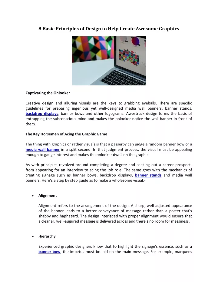
Creative design and alluring visuals are the keys to grabbing eyeballs. There are specific<br>guidelines for preparing ingenious yet well-designed media wall banners, banner stands,<br>backdrop displays, banner bows and other logograms. Awestruck design forms the basis of<br>entrapping the subconscious mind and makes the onlooker notice the wall banner in front of<br>them.

E N D
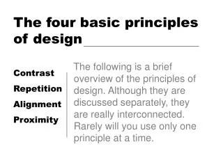
8 Basic Principles of Design to Help Create Awesome Graphics Captivating the Onlooker Creative design and alluring visuals are the keys to grabbing eyeballs. There are specific guidelines for preparing ingenious yet well-designedmedia wall banners,banner stands, backdrop displays, banner bows and other logograms. Awestruck design forms the basis of entrapping the subconscious mind and makes the onlooker notice the wall banner in front of them. The Key Horsemen of Acing the Graphic Game The thing with graphics or rather visuals is that a passerby can judge a randombanner bowor a media wall banner in a split second. In that judgment process, the visual must be appealing enough to gauge interest and makes the onlooker dwell on the graphic. As with principles revolved around completing a degree and seeking out a career prospect- from appearing for an interview to acing the job role. The same goes with the mechanics of creating signage such as banner bows, backdrop displays, banner stands and media wall banners.Here's a step by step guide as to make a wholesome visual:- Alignment Alignment refers to the arrangement of the design. A sharp, well-adjusted appearance of the banner leads to a better conveyance of message rather than a poster that's shabby and haphazard. The design interlaced with proper alignment would ensure that a cleaner, well-augured message is delivered across and there's no room for messiness. Hierarchy Experienced graphic designers know that to highlight the signage's essence, such as a banner bow, the impetus must be laid on the main message. For example, marquees
must be designed with an approach to keep the event it's being used for in mind and write something similar- concordant with both the company's vision and event's highlight/s. Contrast Perhaps the most familiar aspect of marketing design is the correct use of contrast. Highlighting the visual areas that need attention and adding some weight to a graphic is done by adding a hint of contrast to the signage. The contrast works well for abanner stand,wherein the light colours are utilised with a contrasting background to increase the readability of the signage. Repetition "Wherever I go, I see that Spotify logo" The green background and three black lines image comes to mind when one hears "Spotify". It's no rocket science that in order to make a visual trapped in the onlooker's subconscious, there is much repetition of that brand/signage. That's the reason when one hears Netflix (the theme plays in the background, and red color comes striking to the eyes!) Proximity Proximity is the designing methodology that utilises colour coding and connects with the onlooker in similar visual house patterns. Proximity is used in game design, with the logos and colours matching the game's concordance. For example, with the FIFA games, the EA sports logo's colour is white and has a soccer ball in the design somewhere, making it stand out with other gaming companies. Balance The balance is a crucial ingredient for providing the stability and even distribution of above elements. Balance is provided through two techniques- symmetrical and asymmetrical. Symmetrical relates to the even distribution of weight on the design layout, whereas asymmetrical uses contrast to spread the design evenly. Colour Colour is the contour to the makeup, without the use of colour; there's no attraction to the visual. Green symbolises nature, yellow for happiness and white for peace. Having a bit of knowledge about colour combinations allows for the banners to be used nicely.
Space Space is the boss of all the elements. Spacing ensures that each element has room for customer entrapment. Negative spacing highlights the essential piece/es of information that need attention for a visual. Summing it Up! A beautiful yet enigmatic design is canvassed around the critically placed design elements that highlight the message that a particular bannerstand gives across. A business hoarding's backdrop displaycan make or break the deal for roping in a potential client. A meticulous visual is more than just colours, design and lighting. It has more to do with targeting the right audience, delivering a short but crisp message and other subtleties to make specific signage stand out from others.