Download
1 / 60
600 likes | 605 Views
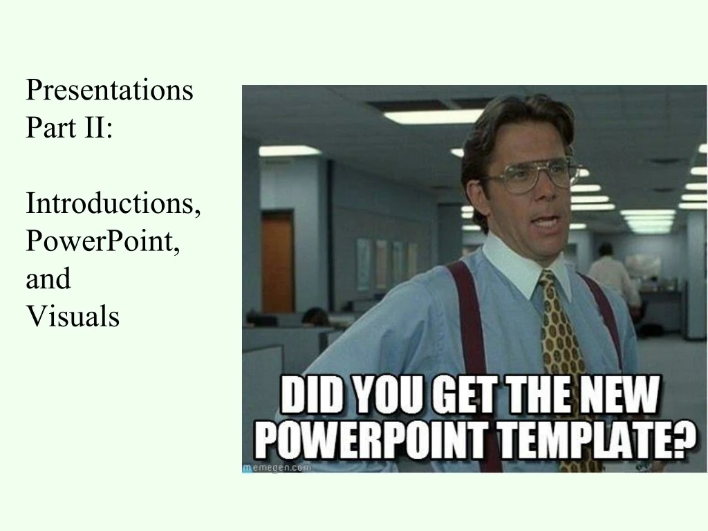
Presentations Part II: Introductions, PowerPoint, and Visuals. Office Hours: 2:30-3:30 Wednesday (new time) For Thursday: bring in draft of introduction; work on scope statement. How to Respect Your Audience. Today. Sandwich Introductions. Plan Materials as Complement.

E N D
Office Hours: 2:30-3:30 Wednesday (new time) • For Thursday: bring in draft of introduction; work on scope statement
How to Respect Your Audience Today Sandwich Introductions Plan Materials as Complement Create Strong Visuals Plan Good Content as a Team Practice and Perfect as a Team Presentations Improve Presentation Skills
Reflections on Expertise/Spice Design T is for Timing and Transitions E is for Energy and Engagement A is for Appearance M is for Materials Q is for Questions
Use your introduction slide and overview slide to your audience’s advantage [Alley, 2013]
Really Important Event Your title slide is your chance to engage with what your topic is and why your audience should care Ny-Ålesund Katrine Aspmo Torunn Berg Norwegian Institute for Air Research Grethe Wibetoe University of Oslo, Dept. of Chemistry June 16, 2004 [Alley, 2013]
Create a detailed scope slide that provides a detailed overview [Alley, 2013]
Engineering Communication Design Review • Tracy Wuster • Miranda Nadeau • Dr. Bob Jekyll • Robert Hyde • Karina Rabinowitz
Presentation outline • Introduction • Objectives • Design Concept • Conclusion
Design to Improve Engineering Communication Course 333t—Engineering Communications Team Monster Robert Hyde Dr. Bob Jekyll Miranda Nadeau Karina Rabinowitz Tracy Wuster Month ##, Year 2nd Year 133t—Advanced Technical Communication 3rd Year 4th Year 364/464—Senior Design
Our Design Process Users (Miranda) Stakeholders (Karina) Educational Design Unit Career Development Unit Spice Design Unit Robert Dr. Hyde
Do not waste the last slide [Alley, 2013]
Questions? Users (Miranda) Stakeholders (Karina) Educational Design Unit Career Development Unit Spice Design Unit Robert Dr. Hyde
REFERENCES • [1] S. Martin. Cruel Shoes. Cat Juggler Press, etc. • [2] T. Wuster. Mark Twain, American Humorist. University of Missouri Press, 2016.
2. Planning Materials • “Presentations largely stand or fall on the quality, relevance, and integrity of the content. …Audience boredom is usually a content failure, not a decoration failure.” • --“Powerpoint is Evil,” Edward Tufte. Wired Magazine (September 2003)
How to PowerPoint!: A Guide *Amaze your friends *Confuse your boss! *Annoy your co-workers!
“It continues to amaze me how many presenters read their slides to the audience. In every one of the seven surveys I have conducted this is clearly the single most annoying thing a presenter can do. Why does this happen so often? The overload of text on slides is the primary culprit. That is why the second and third most common answers in the survey on what annoys audience about bad PowerPoint presentations are related to filling the slides with text.” • -“Results of the 2015 Annoying PowerPoint survey”
Background • Consider background carefully • Minimize distractions and “cute-sy” imagery • Simple is fine
See what your audience sees • Simple is fine • Choose minimal designs • Do not distract from content
Animation is cool! • *No it is not • *It is unprofessional • *Adds unnecessary complexity • *Smart animation can be fine
Leads to too many words PowerPoint’s defaults run counter to how people learn Consumes valuable space Formats material poorly [Garner et al., 2009]
What should you start with? CONTENT Adapted from the Assertion-Evidence Method from Michael Alley at Penn State
Do you need visuals? What kind? CONTENT What is the requirement or norm? Will your audience benefit from visuals?
Avoid PowerPoint defaults Use consistent format Avoid auto formatting Use a blank slide Modify Slide Master
The heading is a form of sandwiching Avoid defaults Write a topic heading
Visual evidence is always better than bullets Avoid defaults Write a topic heading Create good visual evidence
But what if you do not have a visual? Avoid Defaults Write a topic heading Create good visual evidence Use bullets sparingly or use a blank screen
Presentation of Materials: Slides • --Consider from audience’s point of view • --Simplify message to essential information • --Be consistent with the amount of material • --Plan and revise as a team • --Reduce bullet points as much as possible
Slides are for your audience • --Simplify bullets • --Be consistent • --Reduce text
Ask if the audience needs visuals to understand your content. Plan and practice good content. Write a topic heading Create good visual evidence Use bullets sparingly or use a blank screen
Good graphics are good ethics IEEE Code of Ethics: 3. to be honest and realistic in stating claims or estimates based on available data NSPE Code of Ethics III. 1. A. Engineers shall acknowledge their errors and shall not distort or alter the facts.
chartjunk: graphical decoration or complexity that does not tell the viewer anything new Dollars (thousands) Months Figure 1. Graph of East and West Coast office sales.
Good graphics should be useful for your audience. Dollars (thousands) Months Figure 1. Graph of monthly sales totals for East and West Coast offices.
Provide Context Work on Clarity Monthly Sales Continue as Expected, Except for Months 8-10 Dollars (thousands) Months
Why use bar charts? Dollars (thousands) Months Figure 1. Bar chart of East and West Coast office sales.
Time for Pie? Figure 1. Pie chart showing breakdown of college costs.
Consider context for viewing Figure 1. Pie chart showing breakdown of college costs.