Download
1 / 27
270 likes | 274 Views
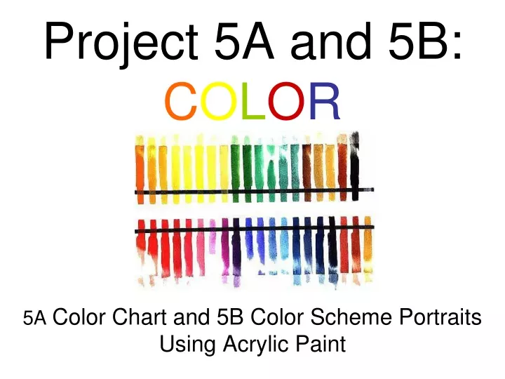
Learn about the color wheel and color schemes while creating vibrant portraits using acrylic paint. Explore primary, secondary, and tertiary colors, as well as monochromatic, analogous, complimentary, and natural color schemes.

E N D
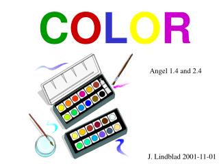
Project 5A and 5B:COLOR5A Color Chart and 5B Color Scheme PortraitsUsing Acrylic Paint
The color wheel is divided into three categories: primary, secondary, and tertiary. The three primary colors are red, yellow and blue. These colors are considered to be foundation colors because they are used to create all other colors. By combining two of the primary colors, three secondary colors are formed. They are orange, green and violet.
If two hues are opposite each other on the color wheel they are considered to be complementary colors. When used together in a design they make each other seem brighter and more intense. (example: red and green)
Color Schemes Related Schemes Monochromatic - This color scheme uses a single hue. (example: red and its varying tints and shades) Analogous - This scheme uses adjacent hues.(example: red, red-orange, and red-violet)
Colors are also divided into cool and warm categories. The cool colors are green, blue and violet. Warm colors are red, orange and yellow.
A tint of a color is made by adding white.A shade is made by adding black. Value involves the lightness and darkness of a color. A color is made lighter by adding white and darker by adding black. Each color also has natural value. From lightest to darkest are: Yellow, Orange, Red and Green, Blue and Violet.
Intensity is the brightness or dullness of a color. A color can't be made brighter than the way the pigment comes to you in the paint tube. In this example, full strength orange on the left slowly has a little bit of blue (it's compliment added to it). This creates tones of orange. As you progress across the scale you reach neutral in the center because there is too much blue mixed with the orange and it has become a neutral. If you start on the right with the blue and slowly add a little orange you can see tones of blue until you reach the neutral in the center.
Project 5A: Using Acrylic Paint- Create a color wheel with Primary and Secondary Colors Create 9 steps of Tints and Shades for the Primary colors Create 9 steps of two complimentary colors mixing.
Project 5A: Using Acrylic Paint- Create a color wheel with Primary and Secondary Colors Create 9 steps of Tints and Shades for the Primary colors Create 9 steps of two complimentary colors mixing.
Project 5A: Using Acrylic Paint- Create a color wheel with Primary and Secondary Colors Create 9 steps of Tints and Shades for the Primary colors Create 9 steps of two complimentary colors mixing.
posterized original Project 5B: Using Acrylic Paint and a Picture of yourself- Paint four different self-portraits using different color schemes: Monochromatic, Analagous, Complimentary, and Natural
Monochromatic Color Project 5B: Using acrylic paint- Paint four self-portraits using different color schemes: Monochromatic, Analagous, Complimentary, and Natural
Analogous Color Project 5B: Using acrylic paint - Paint four self-portraits using different color schemes: Monochromatic, Analagous, Complimentary, and Natural
Complimentary Color Project 5B: Using acrylic paint - Paint four self-portraits using different color schemes: Monochromatic, Analagous, Complimentary, and Natural
Natural Color Project 5B: Using oil paint and liquin- Paint four self-portraits using different color schemes: Monochromatic, Analagous, Complimentary, and Natural