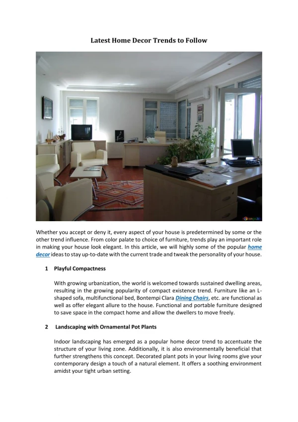
Download
1 / 2
20 likes | 54 Views
While refreshing website designing in tune with the latest web practices, designers and UX experts often pay least attention to the significance of a user friendly and a hassle free navigation.

E N D
Latest Website Navigation Trends To Follow In 2017 While refreshing website designing in tune with the latest web practices, designers and UX experts often pay least attention to the significance of a user friendly and a hassle free navigation. Designing websites merely keeping in mind the upcoming web practices is not enough as it does not promise, the concerned website's attaining the desired objectives. A website, in order to carve a special niche in the heart of the viewers and for keeping the viewers engaged and occupied living up to their interests, must refresh its navigation structure in tune with the latest navigation trends. After a thorough study, some fresh web navigation trends have been noted that promise to sustain in the year 2017. These trends can be jotted down as follows: • Keeping the navigation scrolling bars fixed: This was once a prevalent trend soon to fade into oblivion to make a way for the new ideas. However, 2017 has brought this particular trend back and the infinite merits of fixed scrolling navigation bars have not missed the mark. These fixed bars not only make navigational experience user friendly, but it also ensure greatest user support as people accessing websites from the mobile devices find these bars to be extremely convenient for they help them to navigate through the different pages of a website without compelling them to scroll back to the header. Some of the greatest websites in the World Wide Web has featured these fixed scrolling navigation bars. Fixed scrolling navigation bars get the highest support because websites having limited navigation aspects find these fixed bars to be extremely beneficial for assuring highest number of page views and for keeping the viewers glued to the concerned websites. • Use of Mega Menus: It is interesting if the concern is large or magazine size websites. The navigation of large websites can quite easily be simplified through the use of Mega Menus as compared to an ordinary drop down menu, Mega menus helps accommodating a larger number of aspects that can be accessed via a very limited number of links. However, the web designers and architects need to judge with prudence the pros and cons of using Mega menus, as it is not effective in every possible context. Mega Menus can be of no help for the mobile device users as the small screen of a mobile device cannot incorporate within its limited space so many aspects and links. Moreover, designers should very consciously use the Mega Menus as the viewers can gain a deeper insight into the website by accessing only a few links. However, once the user is competent enough to use Mega Menu, he can gain an easy access to a large body of contents to skim the desired part from the lot. • Using Vertical Stacks or Slides: To give a website a bit of an unusual look, way different from that of the traditional features, use of vertical stacks can be a great idea. Moreover these vertical slides help in developing full screen designs to give the website
an extra edge by refreshing its looks. However, before it is applied, its merits and demerits are to be justified thoroughly. Building these vertical stacks from the very scratch is not that easy and its use, if not properly known to a user, would be a tough nut to crack. • Button free navigation can make a difference: Instead of framed buttons, neatly aligned, properly spaced texts that give clear instructions to the users, and stacked in a series can be extremely aesthetic to give different looks to a website. Button free navigation can really work well in case of websites having minimal design aspects. However, for effectively using button free navigation, certain things are to be remembered. The font should be legible, having proper spacing and color variations, preferably light and dark combo. It must be assured that the fonts are visible. • Using news carousels: Websites having a large body of contents, for instance, blog or a news site, can find the use of news carousel navigation to be fascinating as it assures user friendliness and also the viewing of multiple pages at a time. Just through the use of news carousel navigation at the header the viewer can gain access to the big list of contents and articles featured in a website. The use of this navigation ensures a hike in the traffic rate. In the field of web developing and designing, Wheelistic Web Designing Company has secured a special place. The company is situated at Florida and has clients all across the globe. To know about its services click on https://www.wheelisticwebdesign.com/services/. Author Bio: The writer of this article regularly writes for the SEO and the blog posts of Wheelistic Web Designing Company and deals particularly with designing related contents.


