1 / 8
80 likes | 85 Views
In the recent past, mobile phones have grabbed the attention of the majority of people around the world. The reason? Easy to carry, easy to use and still you have the world in your palms. Approximately, 49% of all the web traffic in the world originates from mobile devices alone, meaning people rely on it to do most of their tasks. Considering its significance in the current digital generation, search engines like Google have factored in mobile friendliness. Read more on https://bit.ly/2KSYr4W

E N D
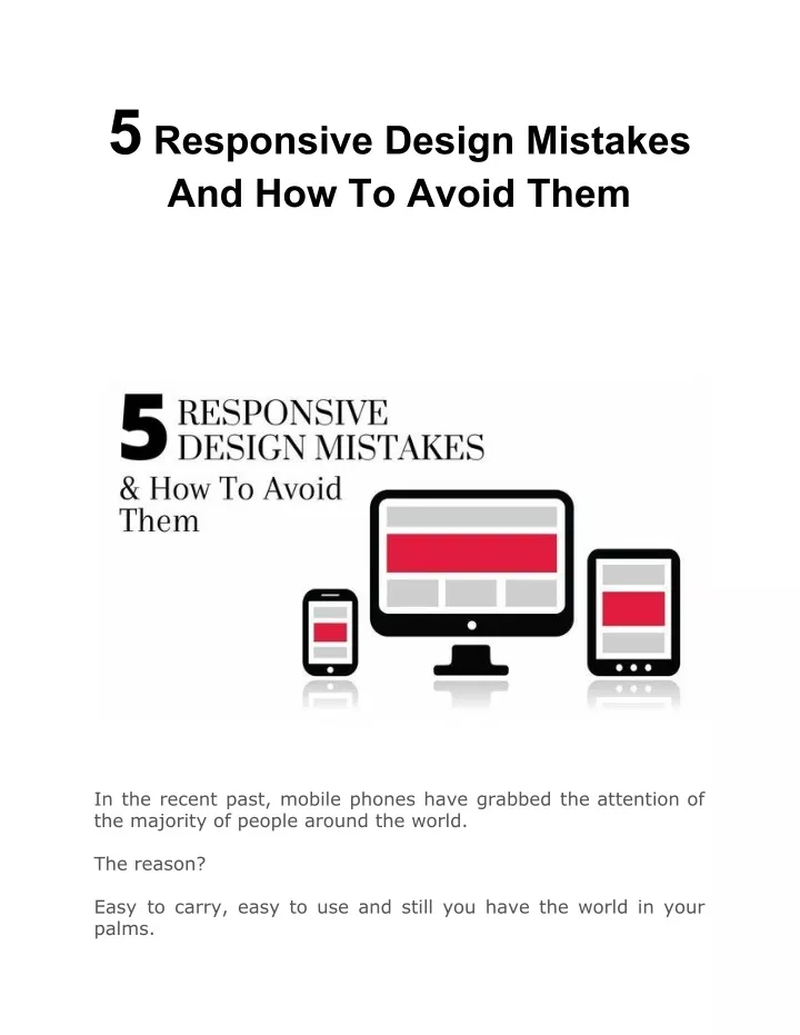
5 Responsive Design Mistakes And How To Avoid Them In the recent past, mobile phones have grabbed the attention of the majority of people around the world. The reason? Easy to carry, easy to use and still you have the world in your palms.
Approximately, 49% of all the web traffic in the world originates from mobile devices alone, meaning people rely on it to do most of their tasks. Considering its significance in the current digital generation, search engines like Google have factored in mobile friendliness of websites to rank at top of the search results. If you don’t have a mobile-friendly design for your website, you are likely to miss out on a massive chunk of target audience. Additionally, having a mobile-friendly website for your business is equally important for SEO. All of this calls for responsive web design through which your website can adjust to different screen sizes of different devices. While designing a responsive website, you might make some common mistakes that could affect the health of your website. To help you avoid them, we have listed out most common responsive design mistakes and their solutions underneath. But before you go through it, I would like to let you know something important about the customer-oriented web design Los Angeles company - SFWPExperts. Well-known for offering quality services on time you can approach them for responsive web design and development, development, plugin development, SEO, PPC and many more. If a trusted professional partner is what you are after, SFWPExperts is the undeniable answer. Changing the track from that, let’s come to - top responsive design mistakes and how to avoid them. 5 Responsive Design Solutions landing page design and Blunders And Its
1. Using Device Sizes As Reference Unit According to a mobile network operator company, there were 24,000 different android devices back in 2015. This number has jumped to a greater mark in the past five years. As there are so many varieties of devices available today, their screen sizes vary too. To make sure that your website offers a seamless experience on all devices, you need to have the right reference unit. If you just focus on the device size reference unit when creating a responsive design, your website might not open properly on newly launched devices. Don’t restrict yourself to the screen sizes of current devices only as far as the reference unit go. Instead, get yourself truly responsive designs that can fit properly to any screen size. A great idea to have a fully responsive web design is to lead with a mobile-first approach where you design your website for the smallest screens and then gradually scale it to large screen sizes. To achieve full responsiveness of your site, you can use a few tools more so, Lambda Test or BrowserStack. It lets you check if your website opens properly on new devices. Alternatively, you can keep in touch with us to get a fully responsive website for your developers at our Los Angeles web design company have lots of experience designing mobile-friendly things further I must let you know that this company offers a slew of services in different parts of the world - mobile-friendly web design and development, website redesign and hosting, website maintenance and support, search engine optimization, pay per click advertising and online marketing. 2. Not Compressing Image Files business. The designers To and websites. elaborate
Beautiful visuals on your site can make it look really attractive. However, you must think twice before adding them to your website. Usually they are larger than text files and can make your site load slower. What’s bad about having a slow-loading website is that as your page loading time increases, so do your bounce rates. In fact, an American content delivery network service provider reported that the bounce rates increased by 6% when pages took 1.5 seconds more while loading. This is why it is necessary to compress the media content on your site like images and videos. There are a few tools you can use to achieve this such as < a href="https://tinypng.com/">TinyPNG or Compress JPEG. If you have a WordPress website, you can install a Smush plugin to optimize your images and videos. Just in case, you want to have a professional website for your next project we highly recommend to have a WordPress website. With WordPress, you can be assured of reliability and flexibility. Moreover, it can also be used as a proper content management system. Just connect with the representative of our Los Angeles web design company and tell them your website requirements. We offer WordPress web design and development, WordPress customization, conversion rate optimization, and email marketing. 3. Not Using Adaptive Image Management As file size of an image is important to consider while responsive website development, so are its dimensions. You may not bother about using images of different dimensions on conventional websites while responsive websites are a whole different thing. Missing out on the right image management can spoil the user experience of your visitors. One thing you definitely don’t want your visitors to see is huge images on a small screen. There are certain measures you can take to avoid this pitfall like implementing adaptive image optimization, search engine
management techniques. You could do the following to achieve this: ● Resolution-based selection: different resolutions. ● Device-pixel-ratio-based selection: Make the images look sharp and clear and reduce the artifacts based on different screen sizes. ● Viewport-based selection: Vary images based on the devices it will be viewed on. ● Art direction: Crop the image based on the screen sizes to improve its viewing experience on different devices. If you want to have a well-organized and well-structured website for your business that is compatible with all devices, get in touch with us. Apart from designing a responsive website for you we will also make sure the visual elements on your website adjust nicely to different screen sizes and deliver a great viewing experience. Just so you know, our Los Angeles web design company offers a wide range ecommerce web design, web development, UI design, UX design, social media management, copywriting, content marketing, SEO, PPC and a lot more. 4. Hiding Content One of the most common mistakes you can commit when creating a responsive design of your site is hiding content. You might implement this trick to fit your website on smaller screens or to speed up your website but that’s not the right approach. You must avoid it at all costs since none of the visitors are coming to your site just to find an incomplete piece of content. They want to have the same visiting experience on all devices just like desktops. Your main aim should be to offer them with an excellent user experience. This is necessary from a visitor’s point of view as they might be accessing your website through multiple devices. Render the same image in of professional services -
This is why you must make sure to maintain consistency in content. 5. Maintaining Consistency In Navigation Have one thing crystal clear in mind that your website navigation plays a key role in improving the user experience. That’s why offering a consistent browsing experience to them across all devices is going to attract them to your business. However, you must know that maintaining a complete consistency isn’t a good idea either. One of the terrible mistakes people often make while designing responsive websites is that they keep consistent navigation across all screen sizes. Now think when your screen size will reduce, a consistent navigation bar might not contract and end up occupying half the space of the screen. And it could translate into a ruined browsing experience. That’s why you should consider reducing the size of the navigation bar with the screen size or you could replace it with a hamburger menu. Along with your website navigation you should also make sure that visual layouts and button sizes are flexible to render well on all devices. However typefaces, links, and color treatments should be consistent so it doesn’t interfere with your brand identity. Final Thoughts If your main goal is to reach your target audience around the world, you can’t underestimate the importance of having a responsive web design. It is rather essential but make sure you don’t make possible mistakes mentioned in this blog. Deliver your visitors a consistent browsing experience across multiple devices and don’t hide anything that can be important for them to know. Focus on improving your page loading speed and reducing your bounce rate as that will help you to easily draw target audience to your site.
Throughout the process of designing a responsive website if you need help at any point, make contact with us and we will definitely resolve your problem. SFWPExperts is the top-rated Wordpress website design company that offers business development services focused on bringing great results like custom web design and development, website analysis and redesign, search engine optimization, social media marketing and pay per click advertising. Contact Details: 213-277-9177 la@sfwpexperts.com Wordpress Developer Visit Reference Profile Websites ambush Marketing https://bit.ly/2Sp1c20 https://bit.ly/35lSKWt https://bit.ly/3aXpqGR https://bit.ly/3fbztvk https://bit.ly/3bW6zxf https://bit.ly/2YrY9Km https://bit.ly/2zJkuZk https://bit.ly/35qxbnW https://bit.ly/2KTHaII
https://bit.ly/2y8Vqe5 https://bit.ly/2zIvuWT https://bit.ly/2YsjX8K https://bit.ly/3aPUeJO https://bit.ly/3bYguT0 https://bit.ly/2VTrg7v https://bit.ly/2YoLkQU https://bit.ly/3d7F3gt https://bit.ly/2zQXbNq https://bit.ly/2KUH3wu https://bit.ly/2YqnxzT https://bit.ly/2StHKRB