Download
1 / 22
220 likes | 303 Views
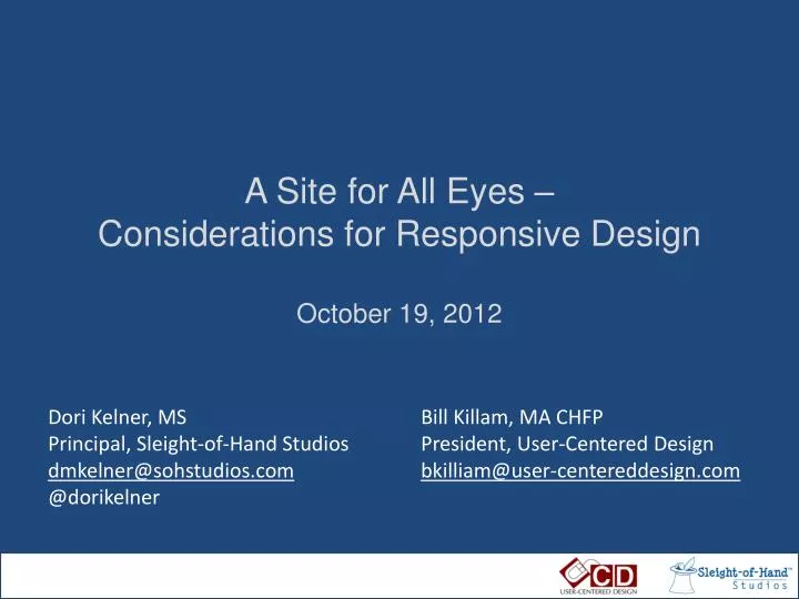
A Site for All Eyes – Considerations for Responsive Design October 19, 2012. Dori Kelner, MS Principal, Sleight-of-Hand Studios dmkelner@sohstudios.com @dorikelner. Bill Killam, MA CHFP President, User-Centered Design bkilliam@user-centereddesign.com. August, 1981. Removable storage

E N D
A Site for All Eyes –Considerations for Responsive DesignOctober 19, 2012 Dori Kelner, MS Principal, Sleight-of-Hand Studios dmkelner@sohstudios.com @dorikelner Bill Killam, MA CHFP President, User-Centered Design bkilliam@user-centereddesign.com
Removable storage The first local network Bit mapped displays Mouse • Windows • Icons • Menus • Desktop Metaphor • WYSIWYG • Direct Manipulation Hardware/IDx from the Xerox 8010
Windows Mac Web-based Application Client-servers and the Web
Tablet B&W iOS Touch Color Smartphone Keyboard WebOS Pixel density TV Android Inflight Orientation Blackberry Gaming Appliances Other “Responsive design is the real deal. It is not a fad. It’s a legitimate attempt to address the massive challenge of delivering great experiences to this explosion of devices and browsers. But don’t feel like it’s the end-all be-all of website construction. This ain’t religion. This is web design.” Brad Frost
Framework: fluid grid, media queries, flexible images Behavioral issues: design for the user Typography: size matters Process: rethinking how we work Performance: you need to hear this Overview
960px .col-a .col-b 634px 306px • .col-a {width: 66.0416666%} /* 634 / 960 */ • .col-b {width: 31.875%} /* 306 / 960 */
1050px 810px 620px 480px
first draft of official specification from W3C for RESPONSIVE IMAGES • Respond to different screen pixel width/height in HTML • Respond to different screen pixel densities • Respond to users zooming in on images • Provide user agents with the information they need to select the most appropriate image source in low-bandwidth situations, via media queries (not yet available) • Preserve separation of content markup and styling • Provide a purely client-side solution that can include JavaScript, but doesn't require it • Provide different crops of an image according to the viewport or device through which it is viewed August 29, 2012 Courtesy: Anselm Hannemann, .net Magazine
Forms Buttons Gestures Behavioral Issues
Flyout or Toggle Select List Dropdown Menus
Responsive Typography image courtesy: Oliver Reichenstein, iA
Responsive layouts, responsively wireframed courtesy: James Mellers, Adobe
Users will only wait 2-3 seconds to load your page display: none; only hides content (bad) but doesn’t lighten the page Images account for a large proportion of the page load Designers must know performance implications Performance
Our goal is a device agnostic web Design for user experience Start with content strategy Mobile first progressive enhancement Iterative design/development in the browser Baked in performance Wrap it Up
http://responsive.is http://www.responsinator.com/ http://bradfrost.github.com/this-is-responsive/resources.html http://www.alistapart.com/articles/responsive-web-design http://www.netmagazine.com/features/top-responsive-web-design-problems-and-how-avoid-them http://bradfrostweb.com/blog/web/responsive-nav-patterns/ http://www.netmagazine.com/features/road-responsive-images http://www.protytype.com/ http://informationarchitects.net/blog/responsive-typography-the-basics/ http://blog.typekit.com/2011/11/09/type-study-sizing-the-legible-letter/ http://www.guypo.com/mobile/performance-implications-of-responsive-design-book-contribution/ Resources Dori Kelner, MS Principal, Sleight-of-Hand Studios dmkelner@sohstudios.com @dorikelner Bill Killam, MA CHFP President, User-Centered Design bkilliam@user-centereddesign.com