Download
1 / 41
420 likes | 431 Views
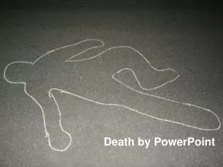
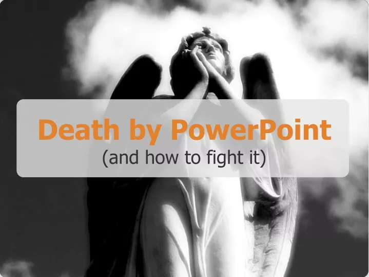
Death by PowerPoint (and how to fight it). There are 300 million PowerPoint users in the world*. * estimate. They do 30 million presentations each day *. * estimate. About a million presentations are going on right now*. * estimate. 50% of them are unbearable *.

E N D
There are 300 million PowerPoint users in the world* * estimate
They do 30 million presentations each day* * estimate
About a million presentations are going on right now* * estimate
50% of them are unbearable* * conservative estimate
LOTS of people are killing each otherwith bad presentations. NOW.
Significance
Why do you present? • To “pass the information”? • Your boss told you to? • Or to make meaning?
How presentations work Significance creates passion Passion attracts attention Attention leads to action
Structure
Structure is how you place the building blocksof your story.
Give 3-4 reasons supporting your point. They will not remember more anyway.
} Memorable opening 1 More details... 1 argument 2 More details... 3 More details... 45 minutes 1 More details... 2 argument 2 More details... 3 More details... 1 More details... 3 argument 2 More details... 3 More details... Memorable closing
You can tell this in... • 5 minutes • 15 minutes • 45 minutes It is scalable.
Simplicity
“ ” Everything should be made as simple as possible, but not simpler.
Apparently, being simple is not that simple. Will give you some examples.
PowerPoint helps to: Visualize ideas Create key points Impress
They use it as: Prompter Handouts Data dumps
Too much text Can it be said instead of written? Is there a visual that can convey the same information? Use no more than six lines, with each line containing no more than six words. Too much information per slide Each slide should convey one main idea. The audience should be able to take in the visual in 20 seconds or less. Information relevant to another idea should be moved to another slide. Irrelevant details should be excluded altogether. Small text No text should be small that 24 pt, including text in an imported figure. If the figure text is not important, Photoshop it out. White or bright backgrounds Use light (not white) text on a dark background to minimize visual fatigue. Inconsistent fonts/colors/backgrounds Using consistent fonts/colors/backgrounds keeps the focus on your science. Absent labeling of graphical representations Make sure each figure includes sufficient labeling for the audience to make sense of it, including axis labels for graphs.Too many slidesPresent only the ideas and science necessary to tell your story, not every experiment you have ever done. A 15 min presentation should have 10-12 slides. Unnecessary animation Animation should only be used to focus your audience’s attention. Revealing one lane of a gel at a time as you discuss an experiment is appropriate. Swirling in every figure is not. Red/green heatmaps or other visuals Remember that those who are red/green colorblind cannot interpret figures that rely on distinguishing red and green. Use blue and yellow instead. People read faster than you speak. This means you are useless.
How much is an extra slide? $0.00. Zero Dollars. Break it in several. It’s free.
What’s the point?One simple point? Remove everything else.
Ditch stupid “rules” • Do you remember the rule: • 7 lines per slide or less • 7 words per line or less? • Well, it is just plain stupid • If you follow this “rule” • You get a slide like this
Ditch stupid “rules” Cramped! Boring! • Do you remember the rule: • 7 lines per slide or less • 7 words per line or less? • Well, it is just plain stupid • If you follow this “rule” • You get a slide like this
Simple Design Rules One point per slide Few matching colours Very few fonts Photos, not clipart
Less text. More imagery. Wild imagery.
Inform with little text* * yes you can
Rehearsal
YOU PRESENTATION RECIPIENT Feedback. Go get some.
Wow* * great presentations