Download
1 / 64
640 likes | 760 Views
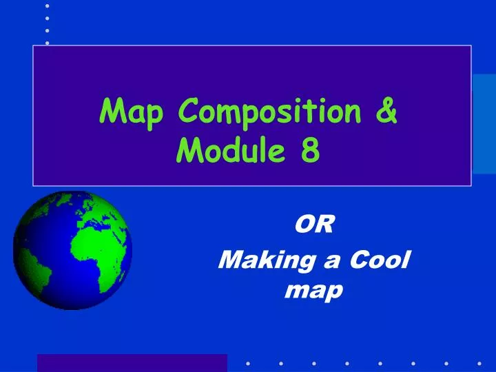
Map Composition & Module 8. OR Making a Cool map. Steps to Creating a Map. Define the Purpose of the map Audience? Professionals? Lay public? How will map be used? Restate into a design problem Design solution - arrangement of map’s image elements to facilitate communication

E N D
Map Composition &Module 8 OR Making a Cool map
Steps to Creating a Map • Define the Purpose of the map • Audience? Professionals? Lay public? • How will map be used? • Restate into a design problem • Design solution - arrangement of map’s image elements to facilitate communication • Sort of an outline • Graphic design esf Laboratory for Applied GIS
Steps to Creating a Map • Define the Purpose of the map • Audience? Professionals? Lay public? • How will map be used? • Which elements of map do you want the viewer to notice first? • The inset map? The main map? The legend? • This is the map hierarchy (or order) • Design some parts to be like background while other, more important features are foreground esf Laboratory for Applied GIS
The Well Designed Map… • Has a single purpose! • Size of paper and map scale determine the level of detail • You cannot simply blow up a map from 8.5-11 to something that would hang on the wall. • A small map size will limit detail • A large map viewed from a distance has same problem • Reader must be able to easily interpret features • Reader should be able to instantaneously understand the maps message esf Laboratory for Applied GIS
Map Elements used in design • Main map • Smaller scale inset maps showing location • Larger scale inset maps showing detail • Title of the map (usually prominent) • Legend everything on the map and no entries that are not on the map • Scale graphic (bar) scale only • North Arrow • Metadata source, projection, date etc. esf Laboratory for Applied GIS
Map Elements used in design • Graticule • Various text (notes, metadata, etc.) • Borders and neatlines • Symbols • Place names and labels • Photographs, Graphics • Mapped and unmapped areas (white space) esf Laboratory for Applied GIS
Mapped Area Title Legend Border Neatline Graticule Purpose, metadata Unmapped Area Credits Scale esf Laboratory for Applied GIS
The elements one-by-one • Title • Draws attention by virtue of its size (big!) • Focuses attention on primary purpose of content of map • Not always needed • Legend • Principle reference to symbology • MUST be there (usually) esf Laboratory for Applied GIS
The elements one-by-one • Scale • A MUST! • Types • graphic -- the bar • verbal -- 1” = 1 mile (watch this one) • a ratio 1/24,000 (this one too) • Because of ubiquitous nature of Xerox machines the graphic scale is a must, the others are optional esf Laboratory for Applied GIS
The elements one-by-one • Credits • another, older, term for metadata • Some metadata can be placed on map • Data source • Statement of accuracy, both spatial and attribute • Date data collected, date map made • Your name, assignment # etc… esf Laboratory for Applied GIS
The elements one-by-one • Credits • another, older, term for metadata • Some metadata can be placed on map • Data source • Statement of accuracy, both spatial and attribute • Date data collected, date map made • Your name, assignment # etc… esf Laboratory for Applied GIS
The elements one-by-one • Mapped and unmapped areas • Objects, land, water, and other geographical features important to the purpose of the map • makes the composition a map rather than a diagram • The most prominent map element • Graticule & Grids • Graticule – geographic coordinates esf Laboratory for Applied GIS
The elements one-by-one • Borders and neatlines • Borders serve to restrain eye movement and focus attention on the map. A Border surrounds all the elements of a map. • A fill color can substitute for a border • Neatlines are: • finer than borders • drawn inside borders • mainly decoration • Used to highlight objects (like legends) and to help balance a map esf Laboratory for Applied GIS
Location of St, Louis Location of St, Louis Legend -adf asdf adfafffdsf Legend -adf asdf adfafffdsf Borders or Not • A heavy border works better than a thin border Legend -adf asdf adfafffdsf esf Laboratory for Applied GIS
Location of St, Louis Location of St, Louis Legend -adf asdf adfafffdsf Legend -adf asdf adfafffdsf Borders or Not • A dark fill works better than a light fill in establishing a border esf Laboratory for Applied GIS
The elements one-by-one • Symbology • Probably the most important part of the map • (object placement is probably the second most important part) • Remember that this is the basic tool in constructing the map’s message • And these make the Legend a very important part of the map. • REMEMBER COLORBREWER!!! esf Laboratory for Applied GIS
Symbology • Symbology (points) • can be point symbols with different sizes, colors, and patterns • In ArcGIS the data will determine where the point will be • The designer can • Tell ArcGIS where to put the names (labels) • And can handle things like label conflicts esf Laboratory for Applied GIS
Symbology • Area and line features • Data controls placemen • In electronic maps anyway – generalization can cause problems • The designer controls • Style • Color and/or • Classification esf Laboratory for Applied GIS
Aside • In Exercise 8 the school polys were so small it was hard to make them stand out. • Solution: Make a point layer and put a point in each school parcel. • Assign one of the school point symbols to the points and make them big. • The school symbol is in the ESRI symbol palette for points esf Laboratory for Applied GIS
The elements one-by-one • Place names and labels • Primary means of communicating to user • Orients user on map • Can provide important info re map purpose • These can be labels or annotation esf Laboratory for Applied GIS
Composition • You have all the data • You have the symbolization plan • Now you have to visualize the map • A creative process • Trial and error process • Where to put borders, neatlines • What style of borders, neatlines • Where does the legend go? • The title • And so on esf Laboratory for Applied GIS
Composition • Purpose of composition • Forces designer or organize the visual material • Stresses the purpose of the map • Directs the users attention • Develops an aesthetic approach for the map • This is an iterative process esf Laboratory for Applied GIS
Nitty gritty of Placement esf Laboratory for Applied GIS
Visual center: 5% of total height aboveGeometric center -- Arrange content around this point Geometric center Composition: Planar Organization • Balance • visual impact of arrangement • is the map “heavy” at top, bottom, sides??? esf Laboratory for Applied GIS
Visual weight • Depends on location • obj weight increases with distance from center • obj at top are heavier than those at bottom • obj on right are heavier than those on left • Depends on size (Duh!) • Depends on color, interest, and isolation • Red>Blue, Bright>dark • complex > simple • isolated > groups • For Example … esf Laboratory for Applied GIS
Which is better balanced? esf Laboratory for Applied GIS
Balance and placement esf Laboratory for Applied GIS
Unequal divisions of space more interesting than equal divisions esf Laboratory for Applied GIS
Movement of reader’s eye - upper left to lower right Field Focus esf Laboratory for Applied GIS
Using Eye Movement Eye goes left to right Generally you want the reader to see the map BEFORE seeing the legend – can’t always do it esf Laboratory for Applied GIS
St. Louis too far from visual center, balance not bad, however • Hard to read name Better, but a heavy on right Balance with legend etc. esf Laboratory for Applied GIS
Location of St, Louis Legend -adf asdf adfafffdsf esf Laboratory for Applied GIS
Location of St, Louis Don’t really need since countries are labeled esf Laboratory for Applied GIS
Size / white space problems Is this a better balanced map? esf Laboratory for Applied GIS
Text • Use mixture of upper and lower case • ALL UPPER CASE IS HARDER TO READ • Use sans serif text • No fancy fonts • Big print for important stuff • Little print for not so important stuff • Use only 2 font families – usually one serif and one sans serif. esf Laboratory for Applied GIS
Using Color • Color is complex and tricky • There are definite color preferences • There are definite color combination preferences • There are standard color codes (like for planning) • The map should NOT be garish! esf Laboratory for Applied GIS
So • Creating a map is like creating a document for a specific purpose -- to communicate something to the reader • It is an iterative process • There are some basic rules or guides that can be used – described above an in the on-line course module. esf Laboratory for Applied GIS
Summary of Guidelines • Map layout – where are the pieces going to go – major pieces – visual center – eye path – uneven juxtaposition of parts • The map area and what’s in it • Legend placement (usually to right of map) • Scale bar, North Arrow • Balance • White space • Map Title – Large – may not be needed esf Laboratory for Applied GIS
Summary of Guidelines • Credits (Metadata) usually present • For FOR357/557- Author’s name, Exercise #, & date! • Borders and neatlines. • Border around ALL map pieces or solid fill • Neatlines (or fill) around (in) various pieces • Color – tricky – but not garish! esf Laboratory for Applied GIS
State & Cnty Highways Hydrology Lewis County Lewis is hard to work with because of its shape- This is only good place for a legend Hydrology Have to be careful because if used neatlines the map would be heavy on the left! By Eustis B. Nifkin , Inc. Syracuse NY 10/10/05 esf Laboratory for Applied GIS
State & Cnty Highways Hydrology Lewis County Hydrology This map illustrates the a;dj;fa a;dljf a;dlfj aljdf a;sdf asdjf a;sdufdafdsf paseuef a;df;a ap[ef a;sduf asdfo aosdf [asdfi asdoif a[dsf [asdifdfi asdifd asdf By Eustis B. Nifkin , Inc. Syracuse NY 10/10/05 esf Laboratory for Applied GIS
Basic idea OK but right side stuff too big! esf Laboratory for Applied GIS
Table Editing • Can do in ArcMap • Open table • In “options” select Add Field • Make field short integer (5 maybe) • Click ok • Click in new field header • Click “Calculate values” • You will get warning – usual answer is Yes • Get window like … esf Laboratory for Applied GIS
How to save maps • File>Export.Png is recommended for import into word • GIF is good for web • PDF is good generally if using Adobe esf Laboratory for Applied GIS
emf 400 dpi234Kb emf 300 dpi229Kb esf Laboratory for Applied GIS
emf 600dpi237Kb Emf 400 dpi234Kb emf 300 dpi229Kb esf Laboratory for Applied GIS
600 dpi 300 dpi esf Laboratory for Applied GIS