Download
1 / 23
230 likes | 258 Views
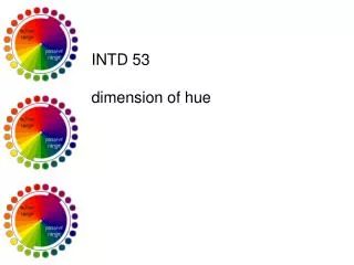
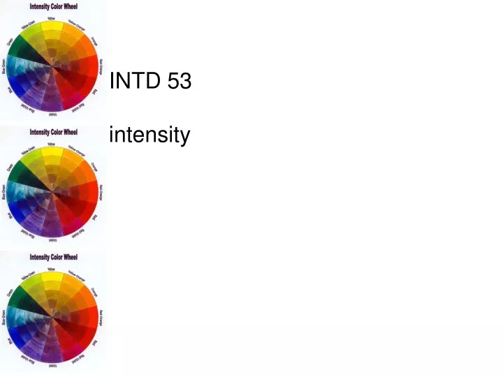
INTD 53 intensity. chroma measure of hue purity or brightness all pure hues are at full chroma pure hues differ as to chroma strength yellow…violet red…green orange…blue. intensity saturation degree of purity of hue brightness or dullness of hue changed by mixing hue

E N D
INTD 53 intensity
chroma measure of hue purity or brightness all pure hues are at full chroma pure hues differ as to chroma strength yellow…violet red…green orange…blue
intensity • saturation • degree of purity of hue • brightness or dullness of hue • changed by mixing hue • with its complement or with • gray of same value
colored grays addition of gray to a pure hue—when gray is same value of hue—results in a duller hue
complementary hues • directly across from each other on color wheel • on intensity scale— • equal mixture of • complementary • hues results in • muddy neutral • ends favor one • hue or another
glazing layering of transparent hues
intensity in compositions • most brilliant pure hue—used in correct setting…value to value • pure red—relatively dark composition • pure yellow—relatively light composition • paired complementary hues— • startling contrasts
intensity in compositions: balance complementaries create balance—do not alter each other’s hue also achieved by contrasting intense and dull small amount of pure hue balances large area of dull hue contrasting color schemes exert greater balance than more related ones
intensity in compositions: intensity and value intensity combines with value to alter hue perception—complementaries vibration excitement emphasis
intensity in compositions: depth • high intensities—large, push object forward in visual field • on black background hues advance according to value—yellow most • on white background hues recede according to value—violet advances most • low intensities—reduce object size, increase distance and spaciousness • result of spreading effect
INTD 53 color temperature
temperature warmth or coolness of a color warm hues:
temperature warmth or coolness of a color cool hues: within these categories the same color can sometimes be cool, sometimes warm
mixing black: warming effect white: cooling effect complementary: reverses temperature
neutrals may be warm or cool warm neutrals: natural objects cool neutrals: manmade/inorganic objects
relative temperatures • hue temperature changes with surroundings • warm hue surrounded by warm hues appears cooler; cool hues appears warmer (afterimaging)
background effects • essential to advancing or receding qualities • warm hues: • make grays seem cool • remain brilliant on dark/black background • spread on white background • cool hues: • make grays seem warm • merge with dark/black background • firmly outlined by white background
tonality • tonality results in composition unity • helps determine colors to use in compostion • EXAMPLE: • warm design done in red, red-orange, orange, red-violet, violet, blue-violet, green • tonality—red (component of all hues used except green) • adding touch of red to green further enhances tonality
proportion when warm/cool hues balanced— neither predominates— composition more dynamic kinetic effect—warm dominant
emotion • warm: • advance • suggest aggression, sunlight, heat, blood, arousal, stimulation • earthy, near, heavy, dry • cool: • receding • quiet, restful, airy, light • suggest sky, water, distance, foliage, shadows
metals relative brilliance often interpreted as warm (gold)/cool (silver) reflect and are totally influenced by surroundings
participation activity: warm/cool collage …using the colored paper you brought to share with the class create two collages of your choice: …one warm/one cool …showing different warm/cool proportions …showing tonality …label each collage according to effect