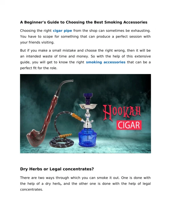
Download
1 / 2
20 likes | 68 Views
We are a web design and development company trusted by leading brands, clients choose us because we understand businesses. As a web design and development company, we seek to highlight your brand identity and equip your site for digital marketing success.<br><br>Visit: http://www.mystechdynamics.com

E N D
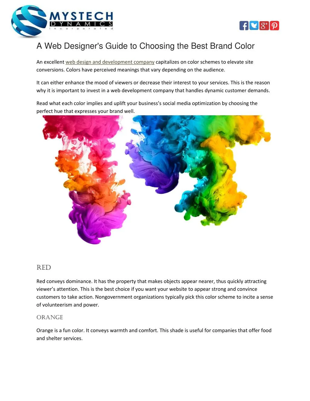
A Web Designer's Guide to Choosing the Best Brand Color An excellent web design and development company capitalizes on color schemes to elevate site conversions. Colors have perceived meanings that vary depending on the audience. It can either enhance the mood of viewers or decrease their interest to your services. This is the reason why it is important to invest in a web development company that handles dynamic customer demands. Read what each color implies and uplift your business’s social media optimization by choosing the perfect hue that expresses your brand well. Red Red conveys dominance. It has the property that makes objects appear nearer, thus quickly attracting viewer’s attention. This is the best choice if you want your website to appear strong and convince customers to take action. Nongovernment organizations typically pick this color scheme to incite a sense of volunteerism and power. Orange Orange is a fun color. It conveys warmth and comfort. This shade is useful for companies that offer food and shelter services.
Yellow Yellow is the strongest hue. It energizes viewers and stimulates self-esteem. Furthermore, it conveys confidence and optimism. Note, however, that uneven tone or wrong color combinations can ignite fear and anxiety. Green Green signifies balance. Some organizations use this color scheme to show concern for the environment. It has a property that requires no adjustment; therefore, it calms the eye. It also conveys restoration and reassurance. One disadvantage of using this color is that it can portray stagnation or blandness if incorrectly used. Blue Blue soothes the mind and increases concentration. Companies offering water services typically use this color to convey purity and cleanliness. The downside of using too much blue is that it can pertain to a lack of emotion. Purple Purple is associated with royalty, nobility and prestige. However, if overly used, it may communicate arrogance. Examples of well-known companies that use this brand scheme are Yahoo! and Crown Royal. Please get in touch with us if you have any questions about web design and development or would like us to guide you through implementing or customizing your website, Keep in mind that the first step to successful brand marketing is to captivate your audience.