Download
1 / 62
620 likes | 833 Views
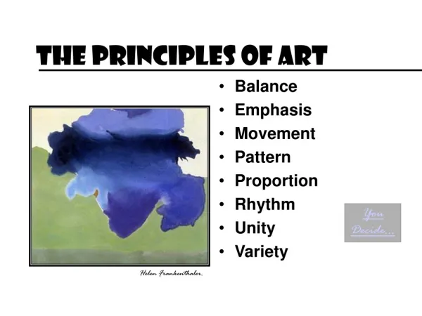
The Principles of Art. Our Directions/Guidelines to Creating Works of Art. The Goal of Unity. Unity is the main goal It is the arrangement of elements and principles with media to create a feeling of completeness and wholeness. The Principle of Harmony.

E N D
The Principles of Art Our Directions/Guidelines to Creating Works of Art
The Goal of Unity • Unity is the main goal • It is the arrangement of elements and principles with media to create a feeling of completeness and wholeness.
The Principle of Harmony • If too little variety can become boring, too much variety can create chaos in a work of art. • Artists avoid chaos in their works by using harmony.
Harmony, Cont’d. • Harmony refers to blending elements to create a work of calm, restful appearance. • An artist may use similar textures, colors values, to make a piece feel even and together. • Sometimes, harmony is referred to as unity.
In Piccaso’s “Blue Guitarist” the use of the color blue throughout the painting makes it seem to fit together. • In Robert Delaunay’s painting “Rhythm” the use of similar shapes, values, and colors give the feeling of harmony or unity.
How to Implement Harmony • One technique of creating harmony in a work of art is by utilizing smooth, flowing lines and subtle color schemes that will easily blend together.
The Principle of Contrast • Contrast refers to differences in values, colors, textures, shapes, and other elements. • Contrasts create visual excitement and interest to a work of art. If all the other elements – value, for example, are the same – the result is monotonous and plain.
Examples of Contrast • 1. Contrast of Color – warm vs. cool colors • 2. Contrast of Texture – smooth vs. rough • 3. Contrast of size – large vs. small • 4. Contrast of shape – organic vs. geometric
In Vincent Van Gogh’s 1884 oil painting “The Ox-Cart”, the artist used bright white in the legs and sky, next to dark black in the ox’s body and the shadows under the cart to create a contrast of the element of art value. In Alfred Stieglitz’s untitled photograph of his wife, the painter Georgia O’Keeffe, hands with one of the skulls from her paintings we have a contrast of not only light and dark value, but also of the texture in the hard smoothness of the bone vs. the fleshy softness of the painter’s skin.
The Principle of Gradation • Gradation refers to a way of combining elements by using a series of gradual changes in those elements.
Examples of Gradation • Small - to – large shapes • Light – to – dark hues of color • Telephone poles in landscapes (ordered, step-by-step change as they go back in the distance).
Gradation of size and direction produces linear perspective. Gradation of color
In the student drawing of a hallway, we see a gradation of space in how the areas in the drawing seem to get smaller and farther back in the image. In the Japanese wood cut print of the five Herons, the background gradually goes from dark on top, to light by the birds, then dark again at the bottom. This is an example of gradation of value.
The same can be said for the painting “Fall Plowing” by the American artist Grant Wood. By gradually making the haystacks get smaller in each of the rows that go farther back, the artist has created an illusion of depth that makes the painting seem to go back in space. Gradation is one of the things an artist may use to create “perspective” or depth in their work.
The Principle of Variety • The same routine day after day can become dull and boring. The same color or shape repeated over and over in an art work can become equally dull. To avoid dullness, artists use the principle of variety in their works.
Variety, Cont’d. • Variety is a principle of art concerned with combining one or more elements to create interest by adding slight changes. • By giving a work variety, the artist heightens the visual appeal of the work.
In George Seurat’s “La Grande Jatte”, there is a variety in the many different shapes, colors and values.
There are many different colors in the painting. In Joseph Cornell’s shadow box “Hotel-Edan”, there is variety in the different forms and textures that make us look all around in the box.
The Principle of Pattern • Pattern uses the art elements in planned or random repetitions to enhance surfaces of paintings or sculptures. • Patterns often occur in nature, and artists use similar repeated motifs (a distinctive and recurring form, shape, figure, etc., in a design, as in a painting or on wallpaper) to create these occurrences.
Repetition • Repetition refers to a way of combining art elements so that the same elements are used over and over again. Repetition will create a visual patter. • Thus, repetition and pattern go hand-in-hand.
In Andy Warhol’s “100 Cans”, the artist used the same shapes, colors and lines to create his image. The pattern that was created has a rhythm, but also repetition because each of the elements are repeated over and over.
Examples of Pattern • 1. Fabrics – regular or planned patterns – because certain elements are repeated with accuracy(lines, shapes, swirls, or other design elements). • 2. Quilts
The Principle of Movement • You may not have realized it, but when you look at a work of art your eye moves from part to part. • Artists use the principle of movement to lead the viewer’s eyes throughout the work.
Movement, Cont’d. • Movement is the principle of art used to create the look and feeling of action and to guide a viewer’s eye throughout the work of art.
Nude Descending Staircase #2 Marcel Duchamp
In David Hockney’s image “Day Pool with 3 Blues”, the shape and color of the diving board create movement by pulling the viewer’s eye from the bottom of the painting to the center of the image.
The Principle of Rhythm • Often artists seek to make their works seem active. When they do, they call upon the principle of rhythm.
Rhythm. Cont’d. • Rhythm is the principle of art concerned with repeating an element to make a work seem active or to suggest vibration.
Even More About Rhythm • Sometimes to create rhythm, an artist will repeat not just elements but also the same exact objects over and over. • One example is Edvard Munch’s The Scream.
Andy Warhol • Another example of rhythm is Andy Warhol’s version of Marilyn Monroe.
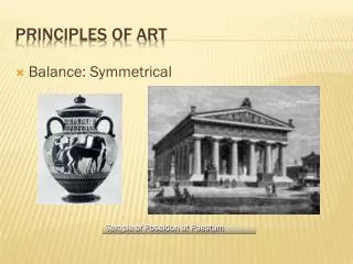
The Principle of Balance • Balance is concerned with arranging elements so no one part of a work overpowers, or seems heavier than, any other part.
Three Kinds of Balance • 1. Formal (symmetrical) Balance – Two halves are mirror images. • 2. Informal (asymmetrical) Balance – Two unlike elements seem to carry equal weight. • For example, a small shape painted bright red will balance several larger items painted in duller reds.
Three Kinds, Cont’d. • 3. Radial Balance – This occurs when elements or objects in an art work are positioned around a central point.
Even though images are different, they balance each other out equally. Formal Balance
Informal Large figures are balanced by the smaller. What about the lighting? What is it called when you paint with tiny little dots?
Where’s the Emphasis? What does the artist do to draw your attention to the focal point? Formal or Informal?
Formal & Informal Project • You will be creating formal and informal designs by cutting and pasting art to a scene. • The first scene will be formal – where objects balance one another out equally. • The second scene will be informal – where asymmetrical layout is used.
Cow Skull: Red, White, & Blue (1931) Georgia O’Keeffe
The Principle of Emphasis • To attract viewer’s attention to important parts of a work, artists use the principle of emphasis. • This principle creates one or more centers of interest in a work.