Download
1 / 25
250 likes | 296 Views
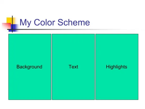
Notes on the second batch the I generally felt they needed some touch of flair to have life and was hard to count on color extension and compare hue contrasts , and Simultaneous contrast which is our strongest tool in this type of diverse combinations.

E N D
Notes on the second batch the I generally felt they needed some touch of flair to have life and was hard to count on color extension and compare hue contrasts, and Simultaneous contrast which is our strongest tool in this type of diverse combinations. It also worth mentioning text always draws the eye first then the color red
Too me it just doesn’t read like that’s even what you use to navigate usually grey is color of a already used link or a non functional one. and looks very sterile. In combination with other neutral colors it dies. This combination essentially I played with in my initial runs in fact this from that session but is essentially the same color as yours
This is probably my preferred choice of the last new color samples
Without reassigning the site colors this color tends (in my response) to kill whatever its next too. A favorite shirt through the laundry a few to many times?
Similar effect as last batch can barely tell the difference.
Having spent a day and Half looking at this and color combinations I still think this is one of the strongest options. A group of harmonious set of combinations. This combination will also naturally accent any skin tones in the images.
Another obvious option is split between analogous and mono chromatic. (see next slides) In doing this once again the problem remains doing 7 times. It seems to be 1 to high a number for elegant combinations. We could also do Blue, Green, and tan type of thing might bypass this issue. The weakest case is here with the second choice (light blue) I used on the national page. I do however feel we need to resolve this issue. It does the CZO’s no favor my keeping the same color scheme. If anything with site this size and similar content from only slightly separate perspectives something needs separate them in look and feel to further accent the unique characteristics of the different CZOs while retaining unity of navigation and purpose. Other wise it’s so much a wash of green pages that more or less essentially say the same thing. Why have different CZOs at all? I think something has to say these are visually and intuitively different pieces of the same puzzle not the same piece 6 times. The banner alone doesn’t carry enough weight. I don’t want to be on the BcCZO page swich pages with a link say for a publication and not feel that I am no longer on the same section That being said with out further ado the newest option-