Download
1 / 11
110 likes | 182 Views
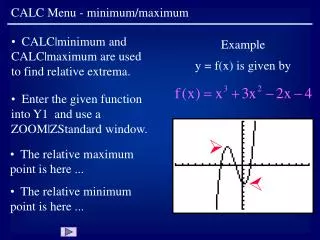
Appendix K Phase 2 HGB Mid Course Review Average Minimum and Maximum Temperatures from 1961-1990 at 9 Weather Stations in East Texas and West Louisiana Prepared by the Technical Support Section Technical Analysis Division TCEQ October, 2004.

E N D
Appendix K Phase 2 HGB Mid Course Review Average Minimum and Maximum Temperatures from 1961-1990 at 9 Weather Stations in East Texas and West Louisiana Prepared by the Technical Support Section Technical Analysis Division TCEQ October, 2004
Aug 31-Sept 5, 2000: Evidence of widespread exceptionally high temperatures • Source of text below and following figures: Southern Regional Climate Center http://maestro.srcc.lsu.edu/temp_precip_2000.html • The top portion describes the annual temperature regime for 2000, for a single station. It is composed of three graphic elements: • The pink shaded area represents the normal range of daily temperature plotted for each day of the year. It is derived from 30 years (1961-1990) of daily maximum and minimum temperatures observed at the site. • A series of vertical red bars represents daily observations of maximum and minimum temperatures observed at the site for the observation year. • The solid black line is a 5-day moving average of the calculated average daily temperature. It is intended to represent short-term variation in average temperature. It does not represent the average temperature on any given day. • The bottom portion of the graph describes the annual precipitation regime for the station. It is composed of two graphic elements: • The light green line represents an accumulation of normal daily precipitation values derived from a 30-year record (1961-1990). • The dark green line is the accumulated daily precipitation values observed for the depicted year.