Download
1 / 38
380 likes | 388 Views
The strategic use of type to create texture, hierarchy, organization, and clear communication. Proportional vs. Monospaced. Serif vs. Sans serif. Display Fonts. Association- have to do with our past experience Visual communication—appearance of the font.

E N D
The strategic use of type to create texture, hierarchy, organization, and clear communication
Display Fonts • Association- have to do with our past experience • Visual communication—appearance of the font
Typography Terms • Alignment along baseline • X-height is height of lowercase x • Cap height may be less than height of ascender • Descenders are below the baseline
Legibility • Function of typeface design • Informal measure of how easy it is to distinguish one letter from another in a particular typeface
Readability • Dependent upon how the typeface is used • Size, color, background, alignment, resolution, et. al. • Gray text on gray background not readable no matter the legibility
Print vs. web • Print is a higher resolution medium (>150 dpi) • Typical desktop screen resolution is around 100 dpi • Read slower on computer screen • Serifs generally more readable in print • Sans Serifs generally more readable on screen – some exceptions
Optimized for screen • Typically higher x-height, more open counters (e.g., inside of a) • Verdana: Sans serif, optimized for reading on screen • Georgia: Serif typeface used frequently on the web • Arial, Helvetica, Open Sans, others • Resource: www.cssfontstack.com
Readability concerns • Justification • Line length • Size • Contrast • Line spacing (leading) • Emphasis
Justified Lorem ipsum dolor sit amet, consectetur adipisicing elit, sed do eiusmod tempor incididunt ut labore et dolore magna aliqua. Ut enim ad minim veniam, quis nostrud exercitation ullamco laboris nisi ut aliquip ex ea commodo consequat.
Centered Lorem ipsum dolor sit amet, consectetur adipisicing elit, sed do eiusmod tempor incididunt ut labore et dolore magna aliqua. Ut enim ad minim veniam, quis nostrud exercitation ullamco laboris nisi ut aliquip ex ea commodo consequat.
Aligned Right Lorem ipsum dolor sit amet, consectetur adipisicing elit, sed do eiusmod tempor incididunt ut labore et dolore magna aliqua. Ut enim ad minim veniam, quis nostrud exercitation ullamco laboris nisi ut aliquip ex ea commodo consequat.
Ragged right Lorem ipsum dolor sit amet, consectetur adipisicing elit, sed do eiusmod tempor incididunt ut labore et dolore magna aliqua. Ut enim ad minim veniam, quis nostrud exercitation ullamco laboris nisi ut aliquip ex ea commodo consequat.
Line length • Avoid very long lines of text • The eye’s span of acute focus is only about three inches wide • Designers keep text in columns or blocks not much larger than that comfortable eye span • Two columns are easier to read than one wide column in print—not on web, though
Optimal line lengths • Too short means too much tracking back and forth • Too long means too hard to find the next line • Rules of thumb vary. Typically 50-100 characters. • Elements of Typographic Style: 66 characters per line
Font size on the web • Pixels • Ems • Avoid points • 16px/1em minimum size • Older browsers - User resize fonts when specified in ems, not pixels.
Contrast • Contrast issues: Black text on white background most readable. • Check contrast with online tool • https://webaim.org/resources/contrastchecker/
Leading (line spacing) • CSS line-height property (in pixels or ems). • Default is 1.15x or so • Increase for longer lines or for effect • Example: https://theastro.com/rooms/
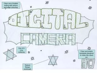
Text as graphics • Create graphic using Photoshop and specifying font—logos, buttons. • Avoid for body text-load time, search engine issues, maintenance.
Emphasizing text • Bold • Italic • Underlined - avoid • Color • ALL CAPS – generally avoid
Font sources for web • User installed fonts (fonts folder) • Webfonts
Standard serif and sans serif fonts: • PC: Times New Roman/Arial • Mac: Times/Helvetica • Android: Roboto/Droid Serif • iPhone: ?
Fonts for the web • In print you specify • On the web you suggest an ordered list of fonts called a font stack • E.g. Ideal, alternative, common, generic • “Open Sans”, Helvetica, Arial, sans-serif
Classic Dreamweaver Font Stacks • Arial, Helvetica, sans-serif • Courier New, Courier, monospace • Times New Roman, Times, serif • Georgia, Times New Roman, Times, serif • Verdana, Arial, Helvetica, sans-serif • Geneva, Arial, Helvetica, sans-serif • Body text - font-family: Ideal, Fit , Common, Generic; • font-family: "Open Sans", "Segoe UI", Tahoma, sans-serif; • http://melchoyce.github.io/fontstacks/examples/open-sans.html
Webfonts • @font-face property (Web fonts) • Browser support • https://caniuse.com/#feat=fontface • Example #1 – Skylark Lounge • Example #2 – Hi*Beams • Google Fonts • Example #3 – Midwinter Bluegrass • Purchasing license
Using Google Fonts • Select with + sign • Explore pairings in bottom left of page • Embed link to font in <head> section • Specify in CSS using font-family property • Use appropriate font stack
Font stack with Google font • If font does not load for any reason • Server down • Script blocker • Bad connection • Flash of Unstyled Test (FOUT)