Download
1 / 18
180 likes | 386 Views
Brand Identity 1.0. Boston University http://www.bu.edu/brand/logotype/placement/. Identity Standards Introduction. Importance of an Identity

E N D
Brand Identity 1.0 Boston University http://www.bu.edu/brand/logotype/placement/
Identity Standards Introduction • Importance of an Identity • Today, Boston University competes with academic institutions across the nation and around the globe. Given this dynamic environment, it is increasingly important for us to express a single, compelling voice in everything we do. • The totality of the logo, visuals, and words we use to describe the University will enable us to establish and maintain a clear, unified brand identity, both within the University community and beyond. • This website provides general guidelines for the visual and verbal articulation of the Boston University brand, as well as specific directions for the application of our updated logo and related elements. We recommend that you refer to this guide whenever you develop marketing communications.
Identity Platform • This positioning is to help you focus and define the University visually and verbally, and it is not intended to be used verbatim. • As an institution, Boston University is large, diverse, and dynamic. It is a 21st-century university that is modern, confident, and continually evolving. It is also a community of people bound together for the common purpose of education. Boston University is committed to the noble purpose of delivering world-class teaching in liberal arts, professional programs, and research by an outstanding, accessible faculty. We inspire members of our community to go out into the world to make a difference. • EXPECT THE WORLD OF YOURSELF • Emphasis on yourself Connection to a global community Freedom to create your own experience at BU Sense of high expectations and unlimited possibilities Opportunity to express yourself
Brand Personality • EXCELLENT World-class liberal arts and professional programs, faculty, and research • MODERN Innovative, forward-looking • DYNAMIC Vibrant, fast-moving, stimulating • CONFIDENT Bold, unapologetic • PROGRESSIVE Open-minded, inclusive, collaborative, socially conscious • GLOBAL International students, faculty, and programs; engaged in the community and world • DIVERSE Kaleidoscope of people, programs, and learning opportunities
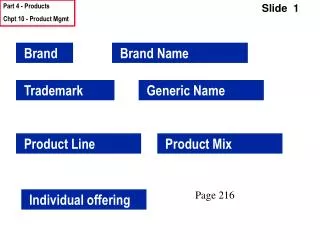
Terminology • For maximum clarity, we have established a vocabulary of technical terms that you will encounter throughout this text. It is important to use these terms accurately and consistently in all written and oral communications related to design. Familiarity with the following key terms will help you become fluent in the language of these guidelines.
Terminology • BRAND • The sum impression derived from a consumer’s experience of the University’s products, services, communications, and people. • MASTER LOGO • The uniquely drawn set of visual symbols and typographic characters that form the University’s official emblem.
Terminology • SUB-BRAND LOGOTYPE • A visually distinctive arrangement of type that brands an individual school, college, or other sub-entity. • ICON • A simplified, “quick-read” version of the master logo that, along with one or more sub-brand logotypes, forms a signature. • SUB-BRAND SIGNATURE • An approved configuration of the icon plus one or more logotypes, used for branding the University’s sub-entities.
Sub-brand Logotype Usage • Logotypes brand the individual schools, colleges, offices, and other sub-entities while demonstrating a connection to the University. Use logotypes as complements to the master logo or in signatures on school- and college-specific brochure covers and website home pages. • Treat the logotypes as artwork, not as typography • Sub-brand logotypes must appear either with the master logo or as part of a sub-brand signature. • Logotypes do not replace the master logo • While the individual schools, colleges, departments, and institutes within the University may have their own unique identities, these sub-identities complement, but do not replace, the University master logo.
Sub-brand Logotype UsageNaming Conventions • Departments • Departments must appear in hierarchical format in logos and letterheads.
Sub-brand Logotype UsageNaming Conventions • Ampersand • In keeping with the Boston University Brand Identity Standards, in logos and in running text the "&" symbol replaces "and" in the names of schools, colleges, administrative or academic departments, offices, centers, and institutes.*
Office of… • In logos and running text, eliminate the words “Office of” in names of departments, unless the office is an individual’s title (e.g., Office of the Provost, etc.). Certain exceptions continue to call for “Office of” or “Office of the” in order to retain meaning – A general rule of thumb is “Office of the” will still remain.
Sub-brand Logotype Placement • Give the logo and logotype their own space • When using both the master logo and logotype in marketing communications, be sure to give both marks the respect they deserve by providing adequate distance between the two. Logotypes are complementary, but are not adjuncts, to the master logo. • A clear zone of “B” (B = logo height) around the logo will give it the room it needs to stand out. The clear zone should be proportionate to the size of the master logo.
Sub-brand Logotype Colors • Boston University black Sub-brand logotypes are secondary to the master logo and should always appear in black—never in BU red. The master logo must be visually prominent, with the logotype clearly subordinate so there is no confusion among the audience as to which is the principal entity. The University is the primary overriding institution, and the group/program/school identification is secondary in the visual hierarchy. • For Print Pantone Process Black CMYK: 0, 0, 0, 100 For Web HEX: #000000 RGB: 0, 0, 0
Sub-brand Logotype Do and Don’t • Do use the original electronic files. • Don’t re-create the logotype using a font. It will be difficult to match the official specifications. • Do pair Boston University with a sub-brand. • Don’tuse Boston University without a sub-brand. Use the master logo instead.