Download
1 / 19
190 likes | 195 Views
Learn how to fit scatter plot data using linear models and make predictions. Discover different types of correlations and find equations for lines of best fit.

E N D
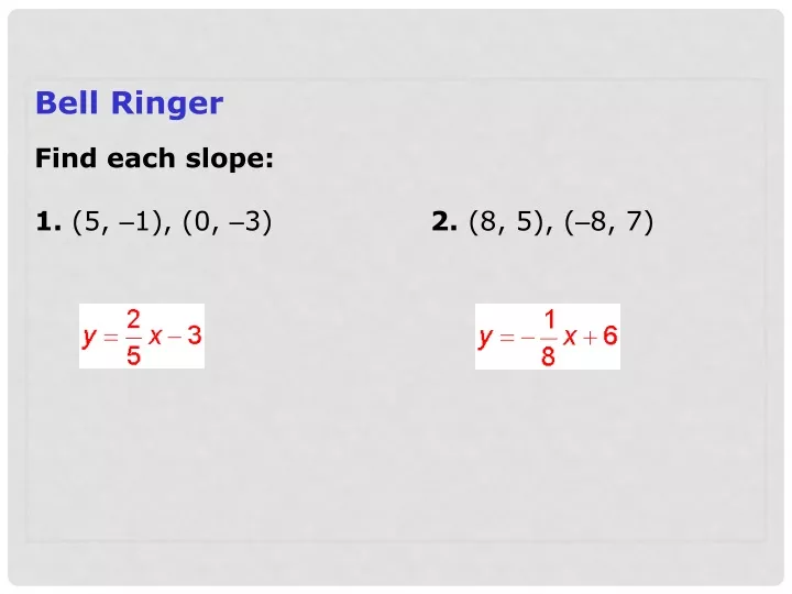
Bell Ringer Find each slope: 1. (5, –1), (0, –3) 2. (8, 5), (–8, 7)
1.4 Objectives Fit scatter plot data using linear models with and without technology. Use linear models to make predictions. A line of best fit may also be referred to as a trend line.
Negative Correlation Positive Correlation No Correlation Constant Correlation Four Kinds of Correlations (you will learn about in Transition)
Scatter Plots + Calculator • 1) STAT • #1 • L1 (x) , L2 (y) (enter data; use arrow keys to select column) • STAT • CALC • 4enter LinReg(ax+b) • 2nd • 8) y= • plot1 • on • TYPE • X list L1 & Y list L2 • mark (select on) • GRAPH
Example 1 That’s to much work with paper & pencil Albany and Sydney are about the same distance from the equator. (a)Make a scatter plot with Albany’s temperature as the independent variable. (b)Name the type of correlation. (c)Then sketch a line of best fit and (d)find its equation. Tables: ACT How to: Calculator data entry Enter ______ in list L1 by pressing STAT and then 1. Enter _______ in list L2 by pressing Make scatter plot in the following way: Press 2nd Y= PLOT 1 set up desired type when done, press GRAPH cont inued
o o Does yours look like this ? example 1 continued Albany and Sydney are about the same distance from the equator. (a)Make a scatter plot with Albany’s temperature as the independent variable. (b)Name the type of correlation. (c)Then sketch a line of best fit and (d)find its equation. (hint: what is m? b?) • • • • • • • • • • •
Example 2 (a)Make a scatter plot for this set of data. (b)Identify the correlation (c)sketch a line of best fit (d)find its equation.
example 2 continued Step 1 Plot the data points. Step 2 Identify the correlation. Notice that the data set is positively correlated–as time increases, more points are scored • • • • • • • • • •
example 2 continued Step 3 Sketch a line of best fit. Draw a line that splits the data evenly above and below. • • • • • Step 4 Identify the equation for the data. • • • • • end
Example 3: Anthropology Application Anthropologists can use the femur, or thighbone, to estimate the height of a human being. The table shows the results of a randomly selected sample. (a)Make a scatter plot for this set of data. (b)Identify the correlation (c)sketch a line of best fit (d)find its equation.
example 3 continued a. Make a scatter plot of the data with femur length as the independent variable. • • • • • • • •
Example 3 Continued b. Find the correlation coefficient r and the line of best fit. Interpret the slope of the line of best fit in the context of the problem. Enter the data into lists L1 and L2 on a graphing calculator. Use the linear regression feature by pressing STAT, choosing CALC, and selecting 4:LinReg. The equation of the line of best fit is h ≈ 2.91l+ 54.04.
Example 3 Continued What does the slope indicate about problem?
Example 3 Continued c. A man’s femur is 41 cm long. Predict the man’s height. The equation of the line of best fit is h ≈ 2.91l+ 54.04. Use the equation to predict the man’s height. For a 41-cm-long femur, Substitute 41 for l. h ≈ 2.91(41)+ 54.04 h ≈ 173.35 The height of a man with a 41-cm-long femur would be about 173 cm. end
Example 4 The gas mileage for randomly selected cars based upon engine horsepower is given in the table. • • • • • • • • • • a. Make a scatter plot of the data with horsepower as the independent variable.
Example 4 Continued b. Find the correlation coefficient r and the line of best fit. Interpret the slope of the line of best fit in the context of the problem. Enter the data into lists L1 and L2 on a graphing calculator. Use the linear regression feature by pressing STAT, choosing CALC, and selecting 4:LinReg. The equation of the line of best fit isy ≈ –0.15x + 47.5.
Example 4 Continued What does the slope indicate ? The slope is about –0.15, so for each 1 unit increase in horsepower, gas mileage drops ≈ 0.15 mi/gal. c. Predict the gas mileage for a 210-horsepower engine. The equation of the line of best fit is y ≈ –0.15x+ 47.5. Use the equation to predict the gas mileage. For a 210-horsepower engine, y ≈ –0.15(210)+ 47.50. Substitute 210 for x. y ≈ 16 The mileage for a 210-horsepower engine would be about 16.0 mi/gal. end
Exit Question: complete on graph paper attached to Exit Question sheet (a)Make a scatter plot for this set of data using your calculator (b)find its equation.