Download

1 / 13
220 likes | 715 Views
Graphing and Analyzing Data. Making Predictions Drawing Conclusions Making Inferences. Lucy’s Lemonade Stand. Lucy’s Lemonade Stand. How many glasses of lemonade did Lucy sell in Week 3? In which week did Lucy sell the most glasses of lemonade?

E N D
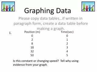
Graphing and Analyzing Data Making Predictions Drawing Conclusions Making Inferences
Lucy’s Lemonade Stand Lucy’s Lemonade Stand • How many glasses of lemonade did Lucy sell in Week 3? • In which week did Lucy sell the most glasses of lemonade? • In which week did Lucy sell the least glasses of lemonade? Glasses of Lemonade Sold
Beach Erosion Predictions • Based on the information in this line graph, which of the following statements would be the best prediction? • Based on this data, there will most likely be 2 inches of erosion in the year 2000. • Based on this data, there will most likely be no erosion in the year 2000. • Based on this data, there will most likely be 6 inches of erosion in the year 2000. Explain.
Spelling Test Grades • Based on this line plot, what grade would Jean most likely make on her next spelling test? • a. F • b. D or C • c. C or B • d. B or A
Spelling Test Grades • Based on this line plot, what grade would Jean most likely make on her next spelling test? • d. B or A
Hector’s Taco Shop Making Inferences: Use the observable data in the graph to make inferences. Hector’s Taco Shop • Hector opens his taco shop 4 days a week. The graph shows the money he made last week. • If Hector has to close his shop either Thursday, Friday, Saturday, or Sunday, what day should he close it? Why? Amount of Money Earned in Dollars
Hector’s Taco Shop Making Inferences: Use the observable data in the graph to make inferences. Hector’s Taco Shop • Hector opens his taco shop 4 days a week. The graph shows the money he made last week. • On which night should Hector have the most food prepared? Why? Amount of Money Earned in Dollars
Making the Grade! Number of Students Making all As in 4th Grade Double Bar Graph • Which group, boys or girls, had the most As? • In which quarter did the boys and girls have the same number of As? • Using your inference skills, which quarter would you infer was the most difficult quarter for the students? Why? # of Students Making all As
Television Conclusions • Make conclusions about students’ ages and the number of hours they watch television on the weekends. • Example: • The older the students are, the more hours they watch television on the weekends.
Making Conclusions • Using the data in this double bar graph, make a conclusion statement about the average monthly temperatures in the summer months. • Using the data in this double bar graph, make a conclusion statement about the average monthly temperatures in the winter months.
Comparing Graphs to Make ConclusionsUsing the data in these two graphs, are the following statements true or false conclusions? • 5th graders always buy more milk than 4th graders. • Both 4th and 5th graders increase their milk purchases as the days progress. • The day the 4th graders bought the most milk is also the day the 5th graders bought the least amount of milk. • The day the 5th graders bought the most amount of milk is also the day the 4th graders bought the least milk.
Comparing Graphs to Make ConclusionsUsing the data in these two graphs, are the following statements true or false conclusions? • 5th graders always buy more milk than 4th graders. • FALSE • Both 4th and 5th graders increase their milk purchases as the days progress. • FALSE • The day the 4th graders bought the most milk is also the day the 5th graders bought the least amount of milk. • FALSE • The day the 5th graders bought the most amount of milk is also the day the 4th graders bought the least milk. • TRUE