Download

1 / 67

E N D
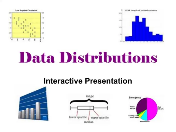
1. Data Distributions Interactive Presentation
2. Collecting Data
3. Math Dictionary
4. Vocabulary Data � facts or numbers that are collected
Survey � given to investigate behaviors or opinions by questioning a group of people
5. Types of Data Categorical data � data that is a name or category
Numerical data � data that is a number
6. Vocabulary Population � the group you want to find information about
7. Vocabulary Sample � a group of people within a population
8. Vocabulary Census � a survey of an entire population
9. Vocabulary Parameter � a measured characteristic of a population
Statistic � a measured characteristic of a sample
10. REMEMBER! Sample Statistics will be more accurate as sample size INCREASES!!
11. Discussion 1 A school principal wants to know the average amount of time it takes her students to reach school each morning. To find this out, she asked 20 students in each grade �How long does it usually take you to reach school in the morning?�
12. Discussion 2 An automotive shop has 25 workers. The owner wants to reward his workers with a company outing. He is considering a day at a baseball game, a day at an amusement park, or a dinner for the workers at a restaurant. He decides to conduct a survey so he can make the best choice.
13. Ticket-out-the-door The 2,000 members of a club were mailed postcards, asking them to suggest locations for next year�s annual meeting. Only 150 returned the postcards. How do the new ideas from this lesson fit this situation?
15. How can I collect, organize, and analyze data in a meaningful way?
VOCABULARY: central tendency, mean, median, mode
16. Measures of central tendency:
Mean
Median
Mode
17. Vocabulary Mean � the average (add up the values and divide by the # of values)
Median � the middle number in a list of numbers (Hint: write the numbers in order)
Mode � the value that occurs the most
18. Discussion Find the mean, median, and mode of the data below:
19. Answers:
20. Discussion In Ms. Lin�s 7th grade class, there are 21 people, including Ms. Lin. There ages are:
11, 11, 11, 11, 12, 12, 12, 12, 12, 12, 12, 12, 12, 12, 12, 12, 12, 12, 12, 12, 37
Find the mean, median, and mode
Analyze the data�which measure of central tendency would be the most appropriate to use?
21. Which would be the best measure for each situation? Would you use mean, median, or mode to describe the typical selling price of a bicycle?
2. Would you use mean, median, or mode to determine the most popular toy sold at a store?
22. MMMR Rap M to the M to the M to the R, Remember this rhyme and you�ll go far
Mode, Median, Mean & Range, Now singing this song might feel strange.
Mode, Mode now I�ve been told, is the number you will see the most
Median now he�s the man, the one in the middle, line HIM up the best you can
From small to large, small to large remember this & your in charge
Now mean mean you may wonder, just add add add all your numbers
Then you just simply divide & you�ll have one number to your surprise
Last but not least is our friend the range
He�s not the best & he�s kind of strange
You start with the high & subtract the low, that�s the range now that�s fo sho!
24. How can I collect, organize, and analyze data in a meaningful way?
VOCABULARY: frequency distribution, histogram, bar graph, pictograph
25. Frequency distribution (frequency table) � a table that organizes data to show how many times each item or group of items appears
26. Let�s make our own frequency table! What is your favorite season?
27. Sometimes, data is grouped before it is organized into a frequency distribution: What is your shoe size?
28. Summary A survey of 200 people asked �On your dream vacation, how would you get where you are going?� The results are shown in the frequency table:
29. 21% of those surveyed chose boat
37.5% of those surveyed did not choose airplane
30. Getting the Idea A frequency distribution presents data in a table. It is easy to read the data in a frequency distribution, but it is not easy to get the �whole picture� from the list of numbers. Graphs are used to show data
31. Graphs that show data using vertical or horizontal bars
The bars have spaces between them
All the bars are the same width
32. Steps to making a BAR GRAPH Study your data from the frequency table and determine a scale
Draw and label the graph.
33. Your turn to try � Using the frequency table below, draw a bar graph
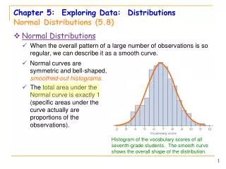
34. Histogram � A special kind of bar graph in which the data has been grouped into equal-sized intervals
35. Steps to Creating a Histogram Draw and label the axes of your histogram
List the intervals from the frequency table on the horizontal axes
Use the totals from the table to set the scale on the vertical axes
Draw the bar for each interval
The bars should be touching, the same width and shaded Example-Top 30 requested songs
36. Try a Histogram on your own The number of words that students in a typing class can type in a minute are listed below. First make a frequency table and then a histogram of the data.
25,19,23,29,34,26,30,40,33,20,35,35,25,29,36,22,31
37. Pictograph � a graph that shows data using symbols or pictures
39. EQ: What are measures of variation?
VOCABULARY: Variation, Range, Quartiles, Interquartile Range, outlier, 5 Number Summary
40. Vocabulary Variability � How a data set is spread out
Range � The difference between the greatest and least values in a data set
41. 58 � 19 = 39
42. Quartile: The three numbers that split an ordered data set in four equal groups
43. 5 Number Summary: the 5 numbers that divide a set of data into 4 equal groups.
1. Lower Extreme
2. Lower Quartile (Q1)
3. Median (Q2)
4. Upper Quartile (Q3)
5. Upper Extreme
44. Interquartile range: The difference between the first and third quartiles. (Note that the first and third quartiles are sometimes called upper and lower quartiles.)
45. Outlier � a number that is much greater than or much less than the rest of the numbers in a data set
48. Box-and-Whisker Plot: a way of organizing data into quartiles that is useful for showing data distribution
49. Step 1: Put the data in order from least to greatest
Step 2: Find the median
Step 3: Find the Lower Quartile
Step 4: Find the Upper Quartile
Step 5: Draw a number line
Step 6: Place a point above the median, lower quartile, and upper quartile
Step 7: Draw a box (with a vertical line thru the median)
Step 8: Place a point above the lower extreme
Step 9: Place a point above the upper extreme
Step 10: Draw the whiskers
50. 15 shoppers rated a brand of paper towel on a scale from 0-10
2, 6, 6, 6, 7, 8, 8, 8, 9, 10, 10
51. Homework: Box-and-whisker handout
53. Scatter Plot: a display of the relationship between two sets of data that are represented by points on a grid
57. Interactivate: Scatter Plot
59. Line graph � a type of graph that shows change over time using a line connecting data points
62. Circle Graph � a type of graph in which data is represented as part of a circle
63. Making a Circle Graph
64. Interactivate: Circle Graph
65. Ticket-out-the-door Create your own circle graph based on the survey data below. *HINT: A total of 50 students were surveyed!!
66. Classwork/Homework: Titanic Handout
67. Graphs that help us analyze data: Pictographs
Histograms
Bar graphs
Line graphs
Circle graphs
Line plots
Box-and-whisker plots
Scatter plots