Download
1 / 7
80 likes | 91 Views
Reading Graphs. Objective: I will learn to read numbers from different types of graphs. I will learn to compare numbers within the same graph. Graphs are a useful way to organize information. In this lesson we will review 4 types of graphs: Bar Graphs Pictographs Line Graphs

E N D
Reading Graphs Objective: I will learn to read numbers from different types of graphs. I will learn to compare numbers within the same graph.
Graphs are a useful way to organize information. • In this lesson we will review 4 types of graphs: • Bar Graphs • Pictographs • Line Graphs • Circle Graphs
Bar Graphs • Abar graph uses vertical or horizontal bars to display numerical information. The length of the bar tells you the number it represents. Use the bar graph at the right to answer the following questions: What type of pizza sold the most? What type of pizza sold the least? How many cheese and tomato pizzas were sold? How many ham and pineapple pizzas were sold? What is the difference between the number of cheese and tomato pizzas sold and the number of tuna and sweetcorn pizzas sold?
Pictograph • A pictograph uses symbols to represent data. • All of the symbols have the same value. • To determine the measure of an item in a pictograph, count the number of symbols and multiply them by the value of the symbol. Answer the following questions using the pictograph above: How much was the production of apples in 2004? What is happening to the production of apples between the year 2004 to 2008?
Line Graph • A line graph is used to show how a set of data changes over a period of time. • Each point represents an item of the data. • The height of the point represents the value of the data. • The time is shown by how far to the right the point is. • By observing the upward or downward slant of the lines connecting the points, you can describe the trends in the data. Questions: What is the line graph about? What is the busiest time of day at the store?
Circle Graph • A Circle Graph is made by dividing a circle into sections or categories. It allows for comparison of the part to the whole. • The larger the value of the data, the wider the section that represents the value. Questions: What percentage of students prefer pepperoni pizza? Which is the least favorite pizza topping?
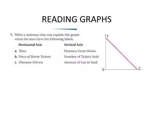
Fill in the blank with the name of the graph described. A ____________ uses symbols to represent data. A _____________ is used to show how a set of data changes over a period of time. A _____________, is made by dividing a circle into sections. A _____________ uses bars to display numerical information. Use the line graph at the right to answer each question. At what age do teens have the greatest number cell phones? __________ At what age do teens have the least number of cell phones? ____________ How many cell phones do 15 year-olds have? _________ Homework:


![[ 6.2] Reading Graphs](https://cdn3.slideserve.com/6514169/6-2-reading-graphs-dt.jpg)