Download
1 / 4
40 likes | 46 Views
Your website design can make or break your business ambitions. Which is why you should look at our list of mistakes website designers make. While web design might look pretty straight forward, it is more than just combining a few pictures and content together. https://goo.gl/4N6HDq

E N D
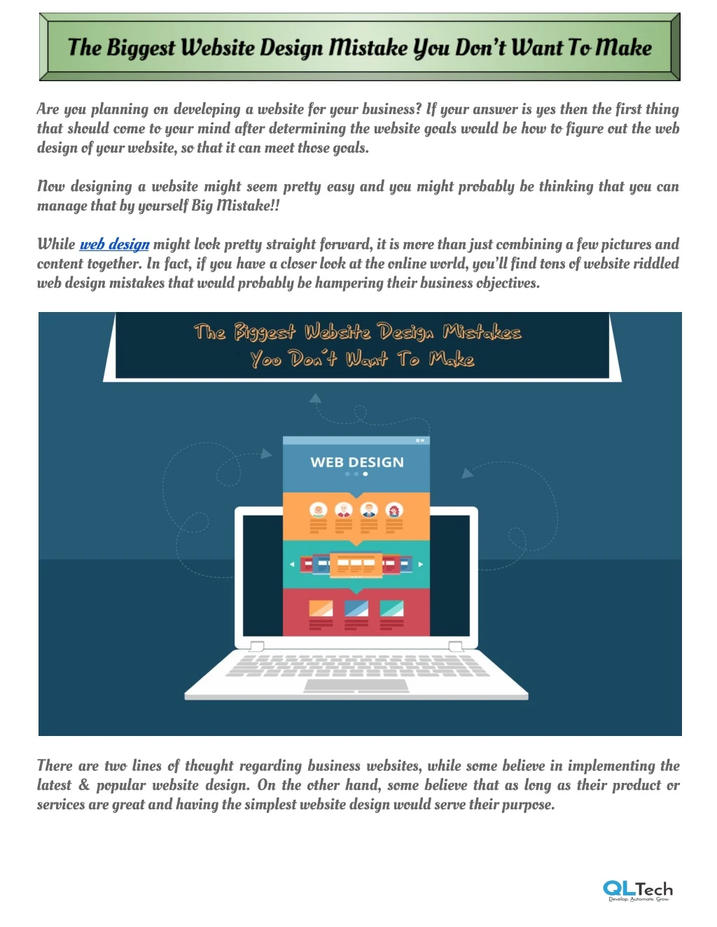
Are you planning on developing a website for your business? If your answer is yes then the first thing that should come to your mind after determining the website goals would be how to figure out the web design of your website, so that it can meet those goals. Now designing a website might seem pretty easy and you might probably be thinking that you can manage that by yourself Big Mistake!! While web design might look pretty straight forward,itismorethanjustcombiningafewpicturesand content together. In fact, if you have acloserlookattheonlineworld,you’llfindtonsofwebsiteriddled web design mistakes that would probably be hampering their business objectives. There are two lines of thought regarding business websites, while some believe in implementing the latest & popular website design. On the other hand, some believe that as long as their product or services are great and having the simplest website design would serve their purpose.
Both of these opinions are correct in their own regards as it mostly depends on their business objective and aspirations. For those of you who want to know all the critical mistakes to avoid while designing their website, they are at the right place. So let’s begin! 1) Don’t forget the basic principles People are used to things onthewebinacertainwaysuchasthebrandlogoontheleftorthetoolbaron the top left corner of the home page. Some brands try to be creative and try to fiddle with these elements by placing the tool somewhere in the middle or some other place on their website but it’s a long shot kind of thing. It mightworkoutfor some, but in most, they fail to achieve the site’s objective. Which is why although it’s a good idea to becreativewithyourwebsitedesign,betterthinktwicewhile making changes on the fundamentals. 2) Little Fonts You might be having great content on your website butitwouldhavenoeffectiftheusersdon’treadit. One of the major reasons is the size of you’re the font you are using in your website design. You have a very short amount of time to capture the interest of the user and restassuredthatmajority of the users will leave your site if they find it difficult to read the content. You need to make the content of your website as readable as possiblethereforeitisouradvicethatyou use appropriate font size preferably around 16 px in the text body which clear to read. 3) What’s the deal with sliders? You’ll find a lot of businessownersusingsliderswithintheirwebsitedesign,probablytheylookkindof techy and they wanted to display multiple offers in one place. Or maybe the web designersuggestedit as it is an easy solution to implement. If you have you rotating sliders in your website design then the question you need to ask yourself is if these really do lead to conversion? A study from the University of Notre Dameshowedthatonly1%ofusersengagewiththesliderandout of those 84% users clicked on the first option.
Thenwhyuseslidersratherkeepyourmainofferinyou’reaspaceofyourwebsitewhilelinkingittothe other offers available. Again this is our take on sliders for web designs if they’re working out for your business website then Kudos!! 4) Don’t clutter your home page We understand that you want to explain everything about your business on yourwebsitelikewhatyou do, how you do it, your inspirations, etcetera, etcetera. But the fact is guys when users specifically searched and came to your website they are rarelylooking for all that. Majority of the users only want to look at your key metrics, your previous customer experience and how to quickly complete their business with your brand. The best strategy for your web design would betoshowcaseconfidenceboostingelementssuchasclient reviews and accolades along with the clearly defined call to actions on top of your website. Try to be sequential and systematically prioritize all the elements while designing your business websitebecauseiftheusersfeelconfusedwhentheycomeovertoyoursite,theywillimmediatelyhitthe back button. 5) It’s all about CTAs What’s the use of having great content and awesome videos if the users don’t convert? Since thecallto action (CTA) button leads to successful conversions. It’s imperative that for you to position your CTAs in prominent places where you think the conversions are more like to happen. The more call to action buttons you include in your website design, the more is the probability of conversion but it depends on your home page length. It’s advisable thatyourhomepageshouldhaveat least 5 CTAs. Make sure you accentuate your CTA withhighcontrastingcolorsfromtherestofthehomepagesothat it stands out and catches user attention.
Last words… The design of your website can make or break your business ambitions. Your business website design comprises quite a few technical elements all working together in sync. Which is highly advised, that you hire a professional website designer which developing your website. We hope you found our tips of website design useful and hope that you make a fantastic site to fulfill your entrepreneurial ventures. All The Best!! Company Name Address Facebook Twitter Google+ Instagram Website :QL Tech : QL Tech - 45 St Georges Terrace, Ground Floor, Perth, 6000 : https://www.facebook.com/QLTechAU/ : https://twitter.com/qltechaustralia : https://plus.google.com/+QLTechPerth : https://www.instagram.com/qltechau/ : https://www.qltech.com.au/