Download
1 / 10
100 likes | 105 Views
Learn how to create basic x-y plots in MATLAB using the plot function. Understand how to create and customize plot elements such as title, legend, labels, and tick marks.

E N D
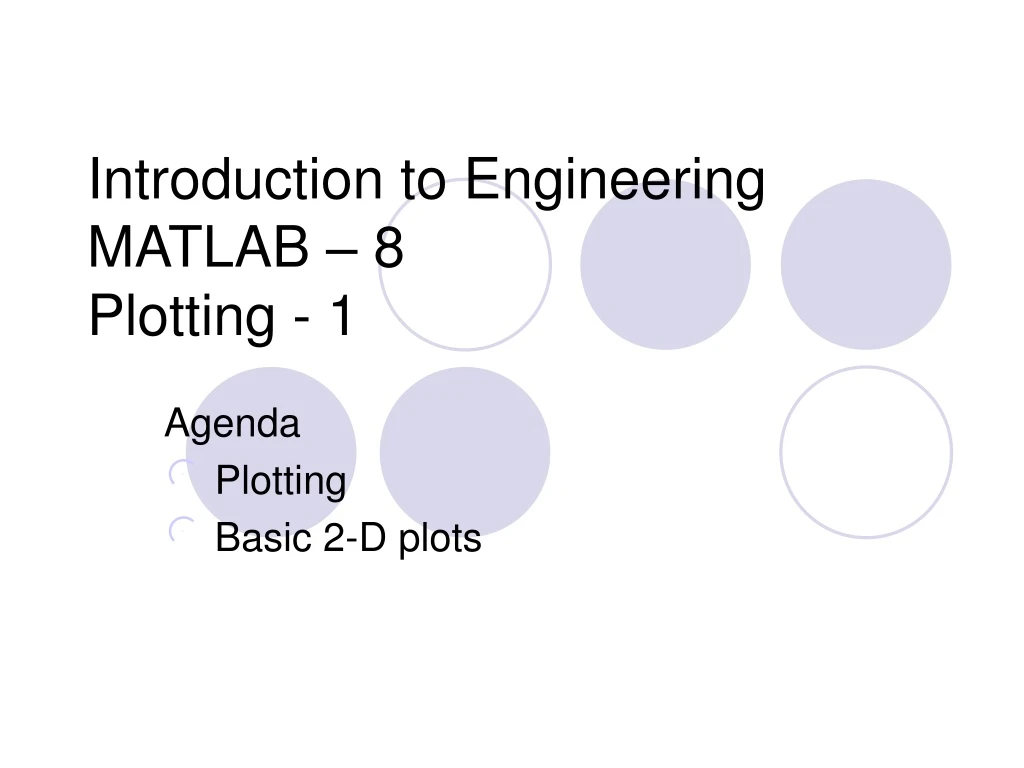
Introduction to EngineeringMATLAB – 8Plotting - 1 Agenda Plotting Basic 2-D plots
MAKING X-Y PLOTS MATLAB has many functions and commands that can be used to create various types of plots. In our class we will only create two dimensional x –y plots.
EXAMPLE OF A 2-D PLOT The plot displays the height as a function of time for a falling object. Plot title Legend y axis label Tick-mark Data symbol Text x axis label Tick-mark label
TWO-DIMENSIONAL PLOT COMMAND • The basic 2-D plot command is: • plot(x,y) where x is a vector (one dimensional array), and y is a vector. Both vectors must have the same number of elements. • The plot command creates a single curve with the x values on the abscissa (horizontal axis) and the y values on the ordinate (vertical axis). • The curve is made from segments of lines that connect the points that are defined by the x and y coordinates of the elements in the two vectors.
CREATING THE X AND Y VECTORS • If data is given, the information is entered as the elements in the vectors x and y. • If the values of y are determined by a function from the values of x, then a vector x is created first, and then the values of y are calculated for each value of x. The spacing (difference) between the elements of x must be such that the plotted curve will show the details of the function.
Year 1984 1986 1988 1990 1992 1994 1996 Population 127 130 136 145 158 178 211 CREATING A PLOT OF POPULATION GROWTH Data from lecture # 2: A plot can be created by the commands shown below. This can be done in the command window, or by writing and running a script file. >> year = [1984 1986 1988 1990 1992 1994 1996]; >> pop =[127 130 136 145 158 178 211]; >> plot(year,pop) Once the plot command is executed, the Figure Window opens with the following plot.
Creating a vector with spacing of 0.01 Calculating a value of y for each x CREATING A PLOT OF A FUNCTION Consider: A script file for plotting the function is: % A script file that creates a plot of % the function: 3^(-0.6x)*sin(5x) x = [0:0.01:5]; y = 3.^(-0.6*x).*sin(5*x); plot(x,y) Once the plot command is executed, the Figure Window opens with the following plot.
CREATING A PLOT OF A FUNCTION If the vector x is created with large spacing, the graph is not accurate. Below is the previous plot with spacing of 0.5. x = [0:0.5:5]; y = 3.^(-0.6*x).*sin(5*x); plot(x,y)