Download
1 / 32
320 likes | 324 Views
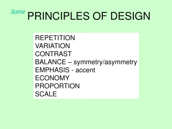
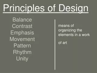
Principles of Design. Lines have a TYPE: straight, curved or angular . They may have a direction ; a relationship to the page edges. A line has a quality ...delicate or bold, thick or thin, rough or smooth.

E N D
Lines have a TYPE: straight, curved or angular. They may have a direction; a relationship to the page edges. A line has a quality...delicate or bold, thick or thin, rough or smooth.
The outline of something, a closed path of lines, is called a shape. It may be abstract or portray an object. They share the qualities of lines. Shapes have TYPE: straight, curved, angular; DIRECTION and QUALITY: rough smooth, etc.
Color can have a powerful effect on a design. The qualities of color are HUE, the name of a color such as red or blue; VALUE, the lightness or darkness, and SATURATION, the brightness or dullness...the amount of color intensity.
Value is the content of light and dark values. This is described as the contrast in a graphic.
There are TACTILE textures which you can touch and feel. There are VISUAL textures which give the illusion of a real tactile texture.
Format is simply the physical form of the design. The format you are viewing is a web browser page. Books, magazines, shopping bags, billboards, TV ads, labels and, brochures are all formats
In a graphic design, balance is an equal distribution of visual weight. It produces harmony and unity. Understanding Balance involves the study of several interrelated visual factors: weight, position and arrangement.
Visual Weight: Creation of the illusion of physical weight on a two-dimensional surface. The size, value, color, shape and texture of an element all contribute to its visual weight. Position: An element positioned at different points on the page will seem to have different visual weight. The center of the page is a powerful area and can carry a good deal of visual weight. Arrangement: There are basically two approaches to the arrangement of elements in a design.
Symmetry- Visual elements are centered on the page. It is always balanced. Asymmetry- To achieve Asymmetrical balance, dissimilar or unequal elements are arranged to place equal visual weight on either side of a design's center axis. An asymmetrical arrangement can be unbalanced if not properly designed. The arrangements of all the elements, the DESIGN, is crucial to asymmetrical balance. It is impossible to list the ways to achieve this. Every element and its position contributes to the delicate balance.
This design has been balanced asymmetrically. The visual weights have been arranged, taking advantage of various design elements. Line, direction, shape, texture, color... even the weight of the white space has been carefully manipulated. This design is symmetrically balanced. Everything has been centered. It is easy, safe and dependable.
Emphasis is the idea that some things are more important than others and important things should be noticed.
Visual Hierarchy: Before you emphasize anything you must establish a priority order of all your information. Consider these questions: Where do you look first? Where do you look second? Where do you look third? Focal Point: The part of the design that is most emphasized. This should be what the designer and client think is most important.
Accents: These are supporting focal points. They are in need of emphasis but at a level lower than the main focal point. • Some possible ways emphasize elements: • Make it brightest • Make it a different color • Make it in color if everything else is in black and white or vice versa • make it go in a different direction • Make it a different value • Position it differently • Give it a texture or a different texture then the other elements • Arrange all the elements to lead to it • Make it a different shape than the other elements • Isolate it • Make it clear and the other elements hazy • Make it an opaque color and the other colors transparent • Make it glossy and the other elements dull
The point of this ad is to sell the three-way calling feature.The two items you notice first are the headline and the photos. These both identify the one phone call concept.The second item that stands out is the logo. It has the boldest contrast on the page.The level-three message is the step-by-step instruction panel. It tells you how to make these calls.Finally, you can read the body copy, which is begun with a sub-headline.
A pattern created by repeating or varying elements, with consideration given to the space between them, and by establishing a sense of movement from one element to another. How do can you "get rhythm"? Use these two factors: Repetition: Repeat visual elements consistently.Variation: Change the color, size, shape, spacing, position, and visual weight of elements.
This rhythm is pure repetition. Repetition and variation of position and direction give this ad its rhythm.
This web page uses a uniform arrangement of a variety of elements, each set into a repeating border. The rhythm in this ad came built into the photo. Three similar giraffes with variations of pose and spacing.
The elements in a design look as though they belong together. They are an integrated whole, rather than unrelated parts. It promotes memorability, total effect and clear communication The designer uses an understanding of the formal elements and the other principles of design to establish a common bond among the elements of a design. There are a number of devices you can use to achieve unity.
Correspondence: When you repeat an element like color, direction, value, shape, or texture, or establish a style, like a linear style, you establish a visual connection or correspondence among the elements. Continuity: Related to correspondence, continuity is the handling of design elements, like line, shape, texture, and color to create similarities of form. Variety: Although an opposite of continuity, the two can be combined to add interest.
Grid: Subdividing the format into fixed horizontal and vertical divisions, columns, margins and spaces establishes a framework for organizing space, type and pictures in a design. Alignment: Visual connections can be made between and among elements when their edges or axes line up with one another. The eye detects these relationships and makes connections among the forms. Flow: Elements should be arranged so that the audience is led from one element to another. Flow is also called MOVEMENT and is connected to the principle of rhythm as the sense of movement from one element to another.
This ad gains unity from a repetition of colors. The photos and page elements share a brown-orange-yellow scheme. Similar boxed elements are used throughout and a 3-column grid underlies the pages. This ad also uses a repetition of colors. Repeating display type, repeating critters (variety!), repeating sidebar items...all applied with exuberance to a grid.
This one's been hit with a "Unity Stick". You've got to wonder who came up with the use of twigs. Was it a clever scheme from the thumbnail stage...or did it start with the unusual photo.
Space is always an active part of a design. It has a visual effect whether it is filled with images or it is empty. As you compose a picture or design you will usually have one element as the Focal Point. This will become the foreground and the space around it becomes the background. This relationship is flexible, the visual weight of foreground and background can vary.
This design has balanced foreground and background. Your eye can flip-flop between recognizing the white shapes or the black shapes as the foreground. The white space, which you usually assume to be background has been given extra importance by giving it equal area and adding little "eye" shapes. This arrangement of the figures creates a very powerful and interesting negative space. The contents of the negative space suggest a "twilight"... an atmospheric space effect.
By manipulating your visual elements you can create the illusion of Spatial Depth on a flat surface. It all happens on the Picture Plane, the flat surface of the format you are working with. You can create the illusion of spatial depth by mimicking the characteristics of space in the real world.
Perspective: Things which are farther away appear differently to us than those things nearby. These different qualities are described as perspective. The classic example of perspective shown below depicts railroad tracks, which are parallel, coming together as they stretch into the distance. They eventually seem to meet (an illusion) at a single place called the VANISHING POINT. We are very quick to read the clues in any scene which indicate a spatial relationship between elements.
These two shapes vary only in size. Do you perceive the blue shape to be farther away than the purple shape? If you do, you are responding to a difference in relative size or SCALE. We are used to seeing similar objects become smaller when they are farther away. Now which shape is closest? We know that an overlapping shape must be closer so the blue box is closer. The purple box is farther away but we now know it is the larger box.
This shape is taller on the right. Do you see it as a flat panel turned toward you? The top and bottom edges, if extended, would eventually meet at a vanishing point. If another shape is added, does the panel become a cube? The top and bottom edges now would extend to vanishing points on either side of the format. This is called two-point perspective. The previous flat shape only indicated one-point perspective.
Atmospheric Perspective: We have become accustomed to the effect of the atmosphere on the sights we see. Looking at objects far away we also see the dust, haze, bugs, fog or smog in the air. This tends to mute, to dim, to diffuse the color and detail of distant objects. This landscape shows an expanse of hills. We see them as going into the distance because they become dimmer in the distance (atmospheric perspective) and they get smaller (change of scale, a clue to linear perspective).
Trompe-l'oeil: This impressive term describes an illusion created by making an element appear to be a real object resting on a surface. The object can be rendered in extremely fine detail to achieve this. The object can also be set off the surface by the rendering of a shadow. Here is an example of trompe-l'oeil using the shadow effect to create the illusion of the graphics hovering over the web page.
This is a very flat appearing page design but it is accented by the icons which are inset into photorealistic sauce pans. This is trompe-l'oeil using only the fine detail technique. Here is another primarily 2-dimensional design but it is spiced up with a few illusions of space. The logo overlaps the blue panel to bring it forward and the characters to the left of the logo pop off the flat surface with the illusion of trompe-l'oeil.