Download
1 / 7
0 likes | 4 Views
Making responsive user interfaces is essential in the quick-paced world of mobile app development. Flutter offers a great foundation for building responsive UIs and Google's UI toolkit for developing natively built mobile, web, and desktop applications.

E N D
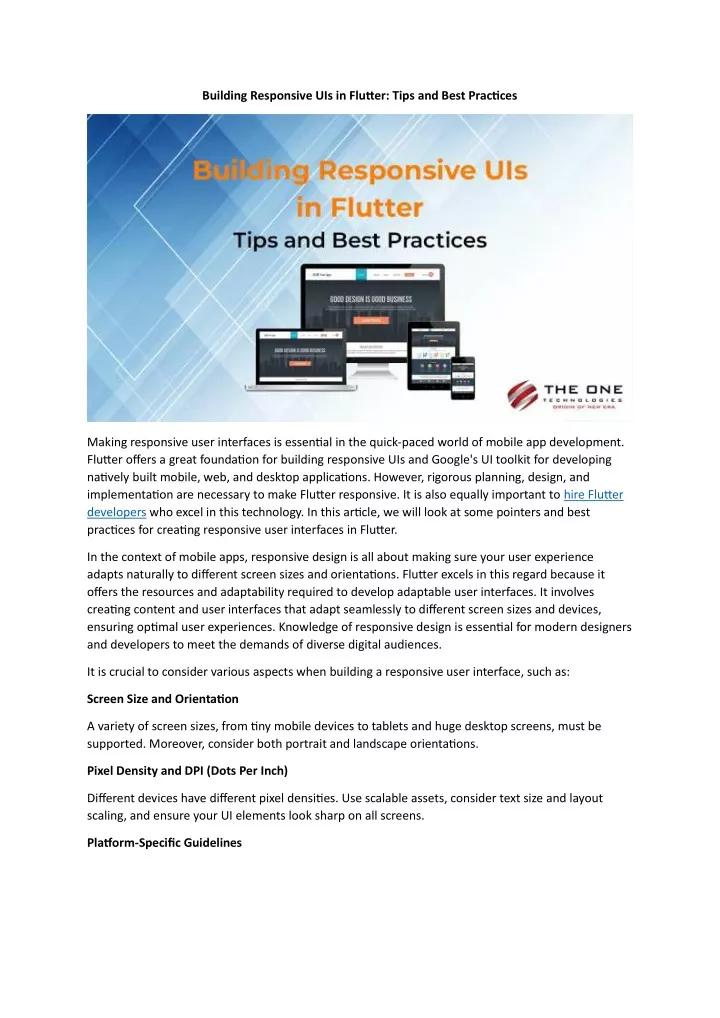
Building Responsive UIs in Flutter: Tips and Best Practices Making responsive user interfaces is essential in the quick-paced world of mobile app development. Flutter offers a great foundation for building responsive UIs and Google's UI toolkit for developing natively built mobile, web, and desktop applications. However, rigorous planning, design, and implementation are necessary to make Flutter responsive. It is also equally important to hire Flutter developers who excel in this technology. In this article, we will look at some pointers and best practices for creating responsive user interfaces in Flutter. In the context of mobile apps, responsive design is all about making sure your user experience adapts naturally to different screen sizes and orientations. Flutter excels in this regard because it offers the resources and adaptability required to develop adaptable user interfaces. It involves creating content and user interfaces that adapt seamlessly to different screen sizes and devices, ensuring optimal user experiences. Knowledge of responsive design is essential for modern designers and developers to meet the demands of diverse digital audiences. It is crucial to consider various aspects when building a responsive user interface, such as: Screen Size and Orientation A variety of screen sizes, from tiny mobile devices to tablets and huge desktop screens, must be supported. Moreover, consider both portrait and landscape orientations. Pixel Density and DPI (Dots Per Inch) Different devices have different pixel densities. Use scalable assets, consider text size and layout scaling, and ensure your UI elements look sharp on all screens. Platform-Specific Guidelines
Each design standard for iOS and Android is different. To make your app feel natural on each platform, abide by these rules. Best Practices for Creating Responsive User Interfaces in Flutter Let us now get into some pointers and best practices for creating responsive user interfaces in Flutter. Use Layout Builders Flutter's Layout Builders are a potent tool for designing responsive layouts. They enable you to adapt your response to the available screen area dynamically. Handling the screen's changing orientation is a frequent use case. To adjust the UI structure and layout based on available space, you can utilize a LayoutBuilder widget. Here is an illustration of how to use a LayoutBuilder. In this illustration, based on the screen size, we move between a desktop and mobile widget using the width restrictions. Use MediaQuery for Device Information The current device's screen size, orientation, and other details are disclosed via the MediaQuery class in Flutter. You can use this information to inform decisions you make in your code, such as changing the layout or font size dependent on the width of the screen.
You can easily develop user interfaces that adjust to different screen widths by utilizing MediaQuery. Use a Responsive Grid System. You can efficiently develop responsive user interfaces using a grid architecture. A responsive grid can be created using the GridView widget provided by Flutter. The grid's behavior can be adjusted based on screen size, and the number of items per row can be specified. In this example, we change the number of columns in the grid based on the screen width. Utilize Modular Widgets For building responsive layouts, Flutter is an ideal choice. This is because it offers Flexible and Expanded widgets, which are crucial for every project. They enable child widgets to occupy open space in a row or column adaptably. This is quite helpful when you want items to grow or shrink appropriately to different screen sizes.
In this illustration, a responsive design will result from the right side using twice as much space as the left side. Dividing the UI into More Compact Widgets Divide your user interface into smaller, reusable widgets. This is one of the guiding principles of Flutter development. When designing responsive user interfaces, this strategy becomes even more crucial. You can simply adjust and rearrange your UI's widgets when the screen size changes by breaking it up into smaller widgets. Make Use of Aspect Ratio You can modify a widget's aspect ratio by using the AspectRatio widget in Flutter. This is notably helpful for maintaining images' or movies' proper aspect ratios across various screens. For instance, you can ensure that an image always keeps a 16:9 aspect ratio, regardless of the screen size. Test on Actual Hardware The Flutter framework offers strong capabilities for creating responsive user interfaces, but testing your app on actual hardware is crucial to ensure everything functions as intended. Many hardware and software platforms may have unique peculiarities that can only be discovered through in-depth testing. Hire experts from a Flutter app development company with ample experience who know the possible testing scenarios and build an app that performs best under all conditions.
Manage Text Effectively Text can be a difficult feature for responsive UIs to manage. To change text size dependent on screen size or platform, use the style attribute of the Text widget. Consider using Google Fonts with varying font weights to ensure text is readable on various devices. Present Implementations that are Platform-Specific Platform-specific UI elements should be used when creating cross-platform applications. This guarantees that your program complies with each platform's design requirements. With the use of widgets like Cupertino and Material, Flutter makes this simple. Your app will have a native appearance and feel on both iOS and Android by offering platform- specific implementations. Manage Portrait and Landscape Orientations
Do not forget to test and adjust your user interface for both portrait and landscape orientations. Your UI needs to adjust since landscape mode can change the amount of screen real estate available. Utilize the Flutter Packages The open-source Flutter community has created a wide range of packages and multiple Flutter app development tools that can make it easier to create responsive user interfaces. You can make your responsive design efforts more efficient by using packages like responsive_builder, device_preview, and flutter_screenutil. Consider Accessibility A successful app needs to be accessible. Make sure accessibility features are not compromised by your responsive design. Make sure all UI elements are accessible and intelligible by testing your app with screen readers. Performance Enhancement Think about how your design decisions may affect performance while creating responsive user interfaces. Keep your layouts simple and avoid excessive widget rebuilds because these might affect performance, especially on low-end devices. Conclusion The gratifying adventure of creating responsive user interfaces with Flutter calls for close attention to detail, exhaustive testing, and profound comprehension. In conclusion, crafting responsive user interfaces in Flutter is a fundamental aspect of delivering a seamless and engaging user experience across various devices and screen sizes. By following the tips and best practices discussed in this article, developers can ensure that their Flutter applications not only adapt to different form factors but also remain performant and visually appealing. Understanding the importance of MediaQuery, LayoutBuilder, and MediaQueryData classes, as well as utilizing flexible widgets like Expanded and Flexible, allows us to create UIs that are not only responsive but also efficient. Moreover, leveraging the power of MediaQuery to handle different screen orientations and employing platform-specific adaptations guarantees that the user experience remains consistent on both iOS and Android. Hire Flutter developers who have sufficient knowledge of all the aspects of Flutter app development. Frequently Asked Questions Why is responsive UI design important when creating mobile apps? Because it guarantees that your software appears and performs effectively on several devices, screen sizes, and orientations, responsive UI design is crucial. It improves user experience and expands the audience for your app. Is Flutter a good framework for creating responsive user interfaces? Flutter is a great option for creating responsive UIs, indeed. It features a variety of tools and widgets to help you customize your user interface for various screen sizes and orientations. Hire Flutter app
developers who are well-equipped with the knowledge and skills to get the best output for your project. How can I make text in Flutter responsive? Text can be made responsive by changing the font size according to the size of the screen. To conditionally set the font size using MediaQuery or other screen size factors, use the style property of the Text widget. In Flutter, what are the best methods for dealing with landscape and portrait orientations? Use the MediaQuery class to determine the current orientation and modify your UI layout and widgets accordingly to handle both landscape and portrait orientations. For finer customization, think about utilizing the OrientationBuilder widget. Do any Flutter packages make it easier to create responsive user interfaces? Yes, there are several Flutter packages that can aid in the building of responsive user interfaces, including "responsive_builder," "device_preview," and "flutter_screenutil." These programs offer tools and widgets to make the process more efficient. How can I make sure that my responsive design is still usable by everyone? Test your app with screen readers and adhere to the best practices for accessible widget labels, semantics, and navigation to ensure accessibility in responsive design. Ensure that UI elements are accessible and understandable. What typical mistakes should you avoid while creating responsive user interfaces in Flutter? Using hardcoded dimensions, ignoring landscape orientation, and disobeying platform-specific design rules are common errors to avoid. It is crucial to test your software on actual hardware and take performance issues into account. Can I use Flutter to mix responsive design with animations and sophisticated interactions? Yes, Flutter allows you to incorporate complex interactions, animations, and responsive design. To guarantee a seamless user experience across all devices, you must carefully test and performance- optimize your code. Original Source: Building Responsive UIs in Flutter: Tips and Best Practices