Download
1 / 2
0 likes | 8 Views
In todayu2019s fast-paced digital world, the way we access and consume online content has shifted dramatically. More than ever, we use our smartphones and tablets to browse the web, shop online, and connect on social media. As a customer, what does this mean for your online experience, and why should you care about responsive design and mobile optimization? Letu2019s dive in.

E N D
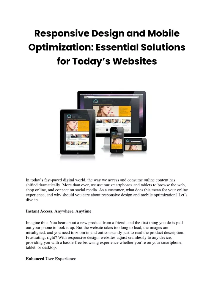
Responsive Design and Mobile Optimization: Essential Solutions for Today’s Websites In today’s fast-paced digital world, the way we access and consume online content has shifted dramatically. More than ever, we use our smartphones and tablets to browse the web, shop online, and connect on social media. As a customer, what does this mean for your online experience, and why should you care about responsive design and mobile optimization? Let’s dive in. Instant Access, Anywhere, Anytime Imagine this: You hear about a new product from a friend, and the first thing you do is pull out your phone to look it up. But the website takes too long to load, the images are misaligned, and you need to zoom in and out constantly just to read the product description. Frustrating, right? With responsive design, websites adjust seamlessly to any device, providing you with a hassle-free browsing experience whether you’re on your smartphone, tablet, or desktop. Enhanced User Experience
Mobile optimization ensures that the website’s design, structure, and functionalities are tailored for mobile devices. This means faster load times, easy-to-tap buttons, and intuitive navigation. As a result, you, the customer, enjoy a smoother, more enjoyable online experience, reducing the chances of abandoning the website out of frustration. Stay Relevant with Changing Trends Let’s be honest, a business that doesn’t adapt to the digital age risks being left behind. As a customer, opting for businesses with responsive websites ensures you’re interacting with brands that understand and cater to modern user behavior and needs. Secure and Up-to-date Often, optimized websites also prioritize security and regular updates. This ensures not only a smooth user experience but also a safe environment for your online transactions, giving you peace of mind while shopping or signing up for services. Improved Search Visibility From a consumer’s perspective, mobile-optimized websites tend to rank higher on search engine results. This means when you’re looking for a product, service, or information, the top results on your mobile device will likely be websites that offer a mobile-optimized experience. It saves you from sifting through websites that might not render well on your device. Consistency across Devices Ever tried accessing a website on your phone and then later on a desktop, only to feel like you’re looking at two completely different sites? With responsive design, the look and feel of a website remains consistent across devices, making your browsing experience more predictable and familiar. Cost Savings While you might wonder how customers save money, think about the data costs. Websites not optimized for mobile often consume more data, leading to increased costs for you, especially if you’re on a limited data plan. Mobile-optimized sites generally use less data, saving you money in the long run. Responsive design and mobile optimization are no longer just fancy buzzwords; they’re essential for providing a user-friendly online experience in today’s mobile-centric world. As customers, it’s crucial to prioritize businesses that value these aspects, ensuring you get the best online experience possible while also supporting forward-thinking businesses. Tag: website designing company in delhi, website development company in delhi
