Download
1 / 13
130 likes | 225 Views
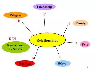
Relationships. If we are doing a study which involves more than one variable, how can we tell if there is a relationship between two (or more) of the variables ?. Association Between Variables :. Two variables measured on the

E N D
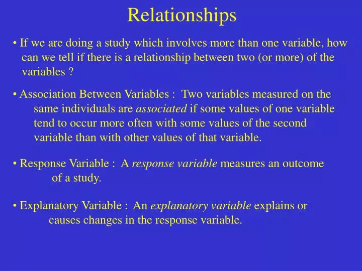
Relationships • If we are doing a study which involves more than one variable, how • can we tell if there is a relationship between two (or more) of the • variables ? • Association Between Variables : Two variables measured on the same individuals are associated if some values of one variable tend to occur more often with some values of the second variable than with other values of that variable. • Response Variable : A response variable measures an outcome of a study. • Explanatory Variable : An explanatory variable explains or causes changes in the response variable.
Scatterplots • A scatterplot shows the relationship between two variables. • The values of one variable appear on the horizontal axis, and the • values of the other variable appear on the vertical axis. • Always plot the explanatory variable on the horizontal axis, and the • response variable as the vertical axis. Example: If we are going to try to predict someone’s weight from their height, then the height is the explanatory variable, and the weight is the response variable. • The explanatory variable is often denoted by the variable x, and is • sometimes called the independent variable. • The response variable is often denoted by the variable y, and is • sometimes called the dependent variable.
Scatterplots Father’s Height Son’s Height Example: Do you think that a father’s height would affect a son’s height? We are saying that given a father’s height, can we make any determinations about the son’s height ? The explanatory variable is : The father’s height The response variable is : The son’s height Data Set : 64 65 68 67 68 70 70 72 72 75 74 70 75 73 75 76 76 77 77 76
Father’s Height Son’s Height Father’s Height Son’s Height 64 65 74 70 68 67 75 73 68 70 75 76 70 72 76 77 72 75 77 76 Response Variable (Son’s Height) 76 72 Explanatory Variable (Father’s Height) 68 64 64 68 72 76
Father’s Height Son’s Height Father’s Height Son’s Height 64 65 74 70 68 67 75 73 68 70 75 76 70 72 76 77 72 75 77 76 76 72 68 64 64 68 72 76 Son Father
Examining A Scatterplot • In any graph of data, look for the overall pattern and for striking • striking deviations from that pattern. • You can describe the overall pattern of a scatterplot by the form, • direction, and strength of the relationship. • Strength : How closely the points follow a clear form. • An important kind of deviation is an outlier, an individual that • falls outside the overall pattern of the relationship. • Two variables are positively associated when above-average values • of one tend to accompany above average values of the other and • below average values also tend to occur together. • Two variables are negatively associated when above-average values • of one accompany below-average values of the other; and vice versa.
Examining A Scatterplot 76 Son 72 68 Father 64 76 72 64 68 Consider the previous scatterplot : Direction : Going up Form : Linear Association : Positive Strength : Strong Outliers : None
Example : The following is a scatterplot of data collected from states about students taking the SAT. The question is whether the percentage of students from a state that takes the test will influence the state’s average scores. For instance, in California, 45 % of high school graduates took the SAT and the mean verbal score was 495. Direction : Downward Form : Curved Association : Negative Strength : Strong Outliers : Maybe
Categorical Variables • To add a categorical variable to a scatterplot, use a different plot • color or symbol for each category. Example : Take the last scatterplot and mark the northeastern states with an “e” and the midwestern states with an “m” : Notice the grouping : Outliers ?
Notes (Figure 2.5) (Figure 2.6) • When we draw the line though the data set, we are drawing the model • we want to use for the data set. We would like to find the equation for • this line to help us understand the data. This is called “smoothing”.
Notes • When we draw the line though the data set, we are drawing the model • we want to use for the data set. We would like to find the equation for • this line to help us understand the data. This is called “smoothing”. • How can we display a relationship between a categorical explanatory • variable, and a quantitative response variable : • Use a back-to-back stemplot to compare the distributions • Use side-by-side boxplots to compare any number of • distributions.
Example : It would make sense that the more hours people work in a week would lead to higher wages. The Census Bureau publishes relevant data. Unfortunately, “how much a person works appears as a categorical variable : A = 26 weeks or less B = 27 to 39 weeks C = 50 weeks or more Notice also that wages is a quantitative variable.
Homework 1, 3, 4, 6, 7, 10, 13, 17