Download
1 / 8
80 likes | 83 Views
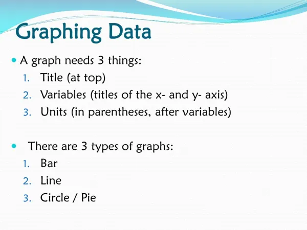
8.1 Graphing Data. In this chapter, we will study techniques for graphing data. We will see the importance of visually displaying large sets of data so that meaningful interpretations of the data can be made.

E N D
8.1 Graphing Data In this chapter, we will study techniques for graphing data. We will see the importance of visually displaying large sets of data so that meaningful interpretations of the data can be made.
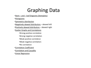
Bar GraphsBar graphs are used to represent data that can be classified into categories. The height of the bars represents the frequency of the category. For ease of reading, there is a space between each bar. The bar graph displayed below represents how consumers obtain their information for purchasing a new or used automobile. There are four categories (consumer guide, dealership, word of mouth and the internet. The graph illustrates that the category most used by consumers is the Consumer Guide.
Broken line graph: This graph is obtained from a bar graph by connecting the midpoints of the tops of consecutive bars with straight lines.
A pie graph is used to show how a whole is divided among several categories. The amount of each category is expressed as a percentage of the whole. The percentage is multiplied by 360 to determine the number of degrees of the central angle in the pie graph.
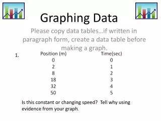
Rounds of golf played by golfers Class: Frequency This graph has seven classes. The notation [0,7) includes all numbers that are greater than or equal to zero and less than 7. The class with the highest frequency is the class[ 28, 35) with a class frequency of 23. A Frequency Distribution is used to organize a large set of numerical data into classes. A frequency table consists of 5-20 classes of equal width along the frequency of each class. Here is an example:
Relative Frequency Distribution The total number of observations is 75. The third column of percentages is found by dividing the numbers in the second column by 75 and expressing that result as a percentage. A relative frequency distribution is constructed by taking the frequency of each class and dividing that number by the total frequency to get a percentage. Then a new frequency distribution is constructed using the classes and their corresponding relative frequencies:
A histogram is similar to a vertical bar graph with the exception that there are no spaces between the bars and the horizontal axis always consists of numerical values. We will represent the frequency distribution of the previous slides with a histogram: • The histogram shows a symmetric distribution with the most frequent classes in the middle between 21 and 35 rounds of golf.
A frequency polygon is constructed from a histogram by connecting the midpoints of each vertical bar with a line segment. This is also called a broken-line graph. • Frequency polygon