Download
1 / 33
370 likes | 1.44k Views
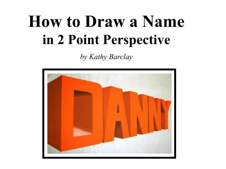
How to Draw a Name in 2 Point Perspective by Kathy Barclay. The rectangle below represents your drawing paper. The lines extending off the paper are the ends of the eye level line. You can attach strips of paper for this purpose.

E N D
How to Draw a Name in 2 Point Perspective by Kathy Barclay
The rectangle below represents your drawing paper. The lines extending off the paper are the ends of the eye level line. You can attach strips of paper for this purpose. The vanishing points are not marked but they are at the ends of the line shown.
Like an outside corner of a building or box, take orthogonals from the top and bottom to the point on the left…
To divide the “box” in half, draw diagonals from the opposing corners.
To further divide into 4 parts, use the crossing diagonals method again in each half.
Establish the width of the first letter, find the midpoint of the 2nd line, cross from top of corner line through midpoint and where it lands on the bottom orthogonal is where the next line goes.
That is so that I can make the letters a consistent thickness. Notice the vertical line drawn to establish the width of the left side of the first letter. Once that is established, a line is drawn to the VP to show the top thickness of ALL the letters.
Notice the second letter has verticals that start at the place where the orthogonal crosses the X… …and the center of the “T” is smaller since it is farther away.
Look at the thickness of the top bar of each letter to help determine the thickness of the center horizontal bars. Since these horizontal lines are on the front of the letters, they must go to the point on the right.
Erasing the part of the orthogonals no longer needed is helpful, but now we have to do a bit more shaping of the letters.
Place arches at the corners where the letters curve…as shown.
Now, to show the depth of the letters we will take lines to the point on the left. Draw a line from every corner and every place where a curve starts or stops.
Erase all lines that are no longer needed. Establish your source of light and shade accordingly. Remember to change the value abruptly at corners where flat planes meet, and shade gradually wherever a surface curves.
The following are examples done by the art teacher and some of her students.