Download

1 / 10
100 likes | 111 Views
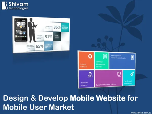
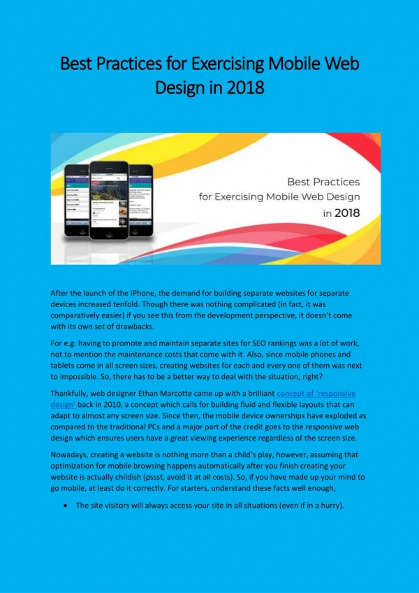
What is Mobile-Friendly Web Design?<br><br>Website images, text, videos and links are accessible across all devices and platforms, particularly on smartphones.<br><br>Features of Mobile-Friendly Web Design<br><br>Easy Navigation<br>Multiple swiping functionalities<br>Intuitive Interface<br>Location enabled<br><br>Why Mobile-Friendly Website<br><br>In 2017, more than 57% of Google Queries originated from mobile devices.<br><br>Mobile users spend twice more time on a website as compared to desktop users.<br><br>On average, a user spends 70% of their smartphone time in media.<br><br>96% of the total mobile search queries are driven by Google.<br><br>How does a Mobile-Friendly Design work?<br><br>A mobile-friendly design requires a few changes in the website design, layout and content so that it can adapt to the mobile platform and devices of different sizes. The basic content structure, however, remains the same.<br><br>Benefits<br><br>Increased traffic conversion<br>Increased search engine visibility<br>Increased website reach to mobile and tablet users<br>No need to create a separate mobile website<br>Improved mobile user experience<br>Advantage over competitors<br>Faster loading speed<br>Connectivity and portability<br><br>Mobile-friendly web design tips<br><br>Design your website to be mobile-responsive, and not just mobile-friendly<br><br>Make flexible images that can adapt to any size<br><br>Optimize your content for mobile<br><br>Compress your website images and content without compromising with the quality<br><br>Design a proper mobile navigation<br><br>Ensure buttons work properly even on smaller screens<br><br>Create a wonderful user experience on mobile devices.<br><br>Visit Website: https://www.sagipl.com/responsive-website-design/

E N D