Download
1 / 17
260 likes | 813 Views
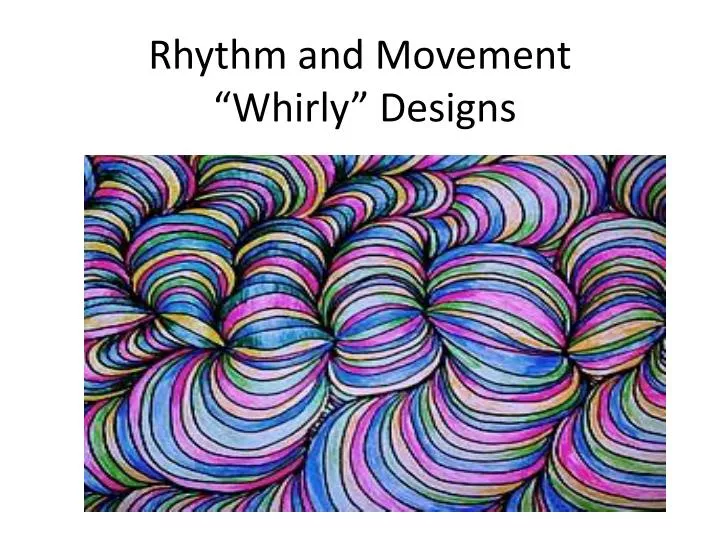
Rhythm and Movement “Whirly” Designs. Learning Goal - . TO APPLY OUR KNOWLEDGE OF THE 2 ART PRINCIPLES RHYTHM AND MOVEMENT INTO CREATING AN ABSTRACT WHIRLY DESIGN. .

E N D
Learning Goal - • TO APPLY OUR KNOWLEDGE OF THE 2 ART PRINCIPLES RHYTHM AND MOVEMENT INTO CREATING AN ABSTRACT WHIRLY DESIGN.
Start by drawing a curved line across the paper. Think rolling hill...not roller coaster! Nice gentle slopes make sure they are in the center of your paper and they go from edge to edge. Have your paper orientation hotdog style (horizontal).
Add 8 dots randomly along the curved line. They should be at different lengths apart. You need the two end dots relatively close to the edges of your paper.
You will then start connecting the dots using small arches. The dots close to the edge will go off the edge of the paper to an imaginary dot. You can not cross over any lines. However, you can share a line as you begin going up and out. The lines should be taken off the edge of the paper as you extend out words.
Go dot - to - dot across the entire line. Make sure to vary the size of your arches slightly to create the illusion of form (3D).
As you are going dot -to- dot, you need to "camp out" on some of the segments. This will help them to balloon out. This will also cause others to be "pinched off"...and that is fine. The lines need to continue off of the paper...and should not just stop because they’re close to the edge. As the shape gets bigger, the lines will have to be shared when going back to the initial dot. Going back to the dot each time is what creates the darker shadowed areas that help create depth.
The lines should NEVER criss-cross over each other. The lines can share a path...but never cross over another line.
Another WRONG way to do this. The picture here is the "RAINBOW EFFECT". It is a lot easier to do it this way.. but it is not correct. You will not get the shadowed effect.
Here you see the results of the lines ballooning out, pinching off, and going off the edge of your paper. This is a great example of what your drawing should look like!
We will then be adding color and value to create RHYTHM using COLORED PENCILS. The colors you choose are completely up to you. Remember to integrate value. The “skinny” parts of each section should be darker. The thicker parts of each section should be lighter to create the form. In the end this will really create beautiful movement in the artwork.
You may want to use a specific color scheme when integrating rhythm (warm or cool). Remember no two colors should be touching each other..
When coloring its best to work in columns to keep track of the process and to guarantee none of the same two colors are touching each other. Please apply Rhythm. I am not going to super strict just TRY. Without this you will lose the effect of movement and the final result will be stoic and flat looking.
Make sure you stay Patient, Productive and Positive and you will have great results in the end! Have fun! These are going to be sweet!Youwill be doing a practice one in your sketchbooks before getting the final paper for your final drawing.