Download
1 / 21
210 likes | 350 Views
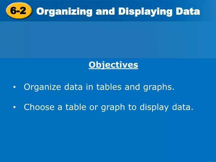
6-2. Organizing and Displaying Data . Objectives Organize data in tables and graphs. Choose a table or graph to display data. Lesson Quiz: 6-1 Answers . 1. Which two apartments are about the same size?. 2. In which week(s) did store B charge more than store A? .

E N D
6-2 Organizing and Displaying Data • Objectives • Organize data in tables and graphs. • Choose a table or graph to display data.
Lesson Quiz: 6-1 Answers 1. Which two apartments are about the same size? 2. In which week(s) did store B charge more than store A?
Lesson Quiz: 6-1 Answers 1. Which two apartments are about the same size? Lamar Place and Candlerun 2. In which week(s) did store B charge more than store A? Week one
Use a circle graph to show how a set of data is divided into parts. Use a bar graph to display and compare data. Use a line graph to show how data change over a time period.
Example 1: Choosing and Creating an Appropriate Display Flowers in an Arrangement Use the given data to make a graph. Explain why you chose that type of graph. Step 1 Choose an appropriate scale and interval. The scale must include all of the data values.
Example 1: Choosing and Creating an Appropriate Display Flowers in an Arrangement Use the given data to make a graph. Explain why you chose that type of graph. A bar graph is good for displaying categories that do not make up a whole. Step 1 Choose an appropriate scale and interval. The scale must include all of the data values.
Example 1 Continued Step 2 Use the data to determine the lengths of the bars. Draw bars of equal width. The bars should not touch. Step 3 Title the graph and label the horizontal and vertical scales.
Example 1 Continued Step 2 Use the data to determine the lengths of the bars. Draw bars of equal width. The bars should not touch. Step 3 Title the graph and label the horizontal and vertical scales.
Degrees Held by Faculty Example 2: Choosing and Creating an Appropriate Display Use the given data to make a graph. Explain why you choose that type of graph. Step 1 Calculate the percent of total represented by each category. Bachelor's: PhD: Master's:
Degrees Held by Faculty Example 2: Choosing and Creating an Appropriate Display Use the given data to make a graph. Explain why you choose that type of graph. A circle graph is good for displaying categories that make up a whole. Step 1 Calculate the percent of total represented by each category. Bachelor's: PhD: Master's:
Degrees Held by Faculty Bachelor's: PhD: Master's: Example 2: Choosing and Creating an Appropriate Display Use the given data to make a graph. Explain why you choose that type of graph. A circle graph is good for displaying categories that make up a whole. Step 1 Calculate the percent of total represented by each category.
Example 2 Continued Step 2 Draw a circle. Mark the center and use a straightedge to draw one radius. Then draw each central angle. Step 3Title the graph and label each sector.
Example 2 Continued Step 2 Draw a circle. Mark the center and use a straightedge to draw one radius. Then draw each central angle. Step 3Title the graph and label each sector.
County Farms 248 Example 3: Choosing and Creating an Appropriate Display Use the given data to make a graph. Explain why you chose that type of graph. Step 1 Determine the scale and interval for each set of data. Time should be plotted on the horizontal axis because it is independent.
County Farms 248 Example 3: Choosing and Creating an Appropriate Display Use the given data to make a graph. Explain why you chose that type of graph. A line graph is appropriate for this data because it will show the change over time. Step 1 Determine the scale and interval for each set of data. Time should be plotted on the horizontal axis because it is independent.
County Farms 248 Example 3: Choosing and Creating an Appropriate Display Use the given data to make a graph. Explain why you chose that type of graph. A line graph is appropriate for this data because it will show the change over time. Step 1 Determine the scale and interval for each set of data. Time should be plotted on the horizontal axis because _________________________
Example 3 Continued Step 2 Plot a point for each pair of values. Connect the points using line segments. Step 3 Title the graph and label the horizontal and vertical scales.
Example 3 Continued Step 2 Plot a point for each pair of values. Connect the points using line segments. Step 3 Title the graph and label the horizontal and vertical scales.
Lesson Quiz 6-2 For each description of the data set, tell what type of display would be most appropriate. 1. The number of points scored per game by the basketball team during the season. 2.The percentage of the variety of cakes made by a bakery. 3.The number of magazine subscriptions sold by each member of the sales staff.
Lesson Quiz 6-2 For each description of the data set, tell what type of display would be most appropriate. The number of points scored per game by the basketball team during the season Time= line 2.The percentage of the variety of cakes made by a bakery. Parts of whole= pie/circle 3.The number of magazine subscriptions sold by each member of the sales staff. Comparison= bar
Classwork/Homework 6-2Worksheet