Download

1 / 22
220 likes | 297 Views
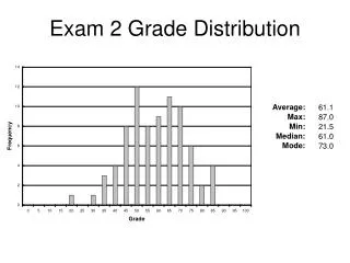
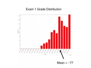
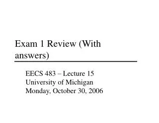
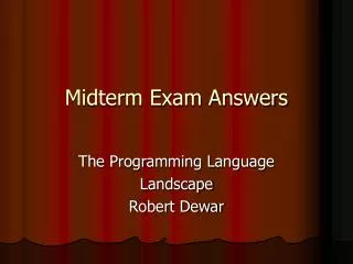
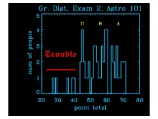
Exam 1 Grade Distribution and Answers. IS 485, Professor Matt Thatcher. Mean: 81.24 Std Dev: 12.59 Median: 83. Min: 42 Max: 95. Design. Prototype. Evaluate. Waterfall vs. Prototyping. Initiation. Application Description. Analysis. Requirements Specification. Design. System

E N D
Exam 1 Grade Distribution and Answers IS 485, Professor Matt Thatcher
Mean: 81.24 Std Dev: 12.59 Median: 83 Min: 42 Max: 95
Design Prototype Evaluate Waterfall vs. Prototyping Initiation Application Description Analysis Requirements Specification Design System Design Implement Product
Problems with WF • WF lacks user’s perspective • technology-driven • focus is on the “client”, not the “user” • does not involve user until “implementation” stage • sees user role as finding “bugs” in the code or other minor problems • WF has no feedback (sequential, not iterative) • groups “hand off” discrete deliverables to the next group in the WF process • functional specs are frozen early in the process • high cost of fixing errors • increases by factor of 10 at each stage • iterative design finds these earlier
Measuring Usability • Easy to learn • how long does it take for typical users to learn relevant tasks? • Easy to remember • how easy is it to remember from one session to the next? • Efficient to use • how long does it take to perform benchmark tasks? • Minimal error rates • how many and what kinds of errors are commonly made? • if they occur, is good feedback provided so users can recover • High user satisfaction (subjectively pleasing) • confident of success • visually pleasing
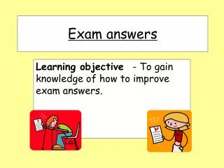
User Model Design Model System UI Design Model and User Model • Users gets model from their background, experiences and the design elements of the UI • What if design & user models don’t match?
User’s Model Design Model System UI Summary(continued) User sees the design choices User interprets UI elements based on her characteristics and experiences Designer’s UI design choices
Make Things Visible (1/2) • Affordances • physical properties (shape, texture, color, etc.) of an object that show functionality • appearance indicates how the object should be used without the need for words, labels, instructions, etc. • the user know what to do instinctively • examples: chair, scissors, staple remover, “buttons” (clickable), knobs, doors, British Rail partition • Complex things may need explaining, but simple things should not
Provide Good Metaphors • Use of a concept or word from one setting (e.g., real world) to convey meaning in another (e.g., digital world) • physical analogies (e.g., trash, spreadsheet, file cabinet) • cultural standards (e.g., color, words) • Help reduce cognitive load for user • Use of metaphors in design should be based on an understanding of user’s model • Communicate that metaphor to the user through the UI
User Interface Design Usability Evaluation Information Architecture Design Specialties • Information Architecture • encompasses information & navigation design • User Interface Design • also includes testing & evaluation Information Design Navigation Design Graphic Design
Physiology of the Eye • Lens is not color corrected chromostereopsis, produces 3D effect Lens White Light Retina (separated wavelengths)
Lens Focus on Red Light Retina Lens Focus on Blue Light Retina
Implication of Chromostereopsis • Spectrally extreme colors produce eye strain (refocusing)
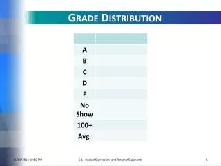
Rods B&W Cones color Physiology of the Eye • Composition of the eye (retina), wavelength sensitivity 65% 2% 33%
The Aging Process • Lens tends to yellow and absorbs shorter wavelengths • causing increased insensitivity to blue • Fluids in the eye suffer from reduced transparency • Perceive a lower level of brightness • Implications • don’t rely on blue for text or small objects • older users need brighter colors
Heuristics of Good GUI Design(Jakob Nielsen) • H2-1: Visibility of system status • H2-2: Match between system and real world • H2-3: User control and freedom • H2-4: Consistency and standards • H2-5: Error prevention • H2-6: Recognition over recall • H2-7: Flexibility and efficiency of use • H2-8: Aesthetic and minimalist design • H2-9: Help users recognize, diagnose, and recover from errors • H2-10: Help and documentation
Task Analysis Questions • Who is going to use system? • What tasks do they perform? • What new tasks are desired? • How critical are the tasks? • How often do the users perform the tasks? • What are the time constraints on the tasks? • How are the tasks learned? • Where are the tasks performed? • How do users communicate with each other? • What happens when things go wrong?
Contextual Inquiry • Way of understanding users’ needs & work practices • Master – apprentice model allows user to teach us what they do! • master does the work & talks about it while working • we interrupt to ask questions as they go • The Where, How, and What expose the Why “Think aloud” and “probing questions”
Principles • Context • go to the workplace & see the work as it unfolds • people summarize in interviews, but we want details • Partnership • master-apprentice relationship, yes; other models, no • avoid interviewer/interviewee (stops work) • set expectations at the start • partnership allows more apprentice interaction • alternate between watching & probing (withdraw and return)
What Should Scenarios Look Like? • Say what the user wants to do (the goal), but not how the user would do it • allows comparison of different design alternatives • Scenarios should say who the users are • name names (John Berry) • characteristics of the users (e.g., job title) • Should be specific, short, and in the user’s words • forces us to fill out description with other details that become important • provides enough information to complete the goal (e.g., John wants to purchase a blue polo shirt - size medium - for less than $50.00. Please help him find a product that matches this description and purchase it.) • Should describe a complete job
Logo + value prop High-Level Browse Categories Search Image Relate +Promote Headline Relate +Promote Browse Fold Headline Relate +Promote Headline Headline Relate +Promote
Independent Evaluations Aggregated List of Violations Independent Severity Ratings Summary Report with Avg Severity Ratings (SR) Final HE Report with SR and Fix Ratings