Download
1 / 20
200 likes | 347 Views
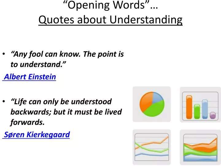
“Opening Words”… Quotes about Understanding. “Any fool can know. The point is to understand.” Albert Einstein “Life can only be understood backwards; but it must be lived forwards. Søren Kierkegaard. AIM = Why do we use tables and graphs…?. * Tables and graphs are used to

E N D
“Opening Words”…Quotes about Understanding • “Any fool can know. The point is to understand.” Albert Einstein • “Life can only be understood backwards; but it must be lived forwards. Søren Kierkegaard
AIM = Why do we use tables and graphs…? * Tables and graphs are used to collect, organize, and interpret data. Introduction to Tables commonly used in collecting and organizing raw data during an experiment also for representing final data to be included in a paper or report. “raw” data are recorded in tabular form in a spreadsheet, a lab notebook, or a lab manual once recorded, data need to be reorganized, summarized, and reshaped into a final table or graph
Bar Graphs • A bar graph typically has spaces between the bars and is used to depict categorical data.
Histograms and Bar Graphs • A distinguishing feature between histograms and bar graphs is that there is no ordering that has to be done among the bars of the bar graph, whereas there is an order for a histogram.
Double-Bar Graphs A double bar graph can be used to make comparisons in data.
Other Bar Graphs • The figure depicts a stacked bar graph with that same data.
Circle Graphs (Pie Charts) • A circle graph, or pie chart, is used to represent categorical data. • Each section represents a part or percentage of the whole. • A circle graph shows how parts are related to the whole.
“Pie pieces” may be unlabeled OR labeled with numbers or percentages
PRACTICE:Surveys and Data Collection • You will work with a partner to CREATE a simple survey question to ask all members of the class (or solo if you can collect your data easily on your own) • Design a data table to record and tabulate data • COLLECT your data by talking to each student, asking your question, and tallying your results (data to be collected also) • GRAPH your data as a bar or circle graph – including a descriptive title, labeled axes, key if needed ** Each student will complete their own graph from the survey data collected
Line Graphs • Most scientific graphs are made as line graphs. • A line graph must be used to show the relationship between 2 variables • Line graphs illustrate how the independent variable influences the dependent variable
LINE GRAPH TIP: remember it’s a “dry mix”! • DRY = Dependent / Responding / Y-axis • MIX = Manipulated / Independent / X-axis
Directly Proportional and Inversely Proportional Graphs Directly Proportional Inversely Proportional As the independent variable increases, the dependent variable increases as well. As the independent variable increases, the dependent variable decreases.
Predicting Data on a Graph • One of the most valuable uses for graphs is to "predict" data that is not measured on the graph. • Extrapolate: extending the graph, along the same slope, above or below measured data. • Interpolate: predicting data between two measured points on the graph.
How to Construct a Line Graph • Identify the variables • Independent variable -Goes on the X – axis (horizontal) -Should be on the left side of a data table • Dependent variable -Goes on the Y – axis (vertical) -Should be on the right side of a data table 2.Determine the scale of the Graph • Determine a scale (numerical value for each square) that best fits the range of each variable • Spread the graph to use MOST of the available space
3. Number and Label Each Axis a. This tells what the lines on your graph represent. Label each axis with appropriate units. 4. Plot the Data Points a. plot each data value on the graph with a dot. 5. Draw the Graph a. draw a curve or line that best fits the data points. b. Most graphs of experimental data are not drawn as “connect the dots”. 6. Title the Graph a. Your title should clearly tell what the graph is about. b. If your graph has more than one set of data, provide a key to identify the different lines.