Download
1 / 35
350 likes | 360 Views
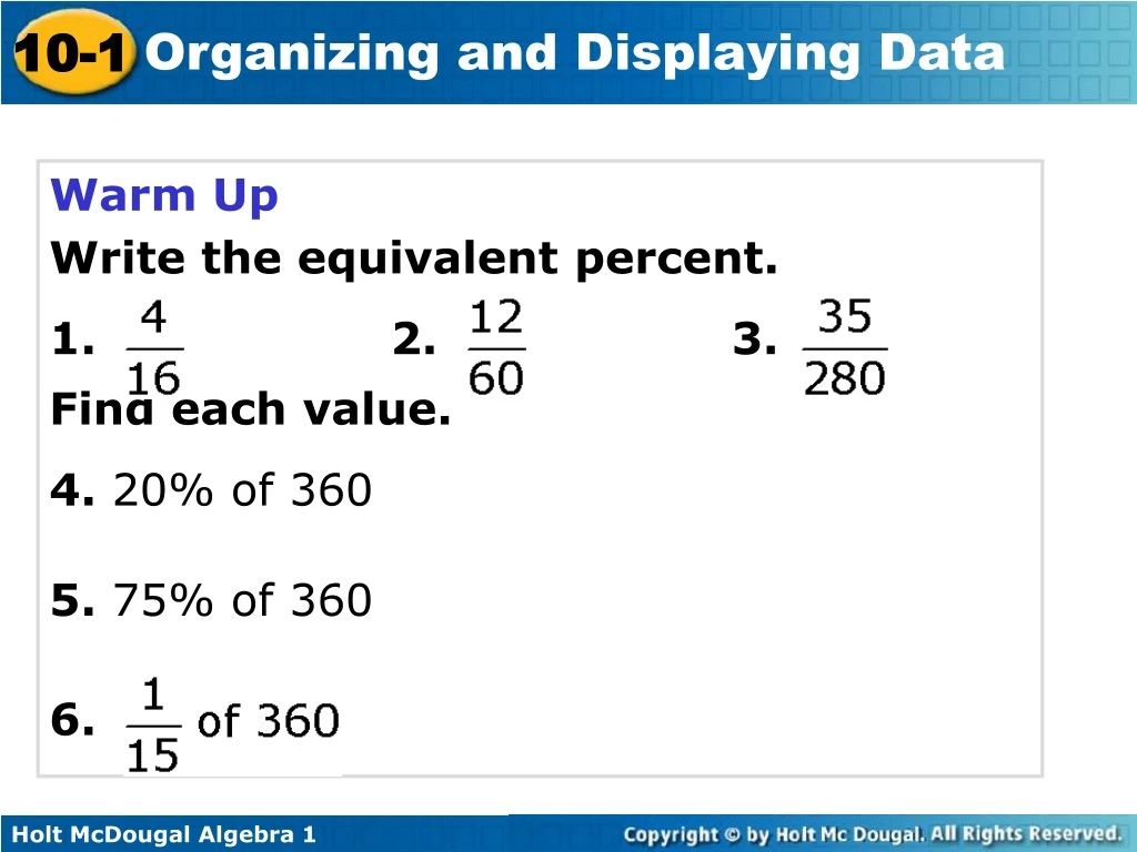
Warm Up Write the equivalent percent. 1. 2. 3. Find each value. 4. 20% of 360 5. 75% of 360 6. Vocabulary. bar graph line graph circle graph stem and leaf plot frequency table histogram. Bar graphs, line graphs, and circle graphs can be used to present data in a visual way.

E N D
Warm Up Write the equivalent percent. 1.2. 3. Find each value. 4. 20% of 360 5. 75% of 360 6.
Vocabulary bar graph line graph circle graph stem and leaf plot frequency table histogram
Bar graphs, line graphs, and circle graphs can be used to present data in a visual way. A bar graph displays data with vertical or horizontal bars. Bar graphs are a good way to display data that can be organized into categories. Using a bar graph, you can quickly compare the categories.
Example 1: Reading and Interpreting Bar Graphs Use the graph to answer each question. A. Which casserole was ordered the most? B. About how many total orders were placed? C. About how many more tuna noodle casseroles were ordered than king ranch casseroles? D. About what percent of the total orders were for baked ziti?
a. Which ingredient contains the least amount of fat? bread b. Which ingredients contain at least 8 grams of fat? cheese and mayonnaise
A double-bar graph can be used to compare two data sets. A double-bar graph has a key to distinguish between the two sets of data.
Example 2: Reading and Interpreting Double Bar Graphs A. Which feature received the same satisfaction rating for each SUV? Cargo B. Which SUV received a better rating for mileage? SUV Y
Check It Out! Example 2 Use the graph to determine which years had the same average basketball attendance. What was the average attendance for those years?
A line graph displays data using line segments. Line graphs are a good way to display data that changes over a period of time.
A. At what time was the humidity the lowest? B. During which 4-hour time period did the humidity increase the most?
Check It Out! Example 3 Use the graph to estimate the difference in temperature between 4:00 A.M. and noon.
A double-line graph can be used to compare how two related data sets change over time. A double-line graph has a key to distinguish between the two sets of data.
Example 4: Reading and Interpreting Double-Line Graphs A. In which month did station A charge more than station B? May B. During which month(s) did the stations charge the same for gasoline? April and July
Check It Out! Example 4 Use the graph to describe the general trend of the data.
A circle graph shows parts of a whole. The entire circle represents 100% of the data and each sector represents a percent of the total. Circle graphs are good for comparing each category of data to the whole set.
Example 5: Reading and Interpreting Circle Graphs 12.5% 50% 12.5% 25% Which ingredients are present in equal amounts? Lemon sherbet and pineapple juice.
Check It Out! Example 5 Use the graph to determine what percent of the fruit salad is cantaloupe.
Flowers in an Arrangement Example 6A: Choosing and Creating an Appropriate Display Use the given data to make a graph. Explain why you chose that type of graph.
Degrees Held by Faculty Example 6B: Choosing and Creating an Appropriate Display Use the given data to make a graph. Explain why you choose that type of graph.
County Farms 248 Example 6C: Choosing and Creating an Appropriate Display Use the given data to make a graph. Explain why you chose that type of graph.
Stem Leaves Example 1A: Making a Stem-and-Leaf Plot The numbers of defective widgets in batches of 1000 are given below. Use the data to make a stem-and-leaf plot. 14, 12, 8, 9, 13, 20, 15, 9, 21, 8, 13, 19 Number of Defective Widgets per Batch
Team A: 65, 42, 56, 49, 58, 42, 61, 55, 45, 72 Team B: 57, 60, 48, 49, 52, 61, 58, 37, 63, 48 Example 1B: Making a Stem-and-Leaf Plot The season’s scores for the football teams going to the state championship are given below. Use the data to make a back-to-back stem-and-leaf plot.
The frequency of a data value is the number of times it occurs. A frequency table shows the frequency of each data value. If the data is divided into intervals, the table shows the frequency of each interval.
Example 2: Making a Frequency Table The numbers of students enrolled in Western Civilization classes at a university are given below. Use the data to make a frequency table with intervals. 12, 22, 18, 9, 25, 31, 28, 19, 22, 27, 32, 14
Example 2 Continued Step 2 Divide the data into equal intervals. For this data set, use an interval of 10. Enrollment in Western Civilization Classes
Check It Out! Example 2 The number of days of Maria’s last 15 vacations are listed below. Use the data to make a frequency table with intervals. 4, 8, 6, 7, 5, 4, 10, 6, 7, 14, 12, 8, 10, 15, 12
A histogram is a bar graph used to display the frequency of data divided into equal intervals. The bars must be of equal width and should touch, but not overlap.
Example 3: Making a Histogram Use the frequency table in Example 2 to make a histogram. Step 1 Use the scale and interval from the frequency table. Enrollment in Western Civilization Classes Step 2 Draw a bar for the number of classes in each interval.
Check It Out! Example 3 Make a histogram for the number of days of Maria’s last 15 vacations. 4, 8, 6, 7, 5, 4, 10, 6, 7, 14, 12, 8, 10, 15, 12