Download

1 / 7
70 likes | 94 Views
E-commerce continues to evolve at a rapid pace, and you need to keep up with the latest developments. In this article, you will find top 2018 e-commerce trends.

E N D
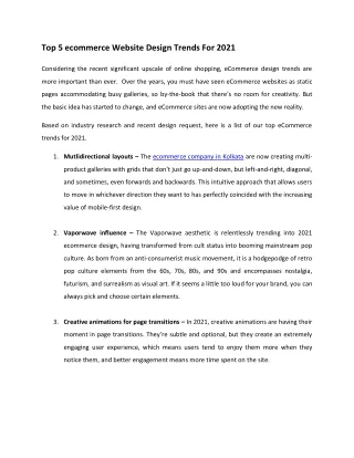
Ecommerce is big business, comprising a respectable portion of global retail sales. Today, you can buy almost anything online, from cars to socks. And the induction of mobile phones and tablets has made ecommerce even bigger business. The convenience of mobile shopping encourages retailers to create mobile – friendly websites and applications (apps). As ecommerce and mobile shopping continues to grow, trends in the sector will continue to emerge, especially trends in web design. Below are 2018’s top web design trends for ecommerce websites.
Changes in Layout and Loading On a mobile website, slow loading can use up precious data (for some users) and precious time. Plus, it defeats the purpose of fast, convenient online shopping. So, every web developer in Edmontonand beyond is combatting slow loading times by creating savvy page layouts. Simple page layouts decrease loading times and improve efficiency by only loading necessary elements.
This is especially useful on product pages. For example, instead of loading 50 products on a page, only loading 10 initially then 10 loading 10 more each time the user scrolls to the bottom of the page. Thus, product listings and web pages become faster and easier to navigate.
Website Adaptation Long gone are the days of designing a desktop and mobile website. Today, developers are designing adaptable sites that are mobile-friendly and can be viewed on any device. However, developers are going a step further by designing sites that also adapt to individual users. This means by using a user’s profile information, visual acuity, and browsing habits, a website can reorder itself to only display products and information that’s relevant to that user. So, web shopping experiences will become more streamlined and personalized.
Even More Mobile-Friendly Design The influx of mobile shopping has prompted an influx in mobile-friendly web design. A mobile-friendly design is a necessity for ecommerce websites. It’s also a marker for contemporary ecommerce web design. Mobile-friendly sites are smoother, faster, and easier to navigate than the old mobile websites. Plus, their configuration and performance are almost identical to their desktop counterparts. These sites are also cost-effective and lend themselves to savvier design.
Easier Navigation with Hamburger Menus Right now, hamburger menus can be found on almost every mobile-friendly website. They’re called “hamburger” menus because their three identifiable horizontal lines resemble two buns with a hamburger in the middle. These menus remain hidden until they’re needed. So, websites become more seamless and easier to navigate. They’re so simple that users only need to scroll over the horizontal lines to reveal the website menu. On smaller screens like smart phones and tablets, this conserves space, improves navigation and increases site speed.