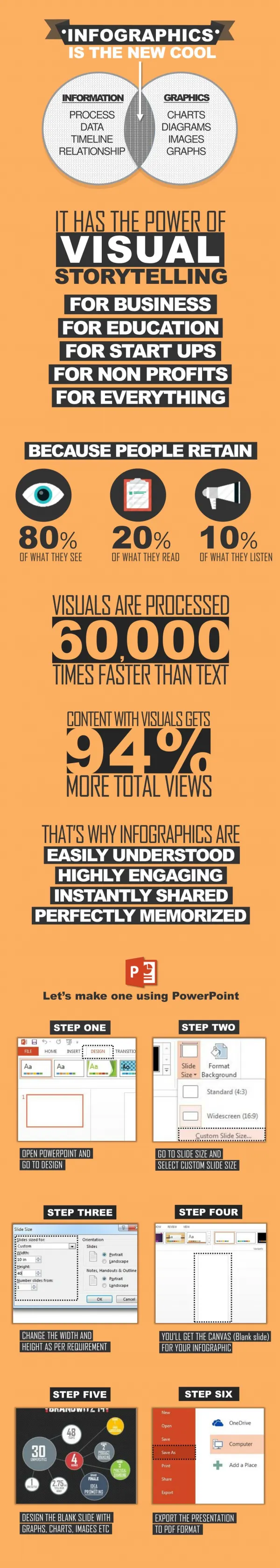
Download

1 / 131
1.32k likes | 1.46k Views
Presenting Data & Standardized Infection Ratios. Tim Wiemken PhD MPH CIC Assistant Professor of Medicine Assistant Director of Epidemiology and Biostatistics University of Louisville School of Medicine, Division of Infectious Diseases Clinical and Translational Research Support Center

E N D
Presenting Data&Standardized Infection Ratios Tim Wiemken PhD MPH CIC Assistant Professor of Medicine Assistant Director of Epidemiology and Biostatistics University of Louisville School of Medicine, Division of Infectious Diseases Clinical and Translational Research Support Center tim.wiemken@louisville.edu Phone: 502.852.4627 www.ctrsc.net
Pre-Presentation Comment • Do not collect any data you do not plan to use (unless your boss tells you to).
Pre-Presentation Comment • What constitutes ‘use’? • Displaying somewhere other thanjust a meeting • Preliminary to a follow-up to collect data that will beused • Education • Targeted prevention • Surveillance (only if you educate with it!)
Overview What makes a good report? How to choose a chart Components of good charts Tips for reports Standardized Infection Ratios
Overview What makes a good report? How to choose a chart Components of good charts Tips for reports Standardized Infection Ratios
What Makes a Good Report? The catch all answer – it depends! There are some key ideas you should think about when preparing any report
What Makes a Good Report? Create reports that can be USED, not just looked at. …more later
What Makes a Good Report? How much time do you have?
What Makes a Good Report? • Who is your audience? • How sophisticated are they? • What do they already know? • Remember that people think and speak differently
What Makes a Good Report? • Why are you giving the presentation? • To show data? (I hope not!) • To provide the status of something? • To prove your worth? • To affect change? • To get someone fired?
What Makes a Good Report? Each of these helps you decide one key piece of information: What do you NEED to present?
What Makes a Good Report? A few rules: Never present more than you need to present.
What Makes a Good Report? A few rules: Never present more than you need to present. Never present less than you need to present.
What Makes a Good Report? A few rules: Never present more than you need to present. Never present less than you need to present. Keep it as short as possible.
What Makes a Good Report? Therefore, focus on what is necessary to meet your goals.
What Makes a Good Report? Yeah, so smarty pants, what is necessary?
What Makes a Good Report? IT DEPENDS!
What Makes a Good Report? Although what is needed depends on how much time you have, your audience, and your goal: It is rarely OK to present raw data by itself:
What Makes a Good Report? Infection Prevention and Control Report, May 2012: CLABSI: 5 VAP: 4 CAUTI: 7 MRSA: 10
What Makes a Good Report? Infection Prevention and Control Report, May 2012: CLABSI: 5 VAP: 4 CAUTI: 7 MRSA: 10
What Makes a Good Report? This is only slightly better. Infection Prevention and Control Report, May 2012:
What Makes a Good Report? Although what is needed depends on how much time you have, your audience, and your goal: • It is rarely OK to present significant amounts of text • E.g. policies, procedures, etc.
What Makes a Good Report? • It is rarely OK to present significant amounts of text • No one wants a six page policy handed to them in a meeting to review. • It will not get reviewed (at least not well). • Send these out early… and many times.
What Makes a Good Report? The Holy Order of Data Quality (worst to best). Text Raw numbers Raw rates Tables of chronological numbers or rates Charts (hierarchy of charts later…) Charts with #4 Charts with #1, #3, and more fun statistics
Overview What makes a good report? How to choose a chart Components of good charts Tips for reports Standardized Infection Ratios
Choosing a Chart • Charts • Numbers alone are bad
Choosing a Chart • Charts • Visual depiction is easier to quickly comprehend
Choosing a Chart • Charts • Visual depiction is easier to quickly comprehend • Choosing the correct chart is extremely important
Choosing a Chart • Charts • Visual depiction is easier to quickly comprehend • Choosing the correct chart is extremely important • Some charts show trends or comparisons in data
Choosing a Chart • Charts • Visual depiction is easier to quickly comprehend • Choosing the correct chart is extremely important • Some charts show trends or comparisons in data • The best chart does not have to be explained
Choosing a Chart • Most common/useful types of charts • Pie • Bar • Line • Radar
Choosing a Chart • Most common/useful types of charts • Pie
Choosing Charts • Pie • Less appropriate than one would think • Categorical data that comprise of portions that add to 100% • Never use 3D pie charts • Do not use a pie chart if you have a lot of categories
Choosing Charts • Pie • Do not use a pie chart if you have a lot of categories
Choosing Charts “Use a pie chart when you don’t have anything to say” - Dr. Julio Ramirez • Pie
Choosing a Chart • Most common/useful types of charts • Bar
Choosing Charts • Bar • Snapshots of data [rates in one month] • Comparing data across different categories • Never use 3D charts unless you have a 3rd dimension!
Bar Charts • Is it ever appropriate to use 3D charts?
Choosing a Chart • Most common/useful types of charts • Line
Choosing a Chart • Line • Longitudinal data (data over time) • Contiguous points
Choosing a Chart • Line • Longitudinal data (data over time) • Contiguous points • Rates, Counts, etc. by Month/Quarter/Year • Run charts • Statistical Process Control charts
Choosing a Chart • Run charts • Use when you have few time periods (e.g. <25 months).
Choosing a Chart • Run charts • Anatomy • Center Line / Median –represents the median of all of the data points. • X-axis –represents the time period of interest (days, weeks, months, quarters, years). • Y-axis –represents the scale of the plotted data points (e.g. rate or count of infection). • Data points – the actual data values.
Choosing a Chart Y-axis (Rate) Data Points (<25) Center Line (Median) X-axis (Month) • Run charts
Choosing a Chart • Run charts • Use • Use to identify when the data are different than you expect (for better or worse) through detecting abnormal variation