Download

1 / 49
500 likes | 594 Views
Box and Whisker Plots. This data shows the scores achieved by fifteen students who took a short maths test. The test was marked out of ten. To construct a box and whisker plot, we need five pieces of information. The median. The lower quartile. The upper quartile. The lowest value.

E N D
This data shows the scores achieved by fifteen students who took a short maths test. The test was marked out of ten. To construct a box and whisker plot, we need five pieces of information. The median The lower quartile The upper quartile The lowest value The highest value
To find the median and the upper and lower quartiles, we first of all need to arrange the data…. in rank order
The median value is the value where n is the number of data items, so here, n = 15. The median value is the 8th value which is 4
median The median value is the value where n is the number of data items, so here, n = 15. The median value is the 8th value which is 4
median The lower quartile is the value where n is the number of data items, so here, n = 15. The lower quartile is the 4th value which is 2
l.q. median The lower quartile is the value where n is the number of data items, so here, n = 15. The lower quartile is the 4th value which is 2
l.q. median The upper quartile is the value where n is the number of data items, so here, n = 15. The upper quartile is the 12th value which is 6
l.q. median The upper quartile is the value where n is the number of data items, so here, n = 15. The upper quartile is the 12th value which is 6
l.q. median u.q. The upper quartile is the value where n is the number of data items, so here, n = 15. The upper quartile is the 12th value which is 6
l.q. median u.q. The lowest value is 0
l.q. median u.q. The lowest value is 0 The highest value is 9
l.q. median u.q. The lowest value is 0 The highest value is 9
Now that we have found the median, both quartiles and the highest and lowest values, we have all the information which we need in order to be able to construct the box and whisker diagram
We first of all need some sort of grid. We can use graph paper for this or just ordinary squared paper will do equally well
l.q. median u.q. Data First of all we draw the box For this, we will need to provide a scale which should be clearly labelled
l.q. median u.q. Data Scores out of ten
l.q. median u.q. Data Next we draw the whiskers Scores out of ten
Data Scores out of ten
Data The Box and Whisker Plot is complete Scores out of ten
Data And the final diagram looks like this Scores out of ten
Box and Whisker plots are useful when comparing sets of data For instance, the scores of the original group of students, group A are now being compared with those of a second group B
Box and Whisker plots are useful when comparing sets of data For instance, the scores of the original group of students, group A are now being compared with those of a second group B Group A Group B Scores out of ten
By simply examining the two side by side box and whisker plots, we can easily deduce lots of useful information. Group A For instance……… Group B Scores out of ten
The highest score was in group B Group A Group B Scores out of ten
The lowest score was in group A Group A Group B Scores out of ten
On average, group A did better Group A Group B Scores out of ten
The top 50% of students in group A did better than the bottom 75% of students in group B Group A Group B Scores out of ten
In group A, the middle 50% of the students scores were between 2 and 6 inclusive whereas with group B, the middle 50% of the students scores were contained in a narrower range of values between 2 and 4 inclusive. Group A Group B Scores out of ten
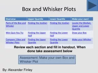
We could say a great deal more about these two diagrams But now it’s your turn to draw and interpret some Box and Whisker diagrams of your own Group A Group B Scores out of ten