Download
1 / 59
590 likes | 797 Views
Unit 3 Examining Relationships Introduction Scatterplots Correlation Least-Squares Regression. In this chapter we will concentrate on relationships among several variable instead of a single variable.

E N D
Unit 3 Examining Relationships • Introduction • Scatterplots • Correlation • Least-Squares Regression
In this chapter we will concentrate on relationships among several variable instead of a single variable. • When you examine the relationship between two or more variable, first ask the preliminary questions that are familiar from the previous chapters. • What individuals do the data describe? • What exactly are the variables? How are they measured? • Are all the variables quantitative or is at least one a categorical variable? • Do you want to simply explore the nature of the relationship, or do you think that some of the variables explain or even cause changes in others? That is, are some of the variables response variables and others explanatory variables?
A response variable measures an outcome of a study. (Dependent Variables) An explanatory variable attempts to explain the observed outcomes. (Independent Variables)
Example • Alcohol has many effects on the body. One effect is a drop in body temperature. To study this effect, researchers give several different amounts of alcohol to mice, then measure the change in each mouse’s body temperature in the 15 minutes after taking the alcohol. • Amount of alcohol is the explanatory variable, and • changes in the body temperature is the response variable.
Example • Jim wants to know how the median SAT Math and Verbal scores in the 51 states (including the District of Columbia) are related to each other. He doesn’t think that either score explains or causes the other. Jim has two related variables, and neither is an explanatory variable. • Julie looks at some data. She asks, “ Can I predict a state’s median SAT Math score if I know its median SAT Verbal score?” • Julie is treating the Verbal score as the explanatory variable and the Math score as the response variable.
The principles that guide examination of data are still the same for bivariate data: • First plot the data, then add numerical summaries. • Look for an overall pattern and deviations from those patterns. • When the overall pattern is quite regular, use a compact mathematical model to describe it.
Scatterplots The most effective way to display the relation between two quantitative variables is a scatterplot.
A scatterplot shows the relationship between two quantitative variables measured on the same individuals. The values of one variable appear on the horizontal axis, and the values of the other appear on the vertical axis. Each individual in the data appears as the point in the plot fixed by the values of both variables for that individual.
TIPS FOR CREATING SCATTERPLOTS • Scale the horizontal and vertical axes. The intervals must be uniform. If the scale does not begin at zero at the origin, then use the appropriate symbol to indicate a break. • Label both axes. Not just x and y. • If you are given a grid, try to adopt a scale so that your plot uses the whole grid. Make your plot large enough so that the details can be easily seen. Don’t compress the plot into one corner of the grid.
Page 125 Exercises 3.6 and 3.7 Follow the tips and create the scatterplots for 3.6 and 3.7. Answer the questions that follow. Be very careful when creating these scatterplots as they will be used again in other exercises.
Interpreting scatterplots In any graph of data, look for the overall patternand for striking deviations from that pattern. You can describe the overall pattern of a scatterplot by the form, direction, and strength of the relationship. An important kind of deviation is an outlier, an individual value that falls outside the overall pattern of the relationship.
Refer to Figure 3.1 on page 124 Form: There are two distinct clusters of states with a gap between them. In the cluster at the right of the plot, 45% or more of high school graduates take the SAT, and the average scores are low. The states that cluster to the left have higher SAT scores and lower percents of graduates taking the test. There are no clear outliers.
What explains the clusters? There are two widely used college entrance exams, the SAT and ACT. Each state favors one or the other. The left cluster contains the ACT states, and the SAT states make up the right cluster. In ACT states, most students who take the SAT are applying to a selective college that requires SAT scores. This select group of students has a higher average score than the much larger group of students who take the SAT in SAT states.
Direction: States in which a higher percent of students take the SAT tend to have lower average scores. This is a negative association between the two variables. Strength: The strength of a relationship in a scatterplot is determined by how closely the points follow a clear form. The overall relationship in Figure 3.1 is not strong—states with similar percents taking the SAT show quite a bit of scatter in their average scores. Answer Exercises 9 and 10 which refer to the scatterplots you drew for #6 and #7.
Describe the form, direction, and strength of the relationship to the left between husband’s ages and wife’s ages. Can you explain the relationship?
Adding Categorical Variables to Scatterplots You can use different plotting symbols to call attention to points that stand for more than one individual. You could graph the ACT states with an “A” and the SAT states with an “S”. Check out data from page 130 to see how the graphs have been changed. Answer Exercises 15-19 and 22 on pages 137-139.
Making a scatterplot on the graphing calculator End of Section 3.1
Correlation A scatterplot displays direction, form and strength of the relationship between two quantitative variables. Linear relations are particularly important because a straight line is a simple pattern that is quite common. We say the relationship is strong if the points lie close to a straight line. The relationship is weaker the more spread out from a line the points are.
Our eyes are not good judges of how strong this relationship is. Below are two scatterplots of the same data. Discuss the differences you see. Figure 3.8
You can see our eyes can be fooled just by changing the scales. We need to follow our strategy for data analysis by using a numerical measure to supplement the graph. Correlation is the measure we use. The correlation measures the direction and strength of the linear relationship between two quantitative variables. Correlation is usually written as r.
Facts about Correlation See Handout Correlation Simulation http://onlinestatbook.com/chapter4/pearson_demo.html Linear Correlation Quiz
Explain whether a scatterplot for each pair of variables would probably show a positive, negative, or no correlation between the variables. • your age and weight from ages 1 to 20 • temperature of a cup of coffee and the time it sits on the table • The amount a mail carrier earns each day and the weight of the mail delivered each day • The distance traveled and the time driving • a person’s height and their birth month • the amount of snow on the ground and the daily temperature • the time water boils and the amount of water in the pot • the number of files stored on a disk and the amount of memory left on the disk.
Suppose that we have data on variables x and y for n individuals. The values for the first individual are and , the values for the second individual are and and so on. The means and standard deviation of the two variables are and for the x-values, and and for the y-values. The correlation r between x and y is )()
How do you calculate the r-value (correlation coefficient)? Using the formula R-Value Worksheet 2. Using a Graphing Calculator Directions
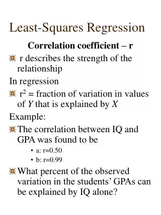
How do I interpret the r-value? • The absolute value of r tells you the strength of the association (0 means no association, 1 is a strong association) • The sign tells you whether it’s a positive or a negative association. So r ranges from -1 to +1 • It makes no difference which variable you call x and which you call y when calculating correlation, but stay consistent!!!
How do I interpret the r-value? • Because r uses standardized values of the observations, r does not change when we change the units of measurement of x, y, or both. (Ex: Measuring height in inches vs. ft. won’t change correlation with weight) • Values of -1 and +1 occur ONLY in the case of a perfect linear relationship , when the variables lie exactly along a straight line.
Requirements for Correlation 1. Correlation requires that both variables be quantitative 2. Correlation measures the strength of only LINEAR relationships, not curved...no matter how strong they are! 3. Like the mean and standard deviation, the correlation is not resistant: r is strongly affected by a few outlying observations. Use r with caution when outliers appear in the scatterplot 4. Correlation is not a complete summary of two-variable data, even when the relationship is linear- always give the means and standard deviations of both x and y along with the correlation.
Beware correlations based on averages • Correlations based on averages are usually too high when applied to individuals. • Example: if we plot the average height of young children against their age in months, we will see a very strong positive association with correlation near 1. But individual children of the same age vary a great deal in height. A plot of height against age for individual children will show much more scatter and lower correlation than the plot of average height against age.
The relationship between two variables may be caused from a third variable, called a lurking variable.
Lurking Variables- Beware! • Example: A college board study of HS grads found a strong correlation between math minority students took in high school and their later success in college. News articles quoted the College Board saying that “math is the gatekeeper for success in college”. • But, Minority students from middle-class homes with educated parents no doubt take more high school math courses. They are also more likely to have a stable family, parents who emphasize education, and can pay for college etc. These students would likely succeed in college even if they took fewer math courses. The family background of students is a lurking variable that probably explains much of the relationship between math courses and college success.
EXAMPLE Over the past 10 years, there has been a high positive correlation between the number of South Dakota safety inspection stickers issued and the number of South Dakota traffic accidents. Do safety inspection stickers cause traffic accidents? b. What third factor might cause traffic accidents and the number of safety stickers to increase together?
EXAMPLE There is a high positive correlation in the United States between teacher’s salaries and annual consumption of liquor. Do you think increasing teacher’s salaries has caused increased liquor consumption? b. As teacher’s salaries have been going up, most other salaries have been going up too. To some extent this means an upward trend in buying power for everyone. How might this explain the high correlation between teacher’s salaries and liquor consumption?
EXAMPLE Over the past 30 years in the United States there has been a strong negative correlation between number of infant deaths at birth and number of people over age 65. Is the fact that people are living longer causing a decrease in infant mortalities at birth? What third factor might be decreasing infant mortalities and at the same time increasing life span?
EXAMPLE Over the past few years, there has been a strong positive correlation between annual consumption of diet soda and the number of traffic accidents. Do you think that an increasing consumption of diet soda has led to more traffic accidents? b. What third factor or factors might be causing both the annual consumption of diet soda and the number of traffic accidents to increase together? End of Section 3.2
Line of Best Fit? Prior to this class, you may have constructed a line of best fit to describe the results of the following activities in Algebra 1 with Ms. Johnson. Slinky Experiment Bridge the Gap Down the Ramp Rolling Along
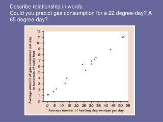
The slope here B = .00344 tells us that fat gained goes down by .00344 kg for each added calorie of NEA according to this linear model. Our regression equation is the predicted RATE OF CHANGE in the response y as the explanatory variable x changes. The Y intercept a = 3.505kg is the fat gain estimated by this model if NEA does not change when a person overeats.
Prediction We can use a regression line to predict the response y for a specific value of the explanatory variable x.
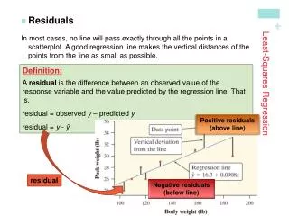
In most cases, no line will pass exactly through all the points in a scatter plot and different people will draw different regression lines by eye. • Because we use the line to predict y from x, the prediction errors we make are errors in y, the vertical direction in the scatter plot • A good regression line makes the vertical distances of the points from the line as small as possible • Error: Observed response - predicted response